Saturday, 29 November 2014

OUGD405 - Studio Brief 1 - Photoshop Experiments - Creativity takes courage


I started with a crumpled paper texture which I taken a picture of and then applied my hand drawn type with embellishments from illustrator onto the top. I duplicated it and inverted the colours to be white to add a shadow that contrasted from the yellow of the background. I also used the brush tool and my pen and tablet to add some accented dashes to some of the flourishes of the type to make it pop more.


I then played around with colours and layer styles of the texture in the background.

This was made using Linear Dodge on a blue background


Making the background monotone


I tried a blue shadow and I think that it's really effective.
 Next I wanted to try and replicate Jessica Hische's piece "You left me alone in the dark" so I found some images of stars and overlaid my type over it. For the image below I used overlay when the text was white, I think that this is quite effective because you don't lose anything from the beautiful image behind but you can still read the quote clearly. 


I also tried this overlaying technique on a darker sky, but I think that it is too subtle and couldn't be read from a distance, which is my aim. 


I then went back to basics and tried a different textured background, editing the colours from a brown to this emerald green colour with the hue and saturation image adjustment tool. I really like this colour because it jumps out at the page at you and invites you in. I think I will maybe try playing around a bit more with the quote to make it really stand out.


OUGD405 - Studio Brief 1 - Interim Crit


In my interim critique I showed some of my early experiments of typography as well as some of my more humorous ideas. Most people said they liked the idea as typography would draw people in rather than just an image. It was questioned how I would make it work in Photoshop, but I think it will work well as I can incorporate textures and colours into the type while still having the illustrative hand drawn feel that I was going for.  

I was told that the funny quotes would work well, so I think that I will use a motivational quote, a funny saying and an artistic quote as my set of 3 designs.  Additionally, they liked my bright colours and said that I should think about using a consistent colour palette in my designs. 

Overall, I am happy with the feedback and now I just want to work on getting my final typography done and working with it in Photoshop.

Thursday, 27 November 2014

OUGD405 - Studio Brief 1 - Initial Ideas


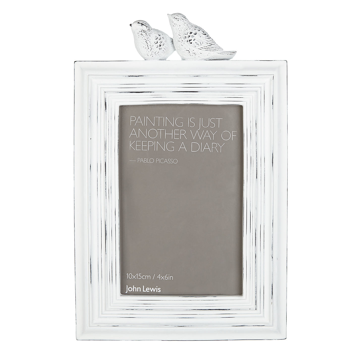
I created a mind map of what themes I could use in my designs to give the frame backings more interest. The themes I initially liked were typography, architecture, art mediums and organics. But in the end I decided on typography and linked it in with another of my theme ideas for motivation. I thought that it would be a nice idea to use quotes to brighten someones mood or day within the frame backings (like in the John Lewis frame). 


So then I started looking for quotes! I found lots of quotes but I tried to pick the most motivational ones or the shortest ones because some quotes wouldn't fit within a small frame. I like the idea of using a quote like "If you can dream it, you can do it." by Walt Disney as it builds confidence in you to think about living your dreams rather than just being a plain design with no message.


Additionally I looked at playing with humour in my designs so I thought of phrases that you would say while taking a picture. Moreover, I played with the idea of using cheesy pick up lines that would make people laugh, as if the photo frame was talking to you.  I like this idea but I think it would narrow my target audience down to mostly women as most pick up lines are aimed at women and men don't take selfies as often as women stereotypically.


RESEARCH

I decided that it would be best to use famous quotes instead of humour to brighten peoples days in a small way so I began researching ways I could present this. 


Jessica Hische - Florence

I found Jessica Hische's work and fell in love. I had never really looked at her work, a part from the typeface that she had created for Moonrise Kingdom, and I was blown away by the elegance of it. I love the idea of having the script all tightly woven together so you have to lean in or squint to read the message in the cursive swirls. The background used is also quite relevant to the font so maybe I could incorporate these elements into my designs.


And I also like this work by Hische, which uses different typefaces and little illustrations to show embellish what could be a simple sentence. I especially like the contrast of colours in this piece and I would be drawn to look at it in a store if it was next to all grey frame backings. 


I also looked at other miscellaneous artists for hand drawn typography like the ones shown above. I love the organic feel of hand drawn type, unlike Hische's typography pieces the imperfections make it unique and friendly rather than rigid and formal. 


Photoshop Induction - Session 1

TOTAL RECALL POSTER REDESIGN


I took the background from a still of part of the film which I thought had an interesting geometric pattern, I decided to take this and use it almost like a halo around the main characters. I think this still of the scene is also quite key to the plot of the story as it confuses the character whether what he is experiencing is real or not. Also, I wanted to add the futuristic look by adding blues to the design, particularly taking the light blue colour from the machine that I used as a background. I added some of this colour to his face to make it look like a glowing light and I added some JJ Abrams style lens flares, by experimenting with blur techniques, to add to the futuristic feel. Additionally I added blur effects to the title and cast names by taking a blue version of the text and using movement blur so it looks like it is moving/ there are lens flares behind it. 

Original photo of Colin Farrell


After I had finished my first poster I decided that I should do a set of all the top billed actors on the original posters. Unfortunately, I couldn't find any photos that were as good as the one of Colin Farrell (which was provided in the photoshop induction) and I had to find one on the internet that suited the style. I then made removed the background and made the image black and white, while adding the blue glow to the side of the face. It was a pretty simple job as all the other elements made it tie in with the other poster.

Original Poster of Kate Beckinsale


I think that this design is my least successful as I struggled to find a picture that matched the other two in terms of composition and style. This was the best one I could find that had a higher resolution yet you can still see that something about it doesn't look right. 

Original Photo of Jessica Biel
Original Film Poster
Overall, due to my existing knowledge of Photoshop I mostly worked on my own for the whole session as I knew most of the techniques that the tutor was talking about. 


Monday, 24 November 2014

OUGD405 - Studio Brief 1 - Primary Research - Frames in Shops

After looking online at frames I thought the best thing to do next would be to go to some shops to see what are on the shelves. 

First of all I visited TK Maxx, who specialise in lots of different brands so finding lots of examples was very easy. I found that most frames use geometric patterns with the information about the dimensions placed in the middle or at the bottom. However, some used type only like the small circular frame pictured, which I find really effective as its use of type and a hint of colour makes it stand out against its busier counterparts. Also there were others that used photography, which worked well but they were often black and white photographs so the frames just merged into the background and didn't stand out to me at all. 


Next I visted Paperchase, whose frames are very quirky and unique and often the backing papers suit this style. They often use unique designs for most frames relating to its style, like with the hedgehog frame the type is very organic and it even has a cute illustration reflecting the cute outer frame. And for the circular metal frame the type used has an industrial feel, with a technical drawing beneath it, so both of these frames could be targeted at completely different target audiences. 


It's interesting to see a contrast in design such as the one above. Both frames are metal photoframes, yet one represents the outer frame by replicating the colours and the pattern used while the other is very plain with a grey background and just type. I prefer the copper frame just because of the use of the pattern backing paper and colours. Perhaps I could pick out colours or designs that suit the frames that I am trying to sell. 


Finally, I visited Wilkinsons or Wilkos for a complete change of audience and price range. Wilkos are known for being cheap so I wasn't expecting cutting edge design used within their frames. 


Wilkos used the theme of circles within all of their frame backing designs, using simple neutral colours within these two frames. They show all the basic information very clearly and even make suggestions to how the frames could be used.  


The simpler clip on frames had a more colourful approach to their designs but retained the same circular theme throughout. 

OUGD405 - Studio Brief 1 - Design Process - Frame - Initial Online Research


Liberty London Frames

These luxurious frames have been given a very unique frame backing. I love the use of traditional patterned papers and using descriptions of how the frames are crafted in the middle. The overall look of these frames screams upper class and quality. It also uses black letter, sans serif and cursive fonts once again connoting quality and luxury. 

Tesco Frame 

This has to be the most simple frame backing paper. It is greyscale, with only essential information displayed on it. Some may like this minimal style but this doesn't sell the product to me at all. 

John Lewis Frames

Though this is a stylised frame, this backing paper is once again grey. But I really like this idea of using quotes from artists on the frame backing paper, I even thought I could use motivational quotes to use to brighten peoples day when they walked past them.

IKEA Frames

The IKEA frame takes a more technical aspect and I think that it has tried to be as multilingual as possible by using internationally known symbols. But I expect this from IKEA as it is a large international company that focuses on ease of use and simplicity.


Overall from this research I have found that most of the frame backing papers don't use bright colours at all, they are mostly grey or very pale shades. This may be because the design has to fit with a large variety of frame styles, shapes and colours. However, I feel like they need to be bold and colourful to draw your eyes to the frame and show that it can work with strong colours.