Saturday, 31 October 2015

OUGD504 - Studio Brief 3 - Mock ups

I created a lot of mock ups for this brief as I felt like on my last publication brief I made lots of mistakes on the final product because it was my first real print out of it. This mock up was just a simple black and white print out on normal paper - not with the tracing paper - to just see whether the layout and the cover worked on the size that I wanted.


For now I just used some bulldog clips to keep it together as I am waiting for the book binding induction in order to learn how to do a Japanese stab bind. The bulldogs do simulate how some of the spine will be covered though so it worked quite well to show how much I needed to change my layout in order to account for the extra gutter. Also I feel that the title on the front cover is far too big, taking away from the journal look that I was going for. However I am satisfied with the minimal layout, I think it looks like a photo album with small pictures placed inside. The tracing paper also emulates this because in some photo albums you have protective thin sheets of tissue or tracing paper to protect the photographs and the tracing paper with the laters could show this. 

Wednesday, 28 October 2015

OUGD504 - Studio Brief 3 - Crit box (Interim Critique)


When going into the crit I had almost finalised my layout plans for the book so I showed a digital version of my proposed book. I told them that I was struggling to justify some of the reasoning behind my designs so far. They suggested that before starting any brief you should select an audience to target the design at. This means that you can justify things by researching your target audience. I found this very enlightening and I will definitely try to do this for my projects now on.

Also because of the simplicity of my layout they said that if I wanted to be more experimental for the letter pages I could try and use a different process/effect to each new letter to create a very interesting affect that would appeal to creatives. These experiments could then be related to the images context. I don't know whether this will be possible within the time scale that I have got left now, but I might try some experiments for the cover instead. 

Additionally when I explained my concept of the personal journal look of the book they suggested I push my photographs further and perhaps make them look like polaroid images, maybe even create the whole book in the size of a polaroid picture. I really like this idea but I feel like it would make the book too niche and it would feel like a novelty book rather than a photography book.

Tuesday, 27 October 2015

OUGD504 - Studio Brief 3 - Canons and Page Layout

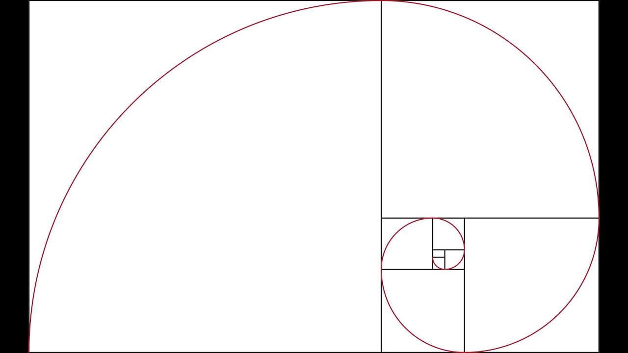
The Golden Ratio

100/1.618 = 16.18

(insert number here) divided or times by 1.618 gives you the golden ratio sum

This can be used within canon construction, font point sizes and a whole range of other things. Below is the golden ratio of an area, created by measuring the width and the height of the boxes and dividing them by 1.618 to get the measurement for where the next line should go. Putting this into practice is harder than it looks - we tried to create our own on graph paper and I found it really difficult as I kept having to flip the page around to switch the measurements around. The hardest part for me was when it was getting to the smaller boxes - I couldn't seem to get the ratios right. 


However I did try the theory of the golden ratio point sizes. That the title should be 1.618 times the point of the body copy. Putting this into practice was quite effective which surprised me because I felt like the use of the golden ratio within imagery and canon page construction seemed to be pointless and not work at all (in my opinion). I think I will definitely use this method of point sizing again as you can see below, it makes the sizes seem very harmonious. 


Van de Graaf

Next we looked at Jan Tscichold's Van de Graaf canon which was a lot more simple to recreate and made a lot more sense layout wise in my opinion.


I implemented it into a text layout and I feel like it works very well. Although it would depend on the binding method of the book whether this layout would be effective or not - if it was perfect bind or a Japanese stab bind then the margins in the centre of the page would have to be a lot bigger in order to account for the bind and not lose some of the text. 


It also works well with type and image. I have used one of my images from the type in context brief and I feel like this layout is particularly effective because of its minimalism. 


Saturday, 24 October 2015

OUGD504 - Studio Brief 3 - Study Task 3 - Print Finishes

1. Metallic Foiling


"Foil stamping is a specialty printing process that uses heat, pressure, metal dies and foil film.  The foil comes in rolls in a wide assortment of colours, finishes, and optical effects." - ohsobeautifulpaper.com

Once a design is finalised, metal dies are created in the shape for each coloured foil to be applied, and for embossing or debossing if a three-dimensional effect is desired – this is most commonly known as blind embossing. Once the dies are created they are stamped onto the printed piece with the help of heat to bond the foil to the paper. 
Foiling is a lot more expensive than other printing methods as you have to factor in the creation of the metal dies and a thicker paper stocks in order to be pressed without going through the paper. An example of a local supplier that specialises in this method is Magpie Press in Leeds: http://magpiepress.co.uk/
Metallic foiling in particular creates a bold and lustrous finish suggesting luxury and wealth so it appeals to a more sophisticated target audience who appreciate the finer things in life. This technique could easily be used in this project as it would be a good method to add a luxurious finish to the cover of the book to make it look like a good quality book. It wouldn't be effective however, being used in the inside because finishes like this are best used sparingly to avoid looking tacky. When preparing a design to be printing using foiling a spot colour should be used in the places where the foil should be applied so a metal die can be created for the decided areas to foil.


2. Matte Lamination


Matt Lamination gives a subtle, tactile, effect that gives the document added quality. This is great for items where image and first impressions mean everything. Whilst forming a protective coating over the print it does not provide the same level of protection as gloss lamination and can be prone to scratching and fingerprints. 
To apply a Matte Lamination, the printed material is fed through a large machine which contains rollers. The paper or material is then passed under these rollers and heat is applied to bond the laminate film to the paper. For this print finish no preparation is needed on the digital file. 


3. UV Spot Varnish


When creating a UV Spot varnish a varnish is applied only to selected areas of a printed piece after printing, rather than to the entire sheet, typically for aesthetic purposes. It creates an effect that mattifies the rest of the page in comparison to the varnished areas raising them slightly making it a more tangible piece. It also adds a spot of luxury to the magazine as the different textures created add an extra experience for the user. Similar to foiling when preparing a document for a UV spot varnish a separate spot colour should be used in areas where the spot varnish is desired. 


4. Embossing and Spot Varnish


Embossing is the processes of creating a raised image or design onto paper. An embossed pattern is raised against the background making it pop out against the background and give a more luxurious, exclusive feel. In this particular example spot varnishing has been used as well to add a very tactile finish that you want to run your fingers over. The pattern in which the spot varnish has been applied also adds to the curious nature of this front cover - applying a strange wave like pattern making it feel like the image is trapped underwater. 


5. Gloss Foiling 


"Foil stamping is a specialty printing process that uses heat, pressure, metal dies and foil film.  The foil comes in rolls in a wide assortment of colours, finishes, and optical effects." - ohsobeautifulpaper.com

Once a design is finalised, metal dies are created in the shape for each coloured foil to be applied, and for embossing or debossing if a three-dimensional effect is desired – this is most commonly known as blind embossing. Once the dies are created they are stamped onto the printed piece with the help of heat to bond the foil to the paper. 
Foiling is a lot more expensive than other printing methods as you have to factor in the creation of the metal dies and a thicker paper stocks in order to be pressed without going through the paper. An example of a local supplier that specialises in this method is Magpie Press in Leeds: http://magpiepress.co.uk/
Metallic foiling in particular creates a bold and lustrous finish suggesting luxury and wealth so it appeals to a more sophisticated target audience who appreciate the finer things in life. This technique could easily be used in this project as it would be a good method to add a luxurious finish to the cover of the book to make it look like a good quality book. It wouldn't be effective however, being used in the inside because finishes like this are best used sparingly to avoid looking tacky. When preparing a design to be printing using foiling a spot colour should be used in the places where the foil should be applied so a metal die can be created for the decided areas to foil.


6. Die Cutting


"Die-cutting is a process used in many different industries to cut a thin flat material (in our case, paper) into a specific shape using a steel cutting die. It can be used to punch out a decorative shape or pattern to incorporate within a larger piece, or it can be used to create the main shape of an object by cutting the entire sheet of paper in an distinct/designed way. More simply put: for us it’s way of making a hole in paper in a desired shape using the same presses that we use for letterpress printing." - ohsobeautifulpaper.com

I found an interesting video on this subject taking you through the process of die cutting on quite a small scale:
https://vimeo.com/31104976


The process of die-cutting is a set up similar to letterpress printing.  Instead of a type printing plate a wood mounted steel cutting die is used.  The shape of the cutting die is something designed and ordered from a die-makers.  Instead of paper and packing (used to control the impression when printing), a sheet of metal is used on the press bed giving the die a hard surface to cut against.
Depending on the size of the die cut the pricing may differ. The bigger the die the more expensive it will be to produce. 
To prepare something for a die cut you would create an extra layer with the shapes or objects that you want to die cut so that the printers could create cutting dies from this. 

7. Gloss Lamination


Gloss lamination adds a high sheen, often used for brochure covers, menus, magazine covers or presentation folders. It forms a protective coating over the print which makes it suitable for items such as menus as it can be wiped clean and not be damaged by water.
It is applied in the same way as the Matte Lamination, the printed material is fed through the machine, which passes through heat and pressure rollers and applies the gloss laminate film. Once again with this print finish no preparation is needed on the digital file. 


8. Patterning


Patterning is very similar to embossing. In fact the process is done in the same way as embossing but by using a pattern on the overall page rather than just on one area. Patterning dies are usually already created so the printing costs would be possibly less than embossing because you wouldn't need to spend money producing the dies to emboss with. However because it covers a wider area over the page a thicker stock would need to be used to cope with the patterning and not fall a part. Here a hardcover has been used so it is produced effectively. The overall effect is very interesting, giving a texture to the background instead of having a flat image it gives a 3D effect. 

 References:
www.ohsobeautifulpaper.com
www.printwiki.org

OUGD504 - Studio Brief 3 - Implementing Layout Ideas

Having drawn out some initial sketches and looked through them all I decided that I wanted to keep the layout of my book very minimal. 


Here I tried t use a full bleed spread of the photograph, however due to the quality of the photos being poor it doesn't look right. The photos become pixelated when they are stretched to this size and that makes for a very unprofessional looking book. 

So moving on I tried a layout loosely based around the Van de Graaf canon with a much smaller area for the content. However I felt that the type on the spread isn't really needed as I repeat myself in a lot of the descriptions and analysis due to the similarity of the type within a small area. Most of my type comes from the signs for certain tents or food stalls within the main arena which means most of them have the same purpose and similar connotations.


So next I tried a very minimal layout with no text used at all. I wanted to try out the idea of using tracing paper to highlight the one letter that is being looked at, in this case A. I like this idea of just simplifying the layout to just image and isolating the letterforms. It brings a sort of interactivity between the reader and the book. Also having just imagery means that the book can be flicked through without having to read anything, as if the reader was walking in my footsteps through the festival.


Taking inspiration from the Meteor book from my research I thought I could try coloured tracing papers to brighten up the images. I tried grey scaling one image and using the colour of the tracing paper to create a duotone like effect. But I feel like it makes the image look muddy due to the presence of the blacks and greys underneath. After looking and experimenting with colours like this, I will definitely keep it plain and simple so the focus is always on the photographs and nothing distracts the reader away from it. 


Friday, 23 October 2015

OUGD504 - Studio Brief 3 - Initial Layout Thumbnails


After looking at page layouts and canons I decided to make some initial sketch ideas of my own. With the 1st layout I used a similar layout to that of the Van de Graaf canon - with a very simple body copy and a rectangular image taking up most of the page. 

Next I tried to push the boundaries with the layouts a bit more and stretched the image to be over 2 pages and just a small section for the body copy - perhaps even no body copy at all. This layout does appeal to me visually however with the bind method that I am planning to use and the quality of my photographs I don't think it will be possible to have a photograph that big on the page. 

Then I tried out having imagery on both pages in a square format. I thought this would be a good idea because it would look like polaroid photographs which are often related with festivals because of their retro nature and being able to print them on the go. 

The next few layouts were very much inspired by the photography books that I looked at in the library. I really liked the design of the meteorite book and the use of tracing paper so I wanted to incorporate something similar in my design. I thought that tracing paper was slightly translucent - reminiscent of memories of a festival which are slightly unclear but you can still see them. I thought that I could do my body copy or even just the letter on the tracing paper above the image.

My final idea was similar to my presentation layout - having a small thumbnail of the letter and then the whole picture on the next page. I thought this would be most effective for the clarity of the book. However I feel like this is very un-ambitious for a book layout and would work a lot better if I had good quality pictures that I could zoom into. However this is not the case. 

Additionally I played around with some front cover layout ideas. I was exploring a number of typography based covers as I felt there was enough imagery inside it wasn't needed on the front page too. I want to experiment with some print finishes so I thought using a foil or an emboss on some simple text would work really nicely to make the front cover look and feel more exclusive and luxurious. From these thumbnail sketches the ones that stand out to me are the 3rd and 4th one. The 3rd one looks like the cover of a personal photo album or a journal this is reminiscent of my personal experiences from the festival and would contextualise the imagery. On the other hand the 4th one is minimal and ideal for using a print finish on to experiment with, yet it is not as personal. I will have to see which looks better as I digitalise some of these ideas.  

OUGD504 - Studio Brief 3 - Photography Book Research


Even though this was the first photography book that I looked at it was by far my favourite. I love the simplicity of just the title and the linear imagery on the cover, complemented by the linear stitching down the side. The minimalism made me want to open the book immediately and discover what was hiding behind the cover. It was also slightly smaller than A4, which was a very nice size to handle and not too cumbersome. 


The photography itself inside the book was mostly in a square format with some being full bleed across the page. Overall the layout was very mixed throughout the book, there didn't seem to be an overall theme. Although there were some pages that used tracing paper to highlight parts of the image or apply a colour overlay. Like above fragments of meteor and rock have been printed on tracing paper and then overlaid on another image to create a whole new image. I really like this effect of creating a new image by combining two images together. 


This book used a simple perfect bind in quite a large format. I found it hard to handle and look through without putting it down on a table. For my book I'd like it to resemble a more personal journal, so something this large would not suit my project. Nevertheless I like the simplicity of the book cover and the use of the black to frame the title and the author.


The layout of the book was very ordered and had a very similar if not the same layout throughout with minimal type on one page and a large image on the other. I really like the use of the white space around the image, though small it still frames it almost like an image in a frame or an album. 


Additionally the use of lots of white space around the text draws your eye to it even more because there is no where else to look on the page. I really like this effect because it focuses in on the text and then the image as that is all that is needed. There is no extra ornamentation that would distract the viewer.


The thing that drew me to this book was the simplistic debossed cover. The use of no ink on the cover is really effective as it forces the reader to use the light to read the debossed text making them interact with the book before even opening it. The bind on this book was a perfect bind, I presume this is for its robust nature and so that it could open as flat as possible. 


The simple layout with full bleed images and pops of colour really enhance the photography that is used within the book. I also really liked the asymmetrical layout when just a photograph is used, it makes your eyes bounce across each page searching for the main focus. There was no set layout in this book which I think worked well for its content. I'm not sure whether the same would work for my book. 


I really liked this little publication, it was about A5 sized which fitted nicely into my hands. The cover I particularly liked due to its simplicity. The colour of the stock is very calming and neutral, creating a nice blank canvas to move onto the photographs. 


The layout was once again the same all the way through, alternating between type and image and image. The way the photographs were framed in the page made them look like polaroid pictures, giving the book a very personal feel. I think this sort of layout would suit my content, due to its personal nature.


- This book was just larger than A4 and had a concertina bind. The foiling on the cover was really effective with the contrast of the silver against the black background. The detail of the flourishes in the text was picked out by the light reflecting on it which was rather beautiful. The images used within the book were spread across two pages so that you had to full unfold the concertina to view the images, which was a bit annoying. But the images being larger enables the viewer to really look at the details of the photographs. And having the images in a sequence like this feels like it is telling a story which the reader had to follow. 


When I went to Manchester for the print fair I found this book that I really liked. I loved the layout of this book because of its simplicity. There is no text in the book so all of the focus is on the photography. What is particularly interesting about this book is its print - it is printed on a risograph printer using CMYK. So each page has 4 laters for each of the colours which creates this grainy 3D esque texture to each of the images. I wish that I could do something similar to this however I feel like it would be too time consuming and considering the quality of my photographs it might not look that great.

Thursday, 22 October 2015

OUGD504 - Study Task - Blogging about Blogging

Re-writing Analysis


"I really like the simplicity of these stamp inspired designs - it reminds me of  stamps that you might find on the burlap sacks of coffee. The use of the logo on an off white background also really compliments the red flourishes of the designs. The font choice brings the vintage style stamp design up to date making it look fresh and clean. If I was going to do something similar I would add more texture I think. "

The simplicity of these designs is very reminiscent of stamps that might be found on burlap sacks of food or coffee, reinforcing the context of the logo. The use of the off white background also represents this as well as bringing out the red flourishes within the design. The sans serif font choice brings the vintage style stamp up to date making it look fresh and clean instead of dated. The design might be improved if more texture was added to further reinforce the stamp design, making it look more dynamic like it was actually stamped onto the page. 


"With this leaflet I found it really interesting how it all folds out into a long strip. It would be good for doing a timeline of sorts for the design process, but I feel like it would leave a lot of blank space. I do think that it looks very neat when folded up though and it might attract people to look at it because of that. The design of the leaflet itself uses shapes created within the folds to make it look 3 dimensional. Also the use of more photographs than text makes for a more striking design. However I don't feel like this sort of design would suit for a design process because it feels like it is the wrong format being too complex. It definitely couldn't be easily produced on a large scale."
This leaflet's fold is very intriguing - it is compact and easy to handle when folded up but when unfolded it becomes a long strip of paper. This kind of leaflet would be very effective for use of a timeline. Additionally, the use of the polygonal shapes within the folds makes the design look 3 dimensional. Also the use of imagery and photography more than text makes for a more striking design. However this design's format is very complex and won't work well if being produced commercially as new folding and cutting plates would need to be custom made in order to mass produce the leaflet.  


Re-writing Design Decisions


"I also tried out the stamp logo with a bit more texture added to it. I also tried inverting the colours and simply using white on black without the use of red. I really like this style similar to the logo Benazio used. I'm not sure whether using white as the main colour would be viable across all the collateral though as it is hard to print white ink on black."
With this design, I tried out the stamp logo but with a bit more texture added to it in order for it to look like it had been stamped quickly onto a page. Inverting the colours and using white on black makes the logo seem more sophisticated as white is harder to print on black so not many people use it within their designs therefore making it look exclusive. However, with this in mind it would be more expensive to produce all of the collateral in this way. 

What is the difference between the following types of writing:

- Describing
- Analysing
- Evaluating
- Contextualising
- Theorising
- Narrating

Summarise and Evaluate


After some feedback on my initial logo ideas I was told that the red overlay made the logo hard to read. I was kind of going for this but I still want the logo to be legible on a shop front. So I added a diamond of red in the background instead of the 'damn fine' and made sure that the title was bold in the middle. I also added the flourishes on the top and the bottom of the logo to add a bit of extra information about the shop and to contextualise it a bit. I think that this also works as a method of framing the title and drawing your eye to it. 

I also tried out the stamp logo with a bit more texture added to it. I also tried inverting the colours and simply using white on black without the use of red. I really like this style similar to the logo Benazio used. I'm not sure whether using white as the main colour would be viable across all the collateral though as it is hard to print white ink on black.

I also experimented with the original logotype that I created out of the stamp style. I used another symbol from the Twin Peaks show with the red textured type layered over it. I quite liked the simplicity of this design, however I don't think that it successfully portrays a coffee shop logo through the imagery I have used. 

From the development above the best design is the second stamp logo. This is because it conveys the idea of Lynch's films better with the use of textures it suggests a distressed slightly dystopian place. Although the logo does need more development due to the colours used it may not be effective to print price wise. 

What have I learnt from this session?

I have definitely learnt a lot from this short session, it has made me able to look at things more critically as well as making my blog posts sound a lot more sophisticated and confident.