Wednesday, 4 February 2015

OUGD406 - Studio Brief 1 - Crit Box

Today I went for a critique on my current digital designs in the second year studio for Crit box/Crap box. They initially said that I had some really nice vectorisation in my imagery. 

When viewing my robot/St Vincent combo someone said that it reminded them of the robot off the film 'Metropolis' and that maybe I could make it more like this style relating back to my ideas of a dystopian digital future. 

http://theboar.org/2014/08/18/metropolis-possibilities/#.VNIrxFWsWQs

When I moved onto the TV girl there was mixed reactions - some said they liked the clean on clean vector effect and others said that it needed some shading to make it stand out from the background more. They suggested that I should maybe use a white noise kind of grainy effect for the background like on a television that has no signal. 

Then with my robot design they suggested that instead of having one robot in the middle of the record sleeve, I should have a repeat pattern of it. Maybe even draw a crowd and then scatter some robots in there a bit like a Where's Wally? illustration. 

I was really pleased that they said that my type piece looks practically finished and that I shouldn't alter it anymore as it looks really effective as it is. But I suggested that I wanted to overlay the colours like in the anaglyph format, and they said I could do it in Photoshop or cut out the overlay shapes and do it that way to merge the colours. So I think I will try to do this next. 

Finally I went to my least favourite design and they said that it really didn't work in vector and I agree with them, it just looks strange. Someone suggested that I illustrate it in the style of Dave McKean who did Neil Gaiman's illustrations. Having looked at his work I think that this style really lends itself to a dystopian style mood so I will definitely have a go. 


OUGD406 - Studio brief 1 - Initial Digital Interpretations

I took some of my favourite St Vincent thumbnails and tried to create some digital interpretations of them. 


I started with one of my typographic pieces. Because it is called "Digital Witness" I thought that the typography should reflect this digital representation. I thought that this quote from the song is really powerful and it emphasises my interpretation that she is trying to get across the message that digital media is brainwashing people. They want our minds. I tried to create a distorted effect by using red and blue and displacing them. This definitely needs a lot more work doing to it to make it look more punchy and effective. 


Next I worked on the TV girl and I tried to use some of the vibrant colours from the video in the background. I used a old fashioned TV as I thought that this once again reflected the era of 1984, also modern TVs are usually flat screens which huge screens which would look strange on the head of a girl. I think that this works really well, I took inspiration from Hey studio using simple vector graphics with not much detail. 

I then took the idea of doing robots from my thumbnail sketches and found the wind up robot toys and thought that they looked very retro, again, referencing the era in which 1984 is set. I made a vector illustration of the robot and added the hypnotic pattern to the eyes to relate back to my idea that digital computers are brainwashing humanity. However looking at this now I feel like the colours are too limited, I need to use some brighter colours to make it stand out from the white background and all the different elements of the robot. 


Then I tried one of the more illustrative designs that I created. Using St. Vincent's unique style - especially her hair - and turning half of her into a robot. However something is not quite right about this design, when asking for feedback it was said that the robot didn't look roboty enough. Maybe I should remove the more human elements and try with more linear ones. Even with the eyes I could do circles instead of the olive shape of her natural eyes. 


Then I tried to do my idea of a brainwashed little boy, mesmerised by a tv. I had a vision in my head which just didn't turn out well and it just looks odd. I think this needs some serious altering doing to it to convey my message properly. 

Tuesday, 3 February 2015

OUGD404 - Design Principles - Study Task 3 - Typesetting

Today we were taught about typesetting and how to do it correctly We mainly talked about the correct way to typeset in a modernist style based on Massimo Vignelli's Canon. 
We were then split into groups of 4 and then given Lewis Carroll's "The Mouse's Tale" to typeset from Alice in Wonderland in both a modernist and post modernist style. 

We weren't allowed to use the internet so we started by creating some thumbnails traditionally and I think that as a group we had a clear vision of what we wanted to do for both of the designs. We used a two column grid on both of them and chose fonts that we thought would be appropriate to the corresponding art movement. 


This was our final outcome for our modernist design. We spent a lot of time working on re-ragging the text which was hard work considering that it was a poem and not a piece of text. We split the poem into two perspectives; Fury's and the mouse's. We used Helvetica Neue in regular and bold as Helvetica is undoubtably the font to use for modernist designs. In the feedback we received was mostly positive. But it was mentioned by re-ragging the text we lost the poetry element of the design. I agree with this as we focused more on the modernist aesthetic when we should have focused on the readability and legibility. Also they thought the bold title contrasted withe regular size author worked well dominating one column.  

The post modernist design was quite time consuming to create because we had to paste each line of text individually and rotate them to create the zig zag effect. We used a typewriter style font (Consolas) to represent the age of the novel as Alice and Wonderland is a classic novel and would have probably been written using a typewriter. And we ended the poem by making the last words into a tail. We felt like these words were the most powerful words in the poem so it felt fitting to emphasises them. 

Monday, 2 February 2015

OUGD406 - Studio Brief 1 - Initial thumbnails


Initially I drew some ideas for the two songs that I thought that I would create designs for. Although when it came round to drawing ideas for Maccabees - Go I didn't have as many as I thought I would. The main lyrics of the piece are about a woman sat in the sunshine of a window so I took this literally. I don't think that it would create an effective record sleeve. For St Vincent, however, when I first watched the video I immediately thought of a futuristic dystopian world like in the book 1984, where digital media has taken over the world. So I had lots of ideas, my favourite image would be the girl with the tv for a head, suggesting that all is on her mind is Tv.


I further developed some ideas on the dystopian idea for St Vincent by using more imagery of children as they are gullible and very impressionable. So I used a little boy being brainwashed by what he is watching on the TV, with hypnotic eyes. I really like the idea of illuminating him with just the light from the TV in a dark room. I also thought about using radio waves and digital waves for a more minimalistic cover. I also tried to do some designs for Underworld - Born Slippy, from which I got a very chaotic and destructive vibe. One of the ideas came from the mark making task that we did where I drew a drew a city scape with an explosion by moving the paper rather than moving the pen. Also I wanted to play on the references of drugs in there. I feel like the song is about someone screaming for help from his mental illness and he tries to make it go away through drugs and of course lager. 


I had lots of ideas for St Vincent and moved onto including her iconic look into the designs. I thought that I could use her figure like a radio antennae, broadcasting her message to the world. I also thought I should do a typographic piece for the song, and the lyric that really stood out for me was "I want all of your mind." Going along with my idea of brainwashing, it suggests the media wants everyone's minds and attention. Additionally, going back to the 1984 theme I thought that I could play on the idea that "Big Brother is watching you" and use a CCTV camera with an eye in it. I then did some initial ideas for The Chemical Brothers. The first thing in the video that really stood out to me was the clock and it is featured throughout to plant the video back into normality. Also I thought that I could feature the girl who dances, overlaying the images to create an effect of movement. 


These were my least favourite thumbnails for The Chemical Brothers and The Rolling Stones. I tried to use the lyrics of the songs to create imagery like in "Let Forever Be" they repeat the lyrics 'screaming a symphony' and I thought that I could do a typographic piece on this. Also some of the lyrics relating to drug use in the song says that they feel like they are "sailing in the wind", so I drew the obvious sail ship in the clouds. Of course, with the whole music video based around kaleidoscopes I thought I could create my own using psychedelic colours to show the drug use in the song. Next for the Rolling stones I took key elements from the lyrics like the "Silk covered chair" and the "Pink Cadillac" to create abstract illustrations for the cover. Also I thought of playing with the lyric "I'll be in my basement room with a needle and a spoon" and I could take a spoon and a needle and repeat it in a tiled pattern to show that he turned to repetitive drug use to get through everyday.


OUGD406 - Studio Brief 1 - Secret 7 - Initial research

The choices for singles are as follows:
  1. The Chemical Brothers - Let Forever Be
  2. The Supremes - Reflections
  3. The Maccabees - Go
  4. Peter Gabriel - Sledgehammer
  5. The Rolling Stones - Dead Flowers
  6. St. Vincent - Digital Witness
  7. Underworld - Born Slippy
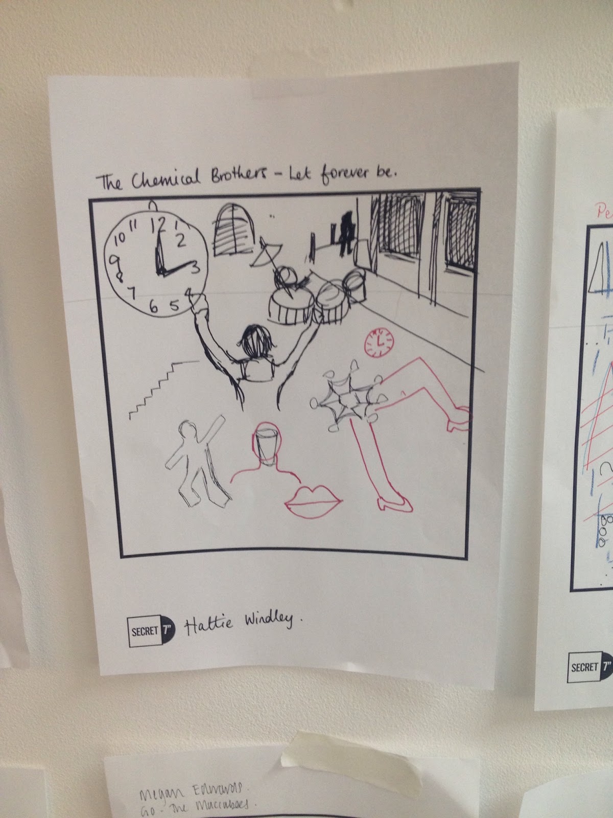
After listening to all the songs, two of them really stand out to me which was The Maccabees - Go and St. Vincent - Digital Witness. When I listened them I had the most vivid ideas especially for "Digital Witness". I think that I will do some thumbnail sketches for both and then decide which one to do based on which designs I prefer. 


http://www.coolhunting.com/culture/secret-7-auction

http://www.secret-7.com/artists.html


These are some examples from a previous year and you can see that they are all really varied interpretations. I like the more illustrative pieces but then again one of the judges this year is Monotype so they may prefer typographic pieces. 

I then went to look at some of the famous designers and illustrator that have entered in previous years. 

Leif Podhajsky


Leif Podhajky's album artwork tends to create his imagery by reflecting an image on itself. The reflection abstracts the piece and makes it seem as if the sea is creating a vortex that could suck you in.  The colours have also been changed slightly - giving the blue a more greenish hue and the sea foam a yellow tinge. It makes the record feel old and used, maybe making it feel like an old friend that you can keep going back to. 

Gilly Rochester and Jules Julien 

http://www.gillyrochester.com/2014/05/secret-7-2014-entry-2-jake-buggs.html

http://www.creativebloq.com/computer-arts/secret-7-2014-meet-designers-behind-sleeves-51411545


I find it so interesting the different interpretations that people have, the examples above were both for Jake Bugg - Strange Creatures. Yet they couldn't look more different. It just shows that there is a wide range of techniques that you can use and a wide range of interpretations too. I much prefer the simplicity of the second piece by Jules Julien as it feels clean with its two toned colour palette and very minimalistic. When talking about his work he said he was inspired to create "A hand, that could be his hand, with the tip of fingers dark. It's as if, playing the guitar for Strange Creatures, Jake Bugg got his fingers dirty."

Hey Studio 

http://heystudio.es/

Though Hey studio has not entered secret 7 that I know of I wanted to look at some of their illustrations because I would like to create a more illustrative piece for my record sleeves. I really like the simplicity of shapes that they have used for their characters, they aren't overcomplicated or detailed but you can still see who the characters are meant to be. The use of the stark white background makes the colours pop out of the page, making them seem bolder and brighter. Additionally the fact that these illustrations are purely vector makes them seem cleaner and more effective than a sketch or an illustration in a traditional media would. 

Neil Stevens

http://designaemporter.tumblr.com/post/34040550841/yluk-a-new-series-of-vinyl-record-cover-designs

I found these designs by Neil Stevens and they really appeal to me, especially the second one with the typography in it. I was originally thinking of doing all my designs quite illustrative but finding these designs has made me think I should create some typographic pieces as well. I love the use of the red and blue together it reminds me of the anaglyph effect made for old 3D films. I think I will definitely try to use the effect shown in the bottom sleeve. 
Huw Gwilliam


http://www.booooooom.com/2009/06/11/classic-records-as-penguin-books/
https://www.flickr.com/photos/littlepixel/sets/72157594269138651/

Huw Gwilliam redesigned some of the classic record sleeves to mimic that of the classic penguin book designs. Although for the secret 7 covers we cannot include the name of the artist or the song I still love the imagery and how worn the records are, it makes them seem loved and well used. Maybe instead of having a completely clean graphic for some I could use some sort of texture or pattern to add to it so it doesn't look stark and lifeless. A record sleeve design should have personality and have a soul.

OUGD406 - Studio Brief 1 - Mark Making Task

We went into the seminar room and listened to each of the songs for secret 7. Then we got pieces of paper and had to interpret the songs in different ways as we passed the sheets round to different people. The results were interesting to say the least! My favourite by far is what was created for the Maccabees - Go as I really like the geometric interpretation of the song. Maybe I will try and use geometry in one of my designs.

1. Continuous line 
2. Shakey hand
3. Opposite to writing hand
4. Eyes closed
5. A pen in each hand

1. Draw what you see in the music video


1. Draw only circles
2. Draw only squares
3. Draw only Triangles
4. Draw straight lines
5. Draw dotted lines 


1. Quiet music = draw small, loud music = draw big
2. Draw what we heard in the lyrics


1. Typographic interpretation of the lyrics


1. Use no ink, use back of pen/pencil to make marks
2. Make marks with folds.

1. Pen still, move the paper to draw in pairs
2. Swap roles

OUGD406 - Studio Brief 1 - SECRET 7"

SECRET 7"


Secret 7” is an annual event that combines music and art for a good cause. This year the charity for which they are raising money for Nordoff Robbins, who are dedicated to transforming live of vulnerable children and adults through music therapy. 

About the competition
We take 7 tracks from 7 of the best-known musicians around and press each one 100 times to 7” vinyl. We then invite creatives from around the world to interpret the tracks in their own style for every 7”. 700 sleeves are exhibited and then sold for £50 apiece. You don't know who created the sleeve, or even which song it's for, until you have parted with your cash - the secret lies within.