Sunday, 8 February 2015

OUGD406 - Studio Brief 1 - Finals

FINALS
I couldn't choose between two of my pieces because I felt like one has a stronger message however the other is a more subtle interpretation from my own opinion so I chose both.


This piece is inspired by the novel '1984' by George Orwell as the song "Digital Witness" reminded me of a dystopian era that is controlled and watched by digital media. I used colours inspired by St.Vincent's music video, but toning it down slightly. I also chose the yellow to create an eerily welcoming effect - you wouldn't associate CCTV cameras with being welcoming.  


For this piece I was simply inspired by the lyrics "People turn the TV on, it looks just like a window". I imagined a world full of people being brainwashed by television and digital media. Immediately I linked this to children as they are arguably gullible and impressionable. This little boy is being brainwashed by the television, in a dark room, so much so that he cannot take his eyes off the hypnotic screen. I wanted him to look slightly longingly at the television as if indeed he was staring out of a window while being shut inside.


I submitted both of these designs along with some of my others and some variations too to increase my chances of getting at least one of my pieces picked. 


OUGD406 - Studio brief 1 - Interim Crit

For the interim crit we had to write down some questions that we wanted answering about our designs and then they could be answered when people came to review your work. At first I was unsure what questions to write as I had already had some of my work critiqued by the second years, but I had made a new design since then so I asked some things about that. 


My questions were:
1. Is the media that I have used relevant? Why?
2. Which song do you think has been interpreted? Why?
3. Which design is your favourite? Why?
4. Do you think my font choice is relevant in the typographic peice? If no which typeface would you use + why?
5. Which design portrays the strongest message? Again why?
6. Do you prefer the more detailed vectors or the simpler ones?


Most people said that the media was very relevant because it relates to the song "Digital Witness" so it is suitable that all my designs are digital. However some people thought that I could consider other ideas and even try using a traditional media like screen printing for the less digital designs. For example on the robot/St. Vincent design it was suggested to try screen printing for the human side and juxtapose it against the illustrator robot side. I quite like this idea so if I want to submit it to the secret 7 I may take it further. 

Almost everyone guessed which song it was because I had used images of her as well as technological feel to my designs and the use of lyrics. Someone said that maybe the links to the songs were too direct in some of the songs and not subtle enough.

Favourite Tally:
1 = 1
2 = 2
3 = 2
4 = 1
5 = 1
6 = 0
7 = 2
8 = 1
9 = 1
10 = 0
11 = 3
12 = 0
13 = 2
14 = 0

The most favourited was number 11 - the CCTV camera with the Yellow background as people said that it had a gentle and delicate aesthetic with the use of thin lines and a warm welcoming background yet it represented something quite sinister. Another person said that it was the best because it had a subtle link to the song and some of my other designs may have been seen as too obvious. 

For the font choice most agreed as they said it was geometric and slightly futuristic, but if I had shown them other font choices for comparison it would have been easier to decide. I was worrying that this choice was too bold, but after getting this feedback I think I will keep it how it is. 

Pretty much all the people who answered the questions said that number 7 had the strongest message (the boy with the TV).

The detail vs simple vectors answers were very mixed in opinions. Some people liked the cctv outlined images however other preferred my other designs. I think I will submit two designs because of this as I thought this would help me decide what design to submit but it hasn't!

Friday, 6 February 2015

OUGD406 - Studio Brief 1 - CCTV camera

I drew out another one of my thumbnails based on a CCTV camera. I thought that this was the perfect object to use to show the world that we live in - that we are so unaware that we are constantly being watched, reminding me of George Orwell's novel "1984". I just used simple outlines to emphasise the slightly intimidating form of the camera. 


I added some more details and shading to the camera to make it look a bit more 3D and give it some depth so it would look like it was facing out from the wall.  I also played around with the colour of the backgrounds to see if I could find a colour that complimented the navy blue of the outlines. I really like this beige yellow, it sort of reminds me of the colour of an old concrete or sand-washed wall, which is probably where you would find a CCTV camera.


After receiving feedback for my final design it was said that I should play around with the composition of the piece. So I decided to try and make the CCTV camera look as if it is facing down and looking at the viewing, a voyeur constantly watching, constantly waiting for something to happen. By placing it an a corner it emphasises how unwanted CCTV cameras usually are - putting it where not many people can see it. I think that I will submit both this composition and the big one as I believe the message of both of them are very strong and portrays what I was trying to say well.


Thursday, 5 February 2015

OUGD406 - Studio brief 1 - Robo/Vincent Development


I tried to add a gradient to the robot side of her face to make her look more metallic but something still seems off. I changed her ear into an antennae as robots probably wouldn't need ears. I also removed her nose which I think makes her look a lot more mechanical. 


I decided to remove most of the human elements in the robot side of the face so instead of having the almond shaped eyes I just used the illusion as her eye. I think that this works really well as it portrays the message really well of brainwashing. I then adjusted some of the gradients again to add more depth. Now I should decide on what I am doing with the background. 

OUGD406 - Studio Brief 1 - TV girl development

After the critique I started to play around with the shading on the TV girl to add more depth. I used gradients to try and make her look more 3D and real and also reduced the size of the TV on her head. Additionally, I added more detail to her dress, adding a pocket, a collar and some stitching detail. I think this lilac colour definitely works better than the white dress. 


I tried changing the colour registration lines in the TV to a more disrupted signal design. I'm not sure whether this works better or not - it does provide a bit of a sinister feel to the design as everything else is bright colours where as the TV is dark and menacing. 

Finally I just changed the shading of the dress to a more appropriate gradient. I will wait to edit this until I have my interim critique.

Wednesday, 4 February 2015

OUGD406 - Studio Brief 1 - Little boy development

Brainwashed boy


I used this image as a reference because it perfectly shows the lighting that I was trying to produce - just lit from the television screen. 

Concept Sketch.


I did an initial sketch of the boy from the image, I thought that I could use this as a base for the more inky style that Dave McKean uses. I feel like I haven't got the right expression across here though - he looks bored rather than hypnotised by the television. But I thought that this could be sorted out when I inked the drawing up. 


I tried to mimic McKean's style, but of course I couldn't get all the nuances into the design that I wanted to and it started to look less serious because it lost detail and looked like a cartoon. I also couldn't manage to fix that bored expression on his face! If anything he looks more bored here. So I decided I would go back to basics and use image manipulation instead.


So, deciding on a digital interpretation I thought that I may as well use the same image. I made it black and white to add more contrast and then played about with posterising to further up the contrast for drama. This was Level 3 which I chose in the end because it had just the right amount of detail 


I then removed the boy and erased a bit of him with a soft eraser brush to make it look like he is in a dark room, the areas I have kept will be in the beam of light from the television. I thought this would create a moodier tone, instead of a playful one.


So against the dark background he appears from the darkness and doesn't stand out too much. 


I then added in the beam of light and I think it really makes the image pop because it points the viewers direction of the two main elements of the story - from the boy to the tv and vice versa. 


I then thought the use of black and white was too harsh, so I changed it to a navy blue as blue has a calming effect, luring the viewer in suggesting that the brainwashing that the boy is receiving could be rather enticing.


Finally I went back to Illustrator and created a vector of it. I lost some detail in the vector making process but I think that it adds to the anonymity of the piece - this little boy could be anyone. I also made the shine from the screen lighter and added the illusion to the screen to further emphasise my message of brainwashing. 

OUGD406 - Studio Brief 1 - Digital Development

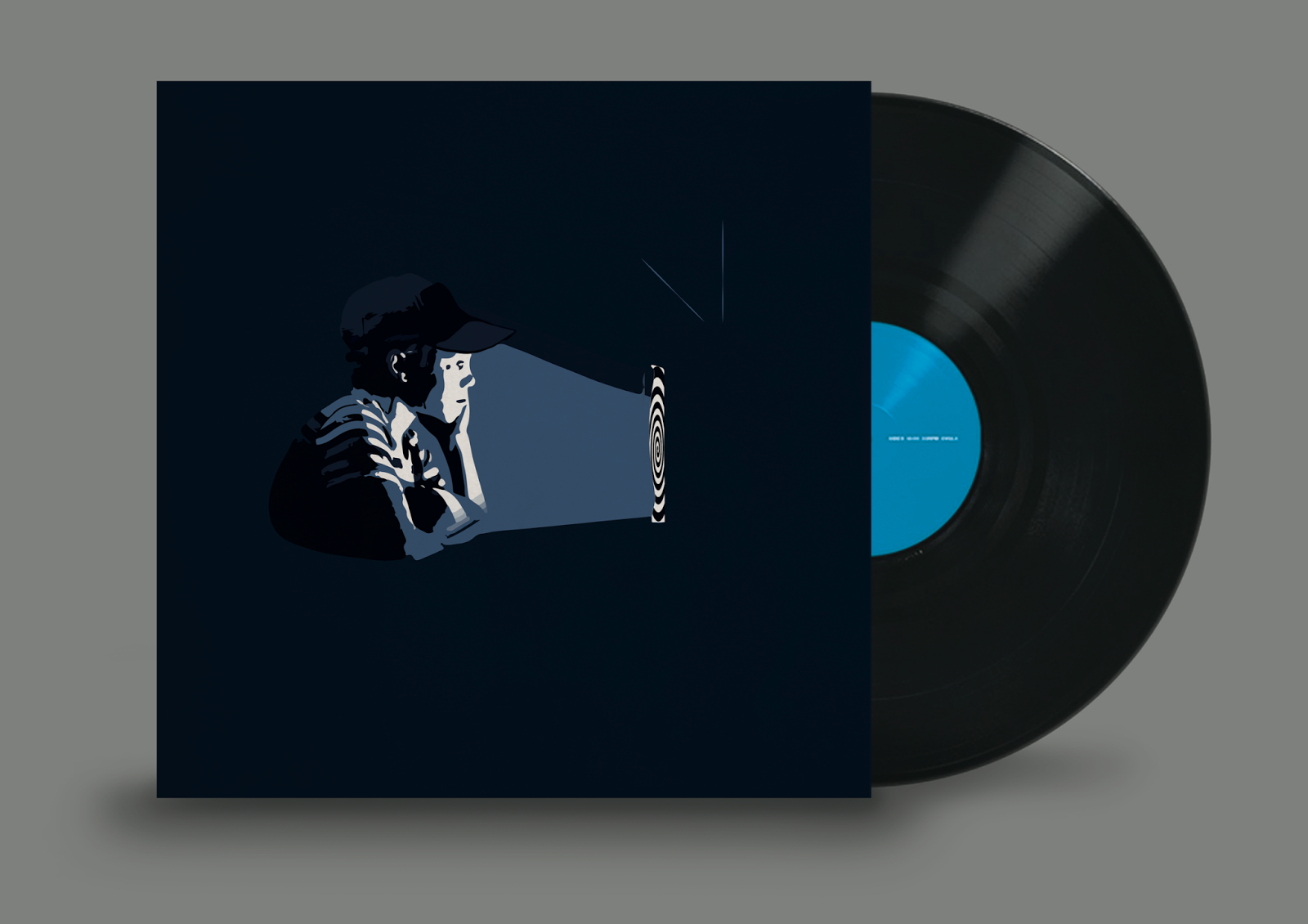
I want all of your mind


After researching Neil Stevens I was very much inspired to improve my typographic piece, taking influence from the anaglyph colour scheme. I started out by trying to create drop shadows from the type and tapering it off to random points. However it didn't end up looking 3D, but it did create some interesting geometry which I really like. It makes the piece look really dynamic. But the font choice here still isn't right. Even though this typeface is quite futuristic because of its unconventional juxtaposition of lines it just isn't bold enough.


So next I tried a big bold typeface but still trying to stick to my futuristic theme. I think that this typeface definitely adds to the dystopian vibe, because it is bold and overpowering. However I don't like the tail on the R as it reminds me slightly of the Star Wars font.


Next I tried a bold, geometric font which I think is exactly what I was looking for. It's not too overpowering but is still easily readable over the bold colours. It also resembles one of the typefaces used on a '1984' poster:


Then like in Stevens design I decided to add some circles to fill a bit of the white space. I used the scribble effect to make some of the circles into zig zag patterns. I think it adds to the energy of the piece making it look like the type is trying to jump off the page. 


I added some more scribbles and circles to fill a bit more space and I thought I should leave it at this stage as I didn't want to overwork it. If I added any more to it I think it would be too crowded and lose the empty space. But I do think that I could try and play around with the anaglyph further by overlapping the different colours to make new shapes and colours. 

Here I used the multiply tool on photoshop to see what they would look like if they overlapped when using more traditional print methods like in screenprints or monoprints. I'm not sure which I prefer now - I like the crisp, clean colours of it without multiply but then again this creates more depth. 
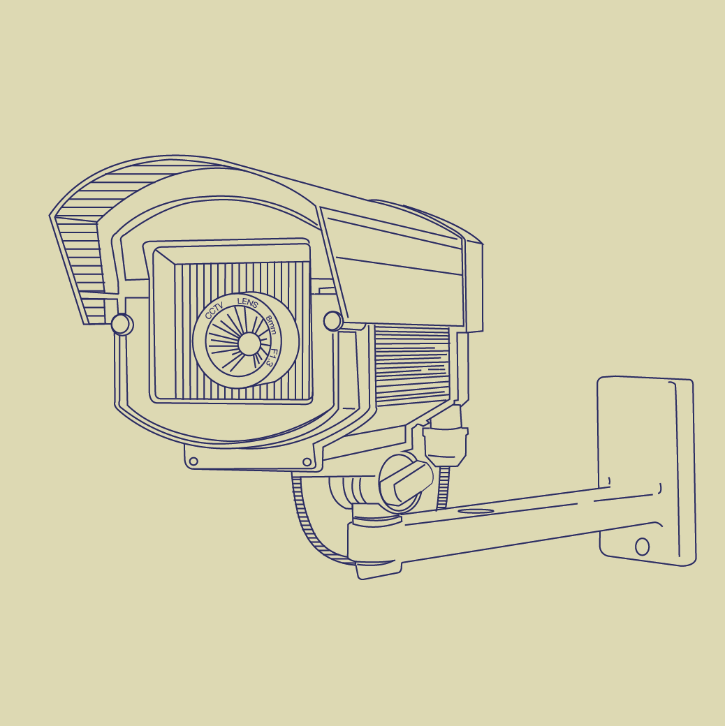
Robots!

After looking at my robot again I thought the grey I had used made it lack personality. So I decided to sample the teal from St Vincent's video and use it for my robot. I think it definitely works a lot better as it compliments and contrasts the red of the antennae. Also, I changed his mouth to have a sound wave on it instead of teeth as it makes him look as if he is speaking. (Maybe he is saying "Exterminate!") 
I made some more slight adjustments - I decided that I liked the contrast of the red foot cups as the robot is framed at the top and bottom with red making it a more cohesive colour scheme. Additionally, I reduced the size of the button on his head to make his antennae more prominent as they would be the instruments of mass brainwashing.


After going to the critique in the second year's studio they said that I should play with the repeating the robot in a pattern to represent the repetitive nature of television. I started out with a simple tiling effect which sort of looks like they are lined up in formation of an army, ready to attack. 


I tried to mix it up a bit by doing alternated inverted rows. I think this also works really well because the red foot cups of the robots create lines that your eyes are drawn to. Next I think I will try and make a human crowd with robots hidden in it, however I think that this will be time consuming.