
Thursday, 15 January 2015
Wednesday, 14 January 2015
OUGD405 - Studio Brief 3 - Mock ups


Initially I tried some cut out designs for the front cover, I really like the way that the design shows through with little splashes of colour. But I think the black colour is too harsh for the front cover even though it provides a nice contrast to the colours. I planned to use either acetate or tracing paper for a cover sheet with the title in so I shall try that instead.


I am really pleased with how the tracing paper works over my watercolour design. It worked much better than I thought it would, creating this cloudy feel over the design.


The only problem I had with this mock up was that I forgot to print blank pages, so the word page printed out on two separate pages instead of a double spread. Of course this will be fixed once I put my illustrations into the design.


OUGD405 - Studio Brief 4 - Development


At first I tried mocking up one of my more illustrative designs from my thumbnail sketches. I liked the idea of using tea cups and ribbon as it gives a very twee vibe that may appeal to a young market. I tried to play around with the colours of the background and the ribbon to make it look as bold as possible. And I liked the blue background the most so I stuck with it. On my final design I added a pattern made out of my bird illustrations which at first I thought would work really well but now I think that it just gets lost and looks way too busy. In the end I decided that I shouldn’t move ahead any further with this design as it doesn’t feel like a packaging design, even though I tried to make it look like Clipper’s packaging. I feel like it could work as a poster to promote the new tea, but there isn’t enough in the design to advertise what the product is about.
If I had more time on this brief I would develop this design further and possibly make a poster or billboard design to advertise the product. I feel like it would need a lot of advertisements as it is a unique product that hasn’t been done before so the message would need to be spread.


I decided that I could still use the vintage label but add it onto a background of the colour relating to the flavour of tea. Also, I decided that all the designs would be the same for the different flavours a part from the colours so I focused on the Green Tea packaging first and then I could apply the different colours and names after I finished this label.
I started to illustrate the label a bit more by adding a tea cup illustration that I drew on Photoshop and vectorised. The indents in the rectangle fit these tea cups really well and it frames the label nicely. But I still think that there is not enough room for information on the label.

So next I extended the rectangular box. I also found a hand drawn looking font on font fabric called Sunday, which I think suits the overall quirky hand made aesthetic really well. It reminds me of the font that was used for the Clipper packaging. The bigger label also meant I could make the flavour of the tea stand out more, so I tried having small lines to frame it from the top and the bottom and to emphasise it even more. Additionally I added curly brackets along either side to add more interest, I think the shape of these brackets work but I might try and illustrate them with the pen tool instead so I’m not just bracketing my label.


At this stage, I had looked back at my research and saw the tin designs again and decided to try and do some small illustrations around the label like they used. I included some of my ‘tea bird’ illustrations which adds to my twee look. I also incorporated tea leaves in a simple form with some curved lines where the brackets were. I think that this border works really well as it contrasts against the very plan box, adding ornateness and making the product seem a bit more luxurious. Instead of having the size of the bottle on its own at the bottom of the label I decided to frame it in a ribbon. I think this once again adds to the quality look of this product as I certainly don’t want it to look ordinary, because it is unique.


After filling the outside of the piece with illustrations, the bottom felt empty so I used another vector graphic of a teapot to tie together the leaves and the tea cups as if there is a full tea set on the page, ready for the tea to be brewed. I also added a small catch line that I had used on my initial ideas. I feel like it gets across that the syrup is fresh and not processed as I am trying to appeal to the younger generation as I feel they are more impatient perhaps than the older generation is. Also you may notice that I changed the colour of the label from an off white to a bright white. This is because I decided that I would be printed on an off white stock so I wouldn’t want it to come across as too dark.


Finally I felt like there was a lot of empty space in the label so I thought I should do some more illustrations. This time I was inspired by the Clipper illustrations which are very simple and straight forward. I struggled coming up for an illustration for green tea (a part from obviously the leaves) so I decided to change the flavour to green tea with lemon as in my research many people had green tea with lemon or honey and hardly ever on its own. I sketched out a simple outline, scanned it in and vectorised it in illustrator. I also added one colour to compliment the colour scheme and misaligned it a little to add a hand printed feel. It makes it look as if more effort has been put into it. Also, I added syrup to the ribbon with the size of the bottle, very small mind you, but I didn’t want to confuse people thinking it was tea leaves or bags. Now I just need to alter this base design for my 2 other flavours.
Tuesday, 13 January 2015
OUGD404 - Studio Brief 2 - Design Principles - Book Folding (Study task 2)

We were given sheets of A4 paper and asked to come up with as many ways of making a booklet simply by folding paper that we could. I decided to start of at a similar stand point by folding the paper in half, then in half again and in half again. This results with 8 rectangles on the sheet.
I have had a brief lesson on book making before so I already knew two books - the trouser leg book and the 'hot dog' book (unsure of the real name of this style of book).


Looking back at my pictures and searching the internet I realised that I have done the trouser fold wrong! It is supposed to have a lot more pages than this, and fold out to look something like the image below. But I believe this is still a creative way of creating a book, as it can fold away neatly and provides room for lots of information with the drop down panels.


(How a trouser fold book is supposed to look like.)

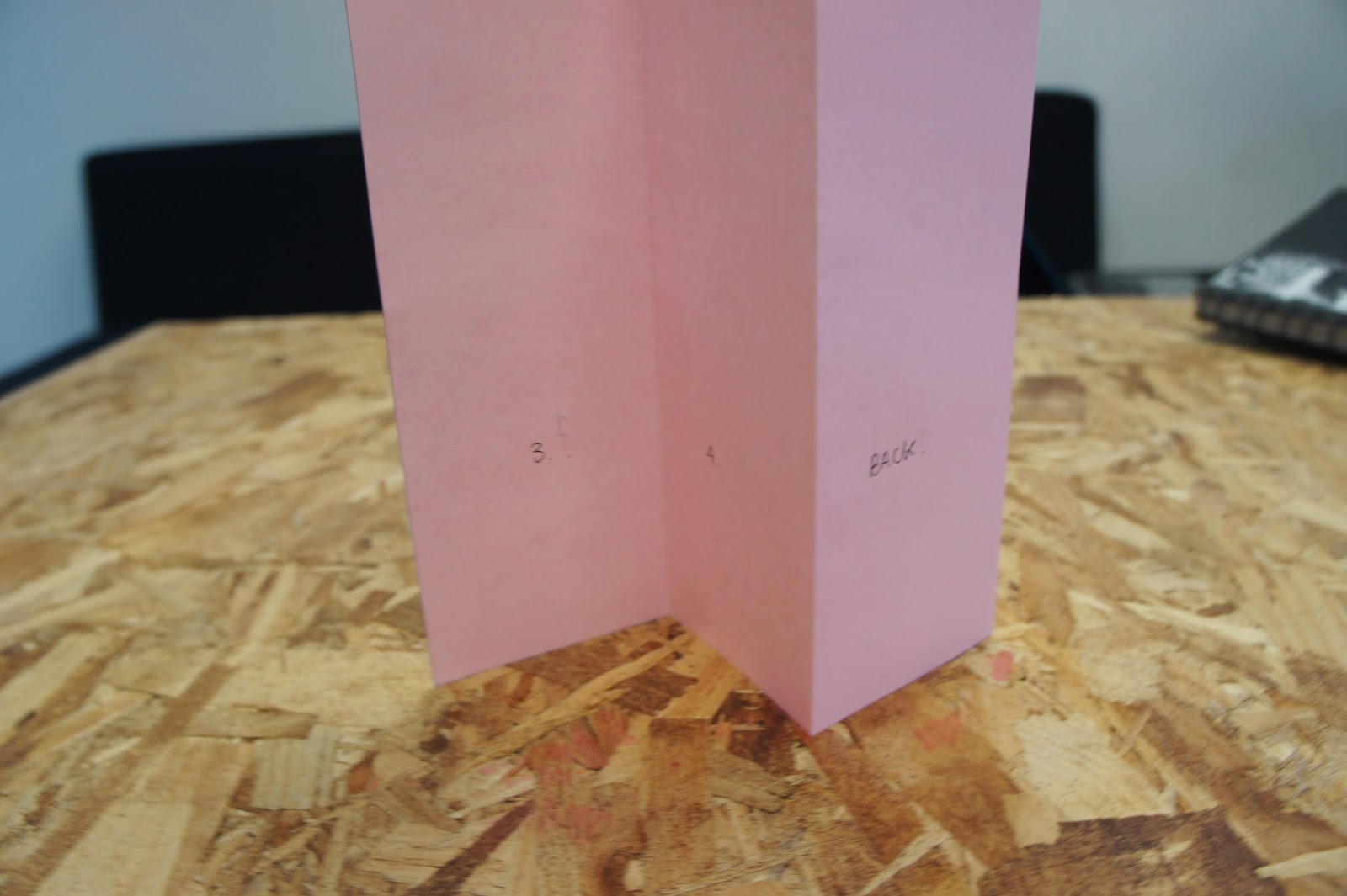
The other one I knew was this one. Which is known as many things like the hot dog fold book and I knew it as a beak book. It's layout is simple yet effective and provides 8 pages (including front and back).

These were my final mock ups of the best of the different folds that our group had created.


My favourite is definitely this one, but after finding how to do it properly I think I will use that method as it has double the amount of pages as this method.


This one turned out more like a leaflet fold, it was inspired by a font specimen that I brought in for the "what is a book" task. I used the front page cut in half to hold it all together by folding back on itself. Because of its long pages you probably could fit a lot of information into this book, and it could also fold out to create a poster like used on the font specimen.
Subscribe to:
Posts (Atom)