Tuesday 29 September 2015

OUGD504 - Studio Brief 1 - Leaflet Folds


This was the first leaflet fold that I tried out. It's a fairly simple concertina fold but I chopped bits out of the individual columns so that when it folded up it would look more interesting. Folded up it almost looks like a plait but when unravelled it reminds me of a cityscape. It would probably be relatively easy to develop commercially but a new cutter would need to be made. 


Again I experimented with cutting into a fairly simple leaflet fold for a dramatic effect. I think with this one I cut too much off. It looks like someone has just gone at it with scissors with no purpose at all. Not what I was going for what so ever. The space that is left for designing on is very limited due to the cuts so I definitely will not pursue this fold any further.


I then moved away from rectangular leaflets and tried to create different shapes. I cut my paper into a square so I could create more angular shapes. I quite liked the idea of a triangular leaflet so I folded the square into a sort of gate fold. However the bottom flap just seems pointless and sticks out stopping the leaflet from folding flat. If this leaflet was to be made in a commercial printers they would probably have to create a custom cutter and fold plate so it wouldn't be very economically viable. 


Another square fold that I created was this one which works quite well while remaining pretty simple. I like the way how you can fold it out flat. I could incorporate the triangle flaps into the design, making it more geometric. I don't feel like I could fit much information into this format though, because I would end up putting all the important information on the middle and not distributing it much else where. 


Next I tried to experiment a bit with the scale of leaflets. I thought it would be more interesting to have a larger leaflet than a little one as you could fold it out and use it as a poster. I tried with an A2 concertina folding it 6 times but it ended up being too long and thin. I would much prefer something less thin at this scale. It would work if I wanted to separate all the design process into stages and have each on one fold. 


Next I tried cutting the A2 paper in half lengthways and it seemed to work a lot better. I also did less folds for the concertina so there was more space for information within the folds. I like the way that it can stand up. Perhaps I could have one side that stands up with a title on and all the information on the other side. I think this is the most simple fold but it would be the best logistically and commercially if used.

OUGD504 - Studio Brief 1 - Leaflet research


With this leaflet I found it really interesting how it all folds out into a long strip. It would be good for doing a timeline of sorts for the design process, but I feel like it would leave a lot of blank space. I do think that it looks very neat when folded up though and it might attract people to look at it because of that. The design of the leaflet itself uses shapes created within the folds to make it look 3 dimensional. Also the use of more photographs than text makes for a more striking design. However I don't feel like this sort of design would suit for a design process because it feels like it is the wrong format being too complex. It definitely couldn't be easily produced on a large scale.


I love the vibrancy of this leaflet. I feel that from the research I have found that to create a successful, eye catching leaflet you don't necessarily need a different or fancy fold, you just have to have a good colour scheme and an interesting design. The front cover in particular really stands out to me as it uses as much of the space as possible, even squeezing text into the counters and apertures of the letters. It reminds me of Paula Scher's more typographic pieces where text is used to swarm the page. I also feel like the hand-drawn design reflects the fact that it is for a council that promotes the use of arts and their art programmes. This kind of informed design is what I would like to produce.


This leaflet is so playful in both the colour and illustrations that it inspires me to try a more playful design for my design process. The double sided concertina is not a fold that I had thought of as I ruled it out as being too simple, but using it in a portrait fashion like this design makes it suit a design process chart a lot more than a landscape leaflet in my opinion. Additionally, the colours used in this feel like they are suited to young adults maybe 20-30 showing that it has a specific target audience. 

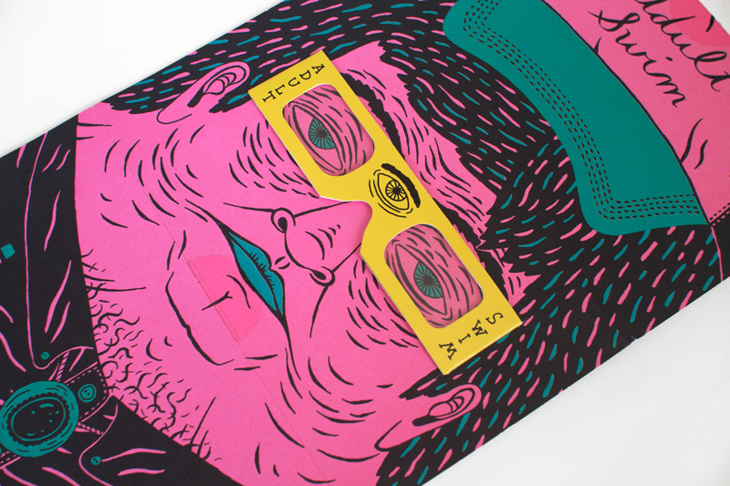
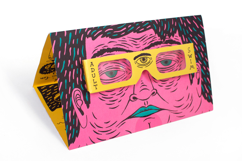
I had an idea to use glasses like in this design, but using coloured lenses so it has two separate processes - maybe a professional and unprofessional version of my design process. I think that this would only work on larger scales so I might create it in an A3 size. I think that I might direct my own design at Graphic Design students to show the good and the bad sides of a design process as sort of a educational leaflet. I really like this idea because it is interactive and means that people have to really get involved with my piece rather than just glancing at it.  


So I looked more into anaglyph designs and looked at the definition of anaglyph:
ANAGLYPH: a stereoscopic photograph with the two images superimposed and printed in different colours, usually red and green, producing a stereo effect when viewed with appropriate filters over each eye.


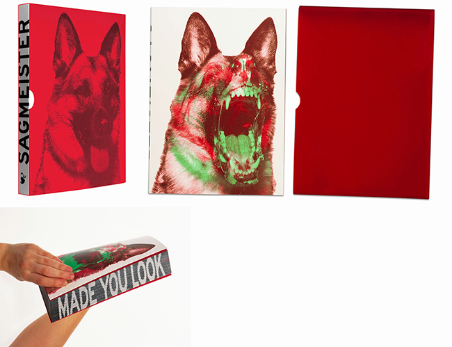
I found this design on Behance of a similar project using anaglyph glasses where a story can only be read wearing the glasses. I love the simplicity of the layout in this one and how the design is all based around the concept. 

OUGD504 - Studio Brief 1 - Initial Ideas

After deciding on a simple concertina fold I went on to thinking about layouts. At first I was thinking of very simple designs that would reflect the fact that it is an informative leaflet so I wanted to make the priority legibility and readability of the information. I also played with the idea of using a flow chart taking the reader through steps where they can answer yes or no in order to perfect their design process. Then I thought of having my own personal design process and illustrating it myself along with my handwriting and having a jest about the process and making it a fun read. Tying to this I thought I could compare my design process with a professional design process as a sort of learning experience comparing and contrasting between the two. Or perhaps it could demonstrate that you don't have to go into such detail for a successful design process.


I was very inspired by the Adult Swim leaflet from my research and took the idea of comparing my own design process with a professional one with the use of anaglyph glasses. So you could only see one process through one pair of glasses and the other through the other pair of glasses. This idea of an interactive leaflet is much more appealing than a simple illustrated one. I will definitely be taking this concept forward. 


Monday 28 September 2015

OUGD504 - Studio Brief 1 - The Design Process

After the initial briefing I decided the best form of research on general design processes would be a book on the matter. So I found "Managing the Design Process - Implementing Design".


It goes into great depth about the design process as well as detail into each stage of the process. In the introduction there is a quote which I think resonates for all designers.

"Great graphic design doesn't happen by magic or in a vacuum. It is the result of intricately orchestrated collaboration between a designer and his or her client."


This is the detailed overview of a typical design process. Going from project creation to project completion. I found this really helpful because it uses both the client's and the designer's perspectives outlining what each of them do in each stage. 

It also outlines the constraints of a design process in the book, which are as follows:
- Communication:
Timely and effective communication and sharing knowledge throughout the process is necessary for a good design project. Otherwise any miscommunication can sabotage the design.
- Scope of work:
Larger projects may require repetition of certain phases, while smaller projects with less complexity can combine steps. 
- Timing:
Compressed schedules mean shortened phases and skipped details. Longer time frames allow for more detailed and extensive work in each of the phases.
- Budget:
Less money means less work. Large budgets accommodate more work through more lengthy and involved procedures.
- Delivery media
The choice of delivery media can mean more (or less) extensive collaboration with other types of collaborators and therefore can affect the process

Taking all this into consideration I realised how simplistic my own design process is (see below) and how many steps I could potentially be missing out on. Especially on the professional side of things. My own idea of a design process is very narrow and specific to the way how I have learnt to design within college. 


Our next task was to collaborate with the rest of the table to create a more comprehensive design process as well as creating a more visual representation. 


We combined all the stages and key words that we thought were most important for the design process. Evaluation, questions, communication and concept were the most important factors for a successful design process as these are all ongoing within a design. Things like research, context and mind maps only need to really been done once or twice throughout the process. 

Upon finding all the stages of a successful design process we wanted to come up with a very simplified visual representation that anyone, not just in the design industry, could understand and follow. So we came up with the idea that a design process is a bit like baking a good cake. You've got to test it over and over to get things right as well as experimenting with different ingredients and recipes until you find the right one that pleases the client. 

So, we set up the process into different stages and figured out what stages of baking would correspond with each process stage.


Finally, we each illustrated the stages to make an engaging yet fun design process. I was very pleased with the outcome however I feel the only thing that it was lacking was a bit of finesse and more detail on what goes on during each stage of the process. For example we could have expanded a lot more on things like development and refinement where we could have talked about discussions with the client or feedback from peers. Also I think we missed out a stage where you sketch ideas and create mind maps.


Book Reference:
Stone, Terry Lee. Managing The Design Process. Beverly, Mass.: Rockport Publishers, 2010. Print.