Showing posts with label studio brief 3. Show all posts

Saturday, 14 November 2015

OUGD504 - Studio Brief 3 - Final Book & Evaluation


During the production of my final book everything seemed to go wrong. With my other mock ups I trimmed each page individually and by hand within the crop marks before I bound them. However with the final I tried to use the guillotine so that I could crop all of the pages at once. This didn't work out at all and ended up misaligning the tracing paper pages with the photos so they no longer lined up. This was incredibly annoying as it meant I had to line up and trim each set of photos and letters down in pairs. This was very time consuming and meant that my final book was a tiny bit smaller than I expected. Also with the final binding of the book I did more stitches because my mock up stitches came a bit loose. Also due to my struggle last time I tied the stitch on the outside and it ended up being a lot tighter which I am happy about. Overall I am really pleased with the final book despite all the difficulties I had while trimming and binding it. 

Generally through out this brief I found book layout quite difficult as I found it hard to develop designs further without coming up with new layouts. However I was overall happy with the results - I like the minimal approach I chose, it pushes me away from my usual style but I think this is good for me. I did struggle with creating the final product due to the misalignment of the tracing paper and the images after I cropped them all in one stack instead of individually. I found the binding method and the actual book binding itself fun to do as I enjoyed the hands on approach - perhaps I can experiment with this to further push my practice. I struggled with blogging in this brief as I was spending a lot of my time doing experiments or trying to get on with the other modules. I used this studio brief to experiment with methods that I have not used before such as  the binding method - I had never attempted a Japanese Stab bind and now I am very confident doing one. I wanted to experiment with foiling too and I managed to test lots of different foils even though the results were rather disappointing it is something that I might pursue in future projects.
I also further pursued my interest in screen printing which I enjoyed a lot. it was good to give myself more of a challenge by doing the cover really small so I had to work on my placement and alignment skills of screen printing. 

Wednesday, 11 November 2015

OUGD504 - Studio Brief 3 - Final Crit

In my final critique I hadn't finished the book yet but I brought my mock up with me as well as the printed pages for my final. My peers said that they liked the Japanese stab binding because it gave the book an added tactile-ness. One thing that was bugging me with my print out was that some of the images where I have added the filter to make the images look like they were taken with a 3mm camera were a bit unclear. I asked the others if they thought so too and they agreed but they said that they liked the effect over all. 

They also commented that the tracing paper gives the book a really nice effect, they said they liked the way that the image and letterforms could be combined and separated with it. Although it does mean that for some of the letter forms you have to line up the tracing paper and the photographs. It was suggested to me to look at www.beccamakingfaces.com to look at more experimental Japanese binds. However I feel like this would take away from the minimalism of the book so far. Also because I had handed round my printed copy that wasn't bound yet I got a bit of feedback on the stock choice. They preferred the stock used on my mock up - it was thinner so that the book could be flicked through. This thicker stock choice would make turning pages difficult - perhaps I could trim the tracing paper inlays down so they can be looked at separately. Or alternatively print on a thinner stock.

OUGD504 - Studio Brief 3 - Production

Below are images of my full mock up with screen printed cover and full colour photographs. The production process was fairly simple for this binding method as I didn't need to worry about pagination. Also the fact that my book's pages were single sided made this even easier. 


The actual binding process was a bit of a pain using the cartridge paper. The last stitch of Japanese binding has to split through the middle of the book and tie off there but I really struggled doing this and found it difficult to put the needle back through the middle. I think for my final bind I will tie it off on the outside as the result of the tying off in the inside loosened my bind. 


The over all alignment on this was really successful - I was worrying that it would go out of place when binding it. 


Also I found the two colour screen print on the front cover really effective at giving the title that 3D look. I am disappointed that I couldn't foil the highlights because of the methods that I wanted to use. But I feel that the white is more subtle - the holographic foiling might have ended up looking really tacky and bringing the quality finish down a bit.

If I were to produce this book commercially it would be quite difficult if I wanted to do a large print run as the only way to do this bind is by hand - there is no machinery that can create it. So this would definitely put the prices up to produce as well as the time scale being a lot longer. Also having a two colour screen printed cover would make it an even more bespoke product and once again make it more expensive to produce. However I think that this adds to the journal concept that I was going for because of how bespoke it is. I know that it is unique and hard to reproduce. 


Monday, 9 November 2015

OUGD504 - Studio Brief 3 - Further Development

This was my first full mock up of the book with my chosen binding method. I also printed it with the tracing paper sections too to see if they would line up properly. The end result was surprisingly effective. After moving over the gutter from the last mock up I thought that there would be problems with the layout that I would need to adjust. However the images seem to be perfectly central so I am pleased with the layout. I also changed the title to be a lot smaller, while also shifting it to the right. I much prefer this size.


After printing this out and binding it, it seems like the finished product. I am pleased with the minimal layout I had chosen and I feel that it works really well for the context of my book. I do feel like it is more personal as well by highlighting the shapes of the letterforms instead of just having them on the other page. I think that this will be my final layout, all I need to do now is get feedback and see if my peers agree. 

Thursday, 5 November 2015

OUGD504 - Studio Brief 3 - Cover Development

I wanted to find a font that represented the freedom and the spirit of the festival to use as my title case within the publication. At first I was going to use a very simple sans serif font to appeal to a younger target audience by making the publication look contemporary. However I feel this would not show the character of a festival so I decided to find something more suitable to the context. 


I started by experimenting with a couple of font choices that I felt looked "festival like". Big, bold and powerful representing the big personalities festivals have. However with the first font choice it reminds me of a varsity sort of font and this doesn't really relate to festival type at all. And with the other type it almost looks like a western style font. 


I found this font called "Industry" which reminded me of the 3D type that was used at the festival. Also gives a quality to the type that makes it more dynamic and look like it is jumping out of the page. I played around with arcs and using the curves of a circle to be more visually pleasing and came up with this simple composition which I think works very well. The hierarchy of the type means that the main focus is on the festival, emphasising the fun and experience of the festival and the type comes after it, which represents my experience of the festival.


I played around with creating more depth by using the drop shadow version of the font to further enhance the emphasis on the festival. I also thought to personalise it a bit more that I would add the year of the festival as a kind of point of reference to look back on in the future further supporting my concept of using it like a photo album or travel journal. 


I finished off the design by adding highlights to the other text so that they didn't fall too much into the background of the image. 


Once I decided what I wanted to do for my title I experimented on how I could make it really stand out from the flat cover. I have never tried foiling before and it was something that I really wanted to experiment with so I thought that this project would be suitable to do so. I felt that the foiling would turn the cover from average to looking luxurious.


I tried this out with holographic, white gloss and turquoise foil on normal printer paper. The results were a bit disappointing, I got my hopes up for a really nice glossy finish but due to the college resources the glue didn't bind to the toner properly leaving a fragmented finish. While this may have been suitable for a more rustic book/finish I wanted my book to look sleek and modern so I feel like foiling would spoil this. Perhaps I will try screen printing on a nicer stock instead to bring that quality to the cover of the book. 

Saturday, 31 October 2015

OUGD504 - Studio Brief 3 - Mock ups

I created a lot of mock ups for this brief as I felt like on my last publication brief I made lots of mistakes on the final product because it was my first real print out of it. This mock up was just a simple black and white print out on normal paper - not with the tracing paper - to just see whether the layout and the cover worked on the size that I wanted.


For now I just used some bulldog clips to keep it together as I am waiting for the book binding induction in order to learn how to do a Japanese stab bind. The bulldogs do simulate how some of the spine will be covered though so it worked quite well to show how much I needed to change my layout in order to account for the extra gutter. Also I feel that the title on the front cover is far too big, taking away from the journal look that I was going for. However I am satisfied with the minimal layout, I think it looks like a photo album with small pictures placed inside. The tracing paper also emulates this because in some photo albums you have protective thin sheets of tissue or tracing paper to protect the photographs and the tracing paper with the laters could show this. 

Wednesday, 28 October 2015

OUGD504 - Studio Brief 3 - Crit box (Interim Critique)


When going into the crit I had almost finalised my layout plans for the book so I showed a digital version of my proposed book. I told them that I was struggling to justify some of the reasoning behind my designs so far. They suggested that before starting any brief you should select an audience to target the design at. This means that you can justify things by researching your target audience. I found this very enlightening and I will definitely try to do this for my projects now on.

Also because of the simplicity of my layout they said that if I wanted to be more experimental for the letter pages I could try and use a different process/effect to each new letter to create a very interesting affect that would appeal to creatives. These experiments could then be related to the images context. I don't know whether this will be possible within the time scale that I have got left now, but I might try some experiments for the cover instead. 

Additionally when I explained my concept of the personal journal look of the book they suggested I push my photographs further and perhaps make them look like polaroid images, maybe even create the whole book in the size of a polaroid picture. I really like this idea but I feel like it would make the book too niche and it would feel like a novelty book rather than a photography book.

Tuesday, 27 October 2015

OUGD504 - Studio Brief 3 - Canons and Page Layout

The Golden Ratio

100/1.618 = 16.18

(insert number here) divided or times by 1.618 gives you the golden ratio sum

This can be used within canon construction, font point sizes and a whole range of other things. Below is the golden ratio of an area, created by measuring the width and the height of the boxes and dividing them by 1.618 to get the measurement for where the next line should go. Putting this into practice is harder than it looks - we tried to create our own on graph paper and I found it really difficult as I kept having to flip the page around to switch the measurements around. The hardest part for me was when it was getting to the smaller boxes - I couldn't seem to get the ratios right. 


However I did try the theory of the golden ratio point sizes. That the title should be 1.618 times the point of the body copy. Putting this into practice was quite effective which surprised me because I felt like the use of the golden ratio within imagery and canon page construction seemed to be pointless and not work at all (in my opinion). I think I will definitely use this method of point sizing again as you can see below, it makes the sizes seem very harmonious. 


Van de Graaf

Next we looked at Jan Tscichold's Van de Graaf canon which was a lot more simple to recreate and made a lot more sense layout wise in my opinion.


I implemented it into a text layout and I feel like it works very well. Although it would depend on the binding method of the book whether this layout would be effective or not - if it was perfect bind or a Japanese stab bind then the margins in the centre of the page would have to be a lot bigger in order to account for the bind and not lose some of the text. 


It also works well with type and image. I have used one of my images from the type in context brief and I feel like this layout is particularly effective because of its minimalism. 


Saturday, 24 October 2015

OUGD504 - Studio Brief 3 - Implementing Layout Ideas

Having drawn out some initial sketches and looked through them all I decided that I wanted to keep the layout of my book very minimal. 


Here I tried t use a full bleed spread of the photograph, however due to the quality of the photos being poor it doesn't look right. The photos become pixelated when they are stretched to this size and that makes for a very unprofessional looking book. 

So moving on I tried a layout loosely based around the Van de Graaf canon with a much smaller area for the content. However I felt that the type on the spread isn't really needed as I repeat myself in a lot of the descriptions and analysis due to the similarity of the type within a small area. Most of my type comes from the signs for certain tents or food stalls within the main arena which means most of them have the same purpose and similar connotations.


So next I tried a very minimal layout with no text used at all. I wanted to try out the idea of using tracing paper to highlight the one letter that is being looked at, in this case A. I like this idea of just simplifying the layout to just image and isolating the letterforms. It brings a sort of interactivity between the reader and the book. Also having just imagery means that the book can be flicked through without having to read anything, as if the reader was walking in my footsteps through the festival.


Taking inspiration from the Meteor book from my research I thought I could try coloured tracing papers to brighten up the images. I tried grey scaling one image and using the colour of the tracing paper to create a duotone like effect. But I feel like it makes the image look muddy due to the presence of the blacks and greys underneath. After looking and experimenting with colours like this, I will definitely keep it plain and simple so the focus is always on the photographs and nothing distracts the reader away from it. 


Friday, 23 October 2015

OUGD504 - Studio Brief 3 - Initial Layout Thumbnails


After looking at page layouts and canons I decided to make some initial sketch ideas of my own. With the 1st layout I used a similar layout to that of the Van de Graaf canon - with a very simple body copy and a rectangular image taking up most of the page. 

Next I tried to push the boundaries with the layouts a bit more and stretched the image to be over 2 pages and just a small section for the body copy - perhaps even no body copy at all. This layout does appeal to me visually however with the bind method that I am planning to use and the quality of my photographs I don't think it will be possible to have a photograph that big on the page. 

Then I tried out having imagery on both pages in a square format. I thought this would be a good idea because it would look like polaroid photographs which are often related with festivals because of their retro nature and being able to print them on the go. 

The next few layouts were very much inspired by the photography books that I looked at in the library. I really liked the design of the meteorite book and the use of tracing paper so I wanted to incorporate something similar in my design. I thought that tracing paper was slightly translucent - reminiscent of memories of a festival which are slightly unclear but you can still see them. I thought that I could do my body copy or even just the letter on the tracing paper above the image.

My final idea was similar to my presentation layout - having a small thumbnail of the letter and then the whole picture on the next page. I thought this would be most effective for the clarity of the book. However I feel like this is very un-ambitious for a book layout and would work a lot better if I had good quality pictures that I could zoom into. However this is not the case. 

Additionally I played around with some front cover layout ideas. I was exploring a number of typography based covers as I felt there was enough imagery inside it wasn't needed on the front page too. I want to experiment with some print finishes so I thought using a foil or an emboss on some simple text would work really nicely to make the front cover look and feel more exclusive and luxurious. From these thumbnail sketches the ones that stand out to me are the 3rd and 4th one. The 3rd one looks like the cover of a personal photo album or a journal this is reminiscent of my personal experiences from the festival and would contextualise the imagery. On the other hand the 4th one is minimal and ideal for using a print finish on to experiment with, yet it is not as personal. I will have to see which looks better as I digitalise some of these ideas.  

OUGD504 - Studio Brief 3 - Photography Book Research


Even though this was the first photography book that I looked at it was by far my favourite. I love the simplicity of just the title and the linear imagery on the cover, complemented by the linear stitching down the side. The minimalism made me want to open the book immediately and discover what was hiding behind the cover. It was also slightly smaller than A4, which was a very nice size to handle and not too cumbersome. 


The photography itself inside the book was mostly in a square format with some being full bleed across the page. Overall the layout was very mixed throughout the book, there didn't seem to be an overall theme. Although there were some pages that used tracing paper to highlight parts of the image or apply a colour overlay. Like above fragments of meteor and rock have been printed on tracing paper and then overlaid on another image to create a whole new image. I really like this effect of creating a new image by combining two images together. 


This book used a simple perfect bind in quite a large format. I found it hard to handle and look through without putting it down on a table. For my book I'd like it to resemble a more personal journal, so something this large would not suit my project. Nevertheless I like the simplicity of the book cover and the use of the black to frame the title and the author.


The layout of the book was very ordered and had a very similar if not the same layout throughout with minimal type on one page and a large image on the other. I really like the use of the white space around the image, though small it still frames it almost like an image in a frame or an album. 


Additionally the use of lots of white space around the text draws your eye to it even more because there is no where else to look on the page. I really like this effect because it focuses in on the text and then the image as that is all that is needed. There is no extra ornamentation that would distract the viewer.


The thing that drew me to this book was the simplistic debossed cover. The use of no ink on the cover is really effective as it forces the reader to use the light to read the debossed text making them interact with the book before even opening it. The bind on this book was a perfect bind, I presume this is for its robust nature and so that it could open as flat as possible. 


The simple layout with full bleed images and pops of colour really enhance the photography that is used within the book. I also really liked the asymmetrical layout when just a photograph is used, it makes your eyes bounce across each page searching for the main focus. There was no set layout in this book which I think worked well for its content. I'm not sure whether the same would work for my book. 


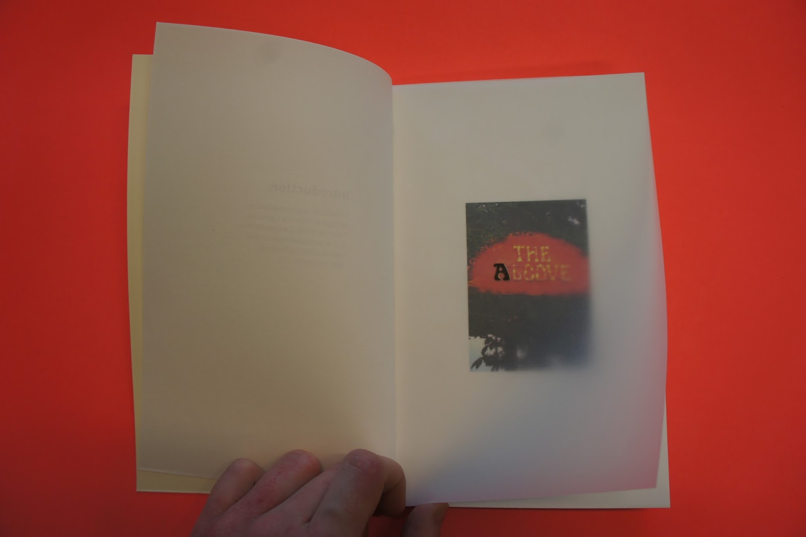
I really liked this little publication, it was about A5 sized which fitted nicely into my hands. The cover I particularly liked due to its simplicity. The colour of the stock is very calming and neutral, creating a nice blank canvas to move onto the photographs. 


The layout was once again the same all the way through, alternating between type and image and image. The way the photographs were framed in the page made them look like polaroid pictures, giving the book a very personal feel. I think this sort of layout would suit my content, due to its personal nature.


- This book was just larger than A4 and had a concertina bind. The foiling on the cover was really effective with the contrast of the silver against the black background. The detail of the flourishes in the text was picked out by the light reflecting on it which was rather beautiful. The images used within the book were spread across two pages so that you had to full unfold the concertina to view the images, which was a bit annoying. But the images being larger enables the viewer to really look at the details of the photographs. And having the images in a sequence like this feels like it is telling a story which the reader had to follow. 


When I went to Manchester for the print fair I found this book that I really liked. I loved the layout of this book because of its simplicity. There is no text in the book so all of the focus is on the photography. What is particularly interesting about this book is its print - it is printed on a risograph printer using CMYK. So each page has 4 laters for each of the colours which creates this grainy 3D esque texture to each of the images. I wish that I could do something similar to this however I feel like it would be too time consuming and considering the quality of my photographs it might not look that great.