Showing posts with label OUGD404. Show all posts

Wednesday, 22 April 2015

OUGD404 - Design Principles - End of Module Evaluation


Overall through this module I believe that I have attended all the sessions that I could so I have benefitted a lot from learning the basics of graphic design within the lessons. Although with some of the lessons I feel I could have concentrated more to get the most out of it and as a result my blog posts 
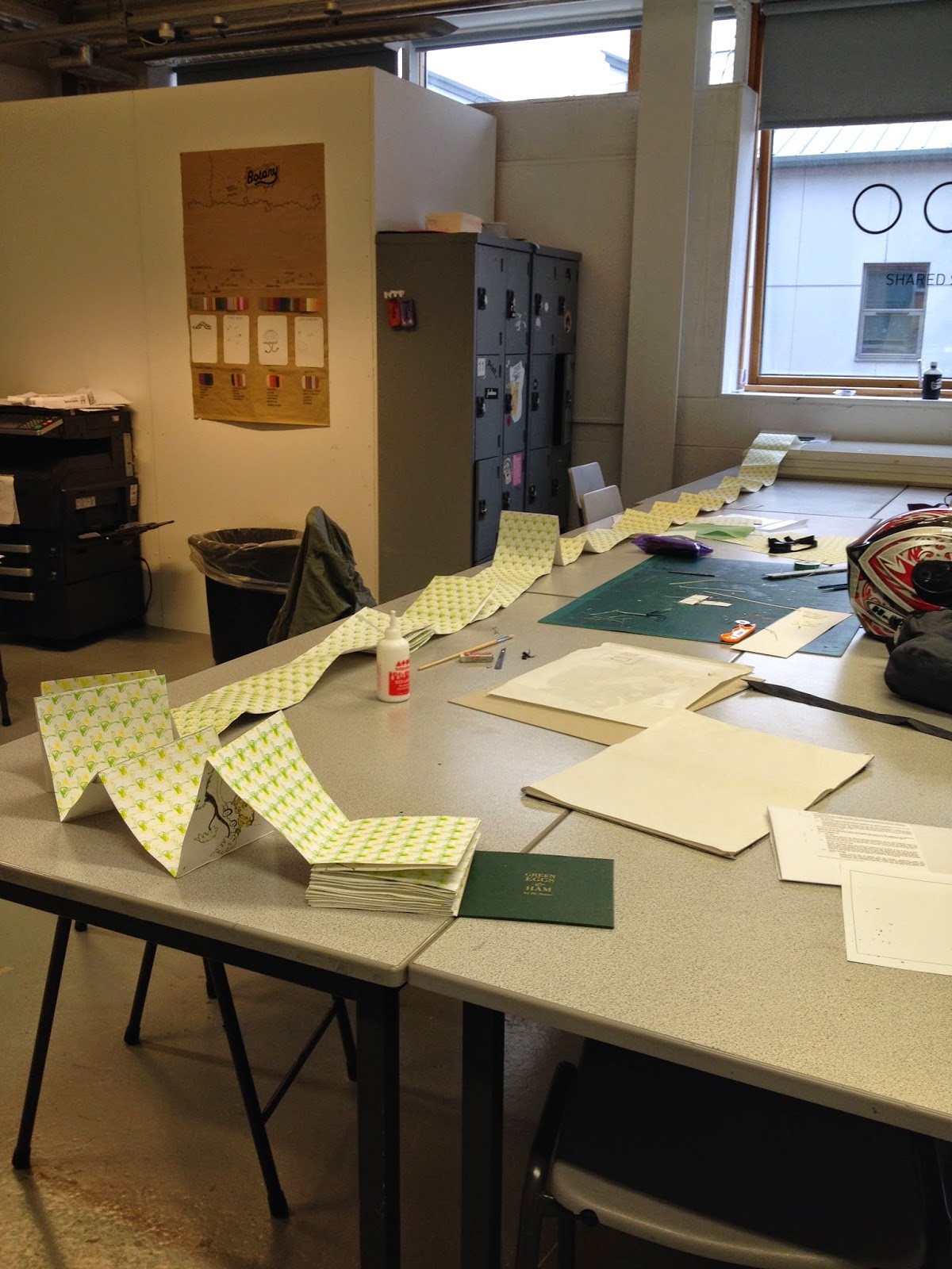
suffered a bit, I think. Even though I have done bookbinding before I learnt a lot more binds that I hadn't learnt before. I even feel confident in doing these binds on my own now. Also I feel like I have improved my screenprinting skills through the module because of the amount that I had to screenprint for my book.

Throughout the brief I think I was a bit overambitious and if I was to do this again I think I would spend more time designing something that actually showed the rules of book layout rather than showing them in a pre-written book. I feel that my finished publication lacks sophistication and is a bit messy, which was said in some of my feedback. I definitely think that I could have done more design wise to the book looking back at it now. But to say that it was such a big book I managed my time well, finishing it and binding it in the week before the deadline. I think that if I had more time I would created a better, neater book because I could have practiced more rather than concentrating on printing and binding it.

After completing this module I would say that bookbinding isn’t one of my strongpoints – I made some silly mistakes while creating the book that made it have a bit of an unkempt feel. Yet I am pleased with the result none the less. 

Friday, 17 April 2015

OUGD404 - Studio Brief 2 - Final Book


Overall I am over the moon with the result. I think that in the end it was worth all the time and effort. Due to the binding method the pages are a bit uneven and in places it has got a bit messy but I think that this all adds a bit of character to the book - you can tell its handmade and bespoke - its not something that could be produced on a large scale. 

I think that the result is successful at ticking most of the boxes of good book layout, but if I were to show this again I probably would have created a book that could show the structure of how it is produced.

I realise that I was a bit overambitious with this project and it meant that it took away from other projects that I have been working on but to see the end result like this is very pleasing and I am proud of what I have achieved. If I was to do a similar brief again I would definitely be a lot easier on myself and pick something that was maybe a tiny bit shorter then I would have more time to make it really unique and display all the criteria for a perfect book.

OUGD404 - Design Principles - Studio brief 2 - Creating the Book

PRINTING

I started to try to screen print my pages as previously planned, I exposed a screen and managed to fit 4 double page spreads on one screen. Once I started printing with the screen problems arose. The text was so thin that the ink would dry once I flooded the screen, leaving some parts blocked. This meant I had to spray the screen constantly to get it unblocked. When printing onto the watercolour paper that I had chosen as my stock it was even worse as the texture meant that the printing quality wasn’t even. This happened with all 4 pages that I printed in fact which meant that I wasted paper and time. 


In the end I decided it wasn’t the best idea to try and screen print a 77 page book as it would take a very long time. I searched for an alternative method that I could use that would still let me print on my stock and let me watercolour over the illustrations. I went to the print room to see if I could laser print onto the stock, to which I was informed that their ink jet printers shouldn’t run once dry. I printed a test and low and behold the ink didn’t budge so I printed all of my pages using this method instead.

I did decide to continue screen printing, but with patterns for the back binding of my book. This was much easier as it was just a 2 colour screen print - green and yellow onto a smooth stock - with no text to worry about. These prints came out really well and I was very pleased with the results as I feel it represents the crazy sort of psychedelic nature of Dr Seuss in one print. Initially I wanted to do this sort of print on a green stock but because I needed over 40 sheets of A3 I decided to use a cheaper alternative. I think the use of white stock worked well as it makes the almost fluorescent colours stand out from the page and almost make them look 3D.


I also screen printed onto my hard cover as I wanted it to look like a traditional hard back book with gold text. So I designed a title using traditional serif fonts (Bodoni and I used Garamond for the ampersand) and I think that it came out really well. I feel that it looks very professional and gives the high quality finish to the book that I wanted.


BINDING


Binding the book together was a very long and tedious process. Due to the amount of pages and the thick stock the book turned out to be rather thick. Above is the pile of unbound pages. If I had known that it would have been this thick I probably wouldn’t have chosen to do a concertina, but at this point I could only move ahead with my plans. 

I had to glue each double page spread to a patterned back piece to link it all together and the end result was rather long! I had a picture taken not even halfway through the binding and it was about 2-3 metres long at that point so it must be very long now. I do realise that this means that it is a rather clumsy book now for being a concertina however I wanted to keep that effect of the continuous story and I think it does show this. 


If I were to make this book again I definitely would do something like a perfect bind or a Japanese stab bind purely for the fact that it would allow double sided pages and therefore would be a much more manageable book.

THE COVER


Thursday, 26 March 2015

OUGD404 - Design Principles - Cover design ideas

After getting on with the design of my book I realised that I hadn't really thought about the cover of it. So I started doodling some different versions and scanned them in to create some initial ideas. 


I started with something really simple using the green eggs and ham illustration from the book. The contrast between the dark green and the white works really well here so perhaps I could use some green stock with white screen printed onto it.


I then tried with some different text styles and used a plate to frame it all. I feel that this makes the book look almost like a cook book and not a children's book. 


I thought that I should try a different colour rather than the obvious green. I thought that this shade of orangey-red complemented the green so it would go well. It is also similar to the colour that is on the current cover of green eggs and ham. I do like the simplicity of just the hand rendered text on a plain background but I can’t help but feel like there is something missing. It doesn’t reflect all of the character of the book.


So I took the illustration of the ham and eggs and made it into a wallpaper like pattern to use in the background of the cover. I thought that this would work a lot better as there would be a pattern all around the slip cover rather than it being blank.

I asked for some feedback off my peers and they much prefer the green colour to the orange as it relates more to the title. Also they preferred the patterned backgrounds to the plain ones as they thought that the illustrations would catch someone's eye more. Additionally they said that having 'eggs & ham' on one line worked much better because it didn't look as squished together.


Friday, 13 March 2015

OUGD404 - Design Principles - Studio Brief 2 - Interim Critique


I organised an interim critique for people's design so far for design principles. When I showed my design ideas so far (as above) someone immediately asked what font size I was going to use, I currently had 20 something pt as it was a children's book so they suggested that it should be smaller maybe 18pt max, 15pt perhaps if I have a lot of text on one page.

I was also questioned on the use of the serif font, they asked if should it be sans serif to be more readable. I wasn't sure about this as the original green eggs and ham book was serif. I also thought that using a serif font would reflect the character and personality of the book. However when trying out some different sans serif fonts I found that Futura worked really well as it is really legible and looks quite friendly and inviting. 

This was the original font I used which is Bodoni book. 


This is with Futura and immediately the book feels more inviting and looks more modern. I feel now that using a serif wasn't the right choice as I am trying to redesign the book and to use a similar font will make it look the same.

As well as this it was suggested that I have a look at current children's books rather than ones that I like the design of. This way I can get a better feel of the layouts, font choices and sizes in order to create a very readable book for a child. 

I also showed the experiments that I did with colouring in the images as I decided to screen print the book, doing lots of different colours using screen print would be time consuming. They said that the examples I showed of watercolour over images was a nice idea as it would create a nice effect with transparency of the paints. They all preferred the splashed version rather than the neater version.

Because I am printing just black and white outlines I could maybe even do a colouring book version - could have one version hardback with watercolour, then paperback with colouring book theme. This is a really nice idea and I might do it if I have the time to. Perhaps going off the colouring book theme I could even do colour by numbers. But I do wonder if this suits the age group as it is meant for children learning to read. Perhaps shapes for younger kids? Does this limit their creativity?

Sunday, 8 March 2015

OUGD404 - Design Principles - Studio Brief 2 - International Book Fair at the Tetley

Today I visited the Tetley for the first time to go to the International book fair as part of my research for design principles. I thought that I could get lots of inspiration for different book layouts and maybe even binding methods. (In advance sorry for the potato quality photographs). 


The first stand I visited was the Pressision print stand, they had lots of colourful and interesting print examples on display but the one that really stood out to me was the book about the miner's strike (black and yellow top right). The very light text over the black sleeve was printed on with coal dust, which gave it a shimmering quality to it, it was beautiful. Very subtle yet very powerful design.


I absolutely loved the traditional illustrations used for these books yet they paired these illustrations with neon and bright coloured stocks. I may try experimenting with bright stocks like this for my redesign of Green Eggs and Ham book cover. I also love the use of the repeat illustration in the inside once again I could use this for my book, maybe doing illustrations of eggs and ham printed onto green stock.


These concertina books were really interesting. When folded they look like a normal concertina yet the opened out to be a flat banner sort of shape which was really effective when using imagery as they have done here. Also combining non paper elements like this moss and stone within the book design was quite innovative. I wouldn't say I would try this myself though.


This stand as you can probably see specialised in letter press. I liked the use of the grey ink pressed onto coloured stocks it creates a subtle yet effective contrast that isn't too strong to look gaudy.


This stall was just full of beautifully illustrated books, mostly with humour involved.


I loved the idea of printing onto acetate like the book on the left. It creates a stunning shadowed/blurred effect of all the other pages of writing underneath it, giving a slightly eery feel. I also like the simplicity of the screw binding, making it possible to fan all the pages out. 


This particular book was very inspiring. String had been used on each page within an illustration of a scene so when you opened the book wider the string would become taut and complete the illustration. There was lots of playful ideas in the one little book, and it inspired me a lot as I had never seen anything like it done before.


There was a Leeds College of Art stall there specifically for the visual communication course with lots of pretty publications and prints. The book shown on the left was beautifully lino printed. Each page with a different design and it was all about art. It was a very inspiring piece.


I loved these little printed boxes. I had never thought of just printing patterns onto box nets before and using them as miniature sculptures almost. I will be trying this at home!