

With this leaflet I found it really interesting how it all folds out into a long strip. It would be good for doing a timeline of sorts for the design process, but I feel like it would leave a lot of blank space. I do think that it looks very neat when folded up though and it might attract people to look at it because of that. The design of the leaflet itself uses shapes created within the folds to make it look 3 dimensional. Also the use of more photographs than text makes for a more striking design. However I don't feel like this sort of design would suit for a design process because it feels like it is the wrong format being too complex. It definitely couldn't be easily produced on a large scale.


I love the vibrancy of this leaflet. I feel that from the research I have found that to create a successful, eye catching leaflet you don't necessarily need a different or fancy fold, you just have to have a good colour scheme and an interesting design. The front cover in particular really stands out to me as it uses as much of the space as possible, even squeezing text into the counters and apertures of the letters. It reminds me of Paula Scher's more typographic pieces where text is used to swarm the page. I also feel like the hand-drawn design reflects the fact that it is for a council that promotes the use of arts and their art programmes. This kind of informed design is what I would like to produce.

This leaflet is so playful in both the colour and illustrations that it inspires me to try a more playful design for my design process. The double sided concertina is not a fold that I had thought of as I ruled it out as being too simple, but using it in a portrait fashion like this design makes it suit a design process chart a lot more than a landscape leaflet in my opinion. Additionally, the colours used in this feel like they are suited to young adults maybe 20-30 showing that it has a specific target audience.
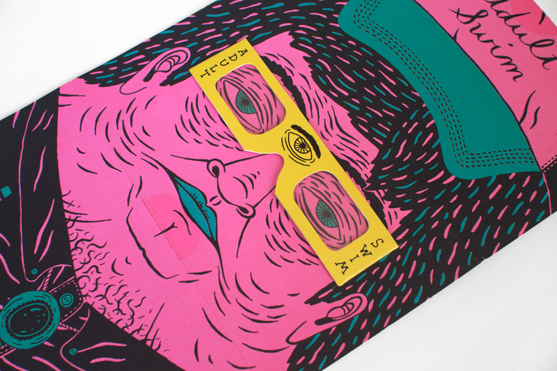
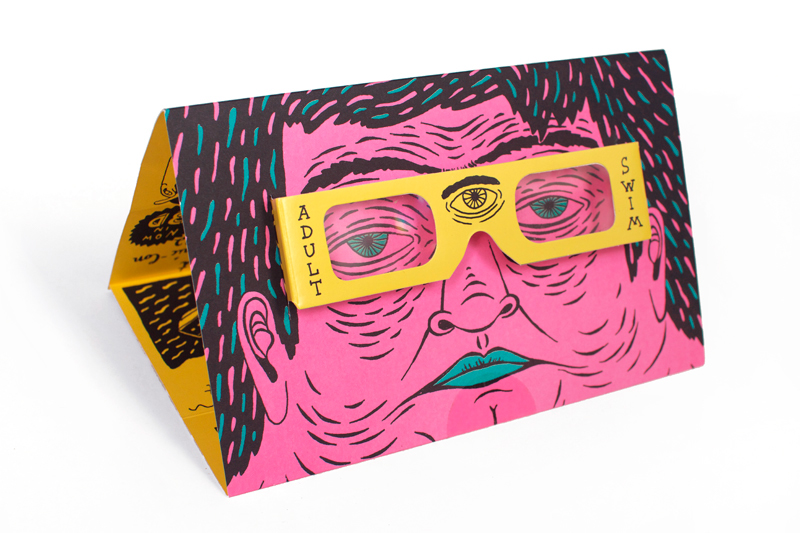
I had an idea to use glasses like in this design, but using coloured lenses so it has two separate processes - maybe a professional and unprofessional version of my design process. I think that this would only work on larger scales so I might create it in an A3 size. I think that I might direct my own design at Graphic Design students to show the good and the bad sides of a design process as sort of a educational leaflet. I really like this idea because it is interactive and means that people have to really get involved with my piece rather than just glancing at it.

ANAGLYPH: a stereoscopic photograph with the two images superimposed and printed in different colours, usually red and green, producing a stereo effect when viewed with appropriate filters over each eye.

I found this design on Behance of a similar project using anaglyph glasses where a story can only be read wearing the glasses. I love the simplicity of the layout in this one and how the design is all based around the concept.
No comments:
Post a Comment