Wednesday 10 February 2016

OUGD505 - Studio Brief 1 - Banknote Research

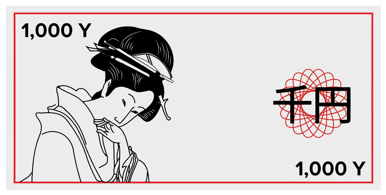
Dollar Redesign by Mucho, London.


We changed the format from horizontal to vertical: a logical change as research revealed that people tend to handle notes vertically, and all machines accept notes vertically. We retained the width of the existing notes, but changed their length. The $1 bill became the shortest and $100 the longest, making it easier for people – especially the visually impaired – to distinguish between notes. Using different colors also gave each note a stronger individual identity. Imagery was selected to reflect the value of each note, with an educational element aimed at Americans and visitors alike. Each denomination features a black and white image of a particular aspect of American history or culture

I particularly like how these notes have a vertical format rather than a horizontal one. I feel like this has a more contemporary vibe to the notes as it switches up the norm. Also the use of the vivid colours adds to the modern feel rather than having the muted and dark tones that are usually used on bank notes. Additionally the use of photographs instead of etched illustrations brings the notes up to date. However all this simplification does mean that the notes themselves would probably be quite easy to reproduce which means that they aren't very secure. 


Over in the US designer Travis Purrington has created his own take on the US currency which is similarly visually appealing. OK it’s unlikely to take the place of the founding fathers any time soon (actually between Apple Pay, PayPal latest work and thing like https://onlycoin.com/ it may be that currency will become used less and less), but nevertheless it’s an interesting piece of visual design.
Travis actually states “Inspired by the Swiss Franc’s (CHF) ambitious redesign process (the currency is thoroughly redesigned every 20 years by way of contest) The goal was to develop a similar updated iconographic system better representing the advancements and culture within the American society.” but it seemed like a nice excuse to showcase the Norwegian banknote design.
Once again these are very contemporary designs for bank notes. I particularly like the use of scientific discoveries rather than the history of the country as I feel like almost every banknote is based around historical figures. So bringing it up to date with technology and science is a way to make it modern. The use of geometric shapes within each design also adds to this and almost gives a screen like quality to the notes making them look like pixels. 


The famous re-design of the Norwegian bank notes has been part of much discussion in the design world. The abstract use of shapes, silhouettes and colours really adds together to make really interesting images for the notes. Mixed with the photographic elements on the back they feel very relevant to the country that they were created for. 


Monday 8 February 2016

OUGD505 - Studio Brief 1 - Digital Development


The first note that I started to try out was the tradition wood block prints one. I found a print and vectorised it while trying to keep the style as close to the original as possible. To make the notes more up to date I wanted to use a limited colour palette that represents Japan so I chose grey, red and black. At the moment the note feels very empty so I might add some patterns in order to make it more secure and less forge-able.


I tried various patterns from a halftone to using the letter equivalents of the Japanese for the amount on the note. Additionally, inspired by the dollar redesign I tried out making the bank note vertical rather than horizontal to twist up the norm. I like this orientation of the note because I feel like it draws the eye down to the illustration rather than drawing your eye across the note to nothing. 


I experimented more with different uses of the text, inspired by the famous rising sun image of Japan. Although the strong use of red on these designs is a bit too overpowering. I'm not sure how all these fine details will come out if I screen print it too, they might block easily when I screen print. 

Sunday 7 February 2016

OUGD505 - Study Task 1 - Appropriation and Subversion

Today we had a task about appropriation and subversion, about how some artists and designers use and abuse other people's artwork in order to present a completely different message.

I found this really interesting to see how people can put across certain political messages. Some of the artists in particular from the presentation caught my eye and gave me some ideas on how I could portray my campaign.

Barbara Kruger


‘We Go To The Museum’ by Miriam Elia (2014)


I based the study task itself on the issue that I have picked for studio brief 2 - Animal cruelty in farming and the general taboo about whether or not we as humans should eat meat. I created two designs, one text and image and the other just text. I feel like the just text poster is more effective as the left over red paper that I used as a background almost looks like knife wounds, consistent with some slaughtering methods. Also the mis-match of the type cut out from magazine portrays the message with a strong and powerful yet ransom note like feel.


Friday 5 February 2016

OUGD505 - Studio Brief 1 - Initial Sketches

I started to sketch out some rough ideas for the Yen bank notes. At first I was thinking of more traditional ideas that involved traditional Japanese art and culture. For example I thought about using famous Japanese wood block prints like the wave and maybe one of a geisha as well. To add to the quality I thought about embossing the kanji characters. I think that these would work well with a simple colour palette however I am unsure on how easy to reproduce they would be. I would have to add a lot of detail in order to make them hard to forge. 


The next idea that I had was to use the Japanese elements through landscapes and buildings. For example here I have used a cherry blossom tree for the element of earth and a koi fish for the element of water. I quite like this idea because the elements are something that are revered in Japanese culture so I feel that they would be relevant. Also I feel like there is more room to modernise the note design with this concept rather than the traditional prints which may come out similar to the current note designs. 


Next I thought about some different, more abstract ideas to relate to origami where I could emboss a sort of folded pattern onto the note designs to represent the traditional Japanese art. However I don't know how I would incorporate colours into this and what method of printing to use. Though the patterns created here would be effective I feel like it wouldn't be enough to fill a banknote and it would feel empty. 

My other idea was slightly "out there" I thought that I could use popular Japanese culture today by having anime characters on the bank notes. Or even show some of the many interesting and unique sub cultures that Japan holds today. While this idea would be interesting to explore I feel that it might not suit the sensible and quiet nature of the Japanese people. 

However I will try out most of these ideas digitally to see how they would work with colour and proper type.