
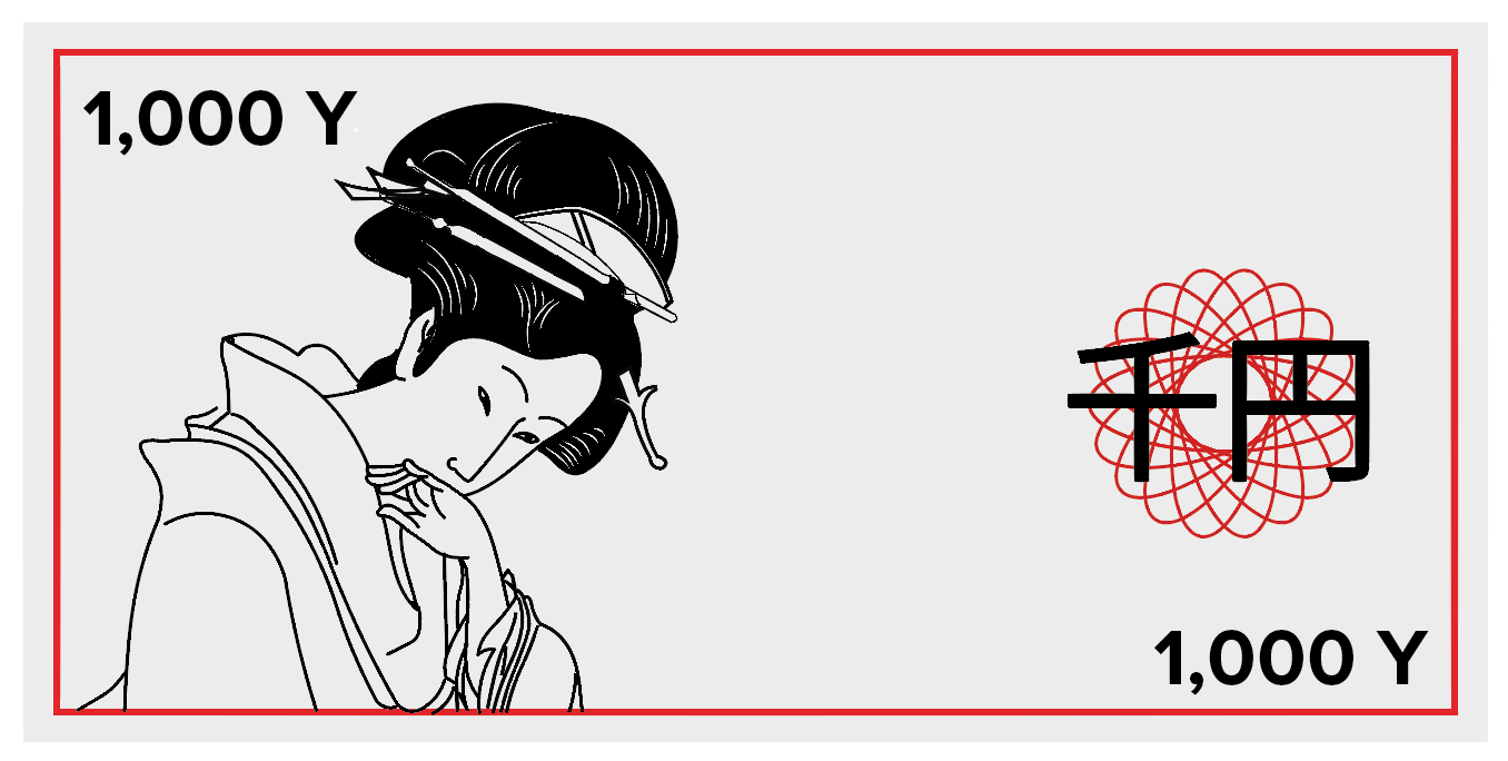
The first note that I started to try out was the tradition wood block prints one. I found a print and vectorised it while trying to keep the style as close to the original as possible. To make the notes more up to date I wanted to use a limited colour palette that represents Japan so I chose grey, red and black. At the moment the note feels very empty so I might add some patterns in order to make it more secure and less forge-able.


I tried various patterns from a halftone to using the letter equivalents of the Japanese for the amount on the note. Additionally, inspired by the dollar redesign I tried out making the bank note vertical rather than horizontal to twist up the norm. I like this orientation of the note because I feel like it draws the eye down to the illustration rather than drawing your eye across the note to nothing.


I experimented more with different uses of the text, inspired by the famous rising sun image of Japan. Although the strong use of red on these designs is a bit too overpowering. I'm not sure how all these fine details will come out if I screen print it too, they might block easily when I screen print.
No comments:
Post a Comment