
PRINTING
I started to try to screen print my pages as previously planned, I exposed a screen and managed to fit 4 double page spreads on one screen. Once I started printing with the screen problems arose. The text was so thin that the ink would dry once I flooded the screen, leaving some parts blocked. This meant I had to spray the screen constantly to get it unblocked. When printing onto the watercolour paper that I had chosen as my stock it was even worse as the texture meant that the printing quality wasn’t even. This happened with all 4 pages that I printed in fact which meant that I wasted paper and time.

In the end I decided it wasn’t the best idea to try and screen print a 77 page book as it would take a very long time. I searched for an alternative method that I could use that would still let me print on my stock and let me watercolour over the illustrations. I went to the print room to see if I could laser print onto the stock, to which I was informed that their ink jet printers shouldn’t run once dry. I printed a test and low and behold the ink didn’t budge so I printed all of my pages using this method instead.
I did decide to continue screen printing, but with patterns for the back binding of my book. This was much easier as it was just a 2 colour screen print - green and yellow onto a smooth stock - with no text to worry about. These prints came out really well and I was very pleased with the results as I feel it represents the crazy sort of psychedelic nature of Dr Seuss in one print. Initially I wanted to do this sort of print on a green stock but because I needed over 40 sheets of A3 I decided to use a cheaper alternative. I think the use of white stock worked well as it makes the almost fluorescent colours stand out from the page and almost make them look 3D.


I also screen printed onto my hard cover as I wanted it to look like a traditional hard back book with gold text. So I designed a title using traditional serif fonts (Bodoni and I used Garamond for the ampersand) and I think that it came out really well. I feel that it looks very professional and gives the high quality finish to the book that I wanted.

BINDING

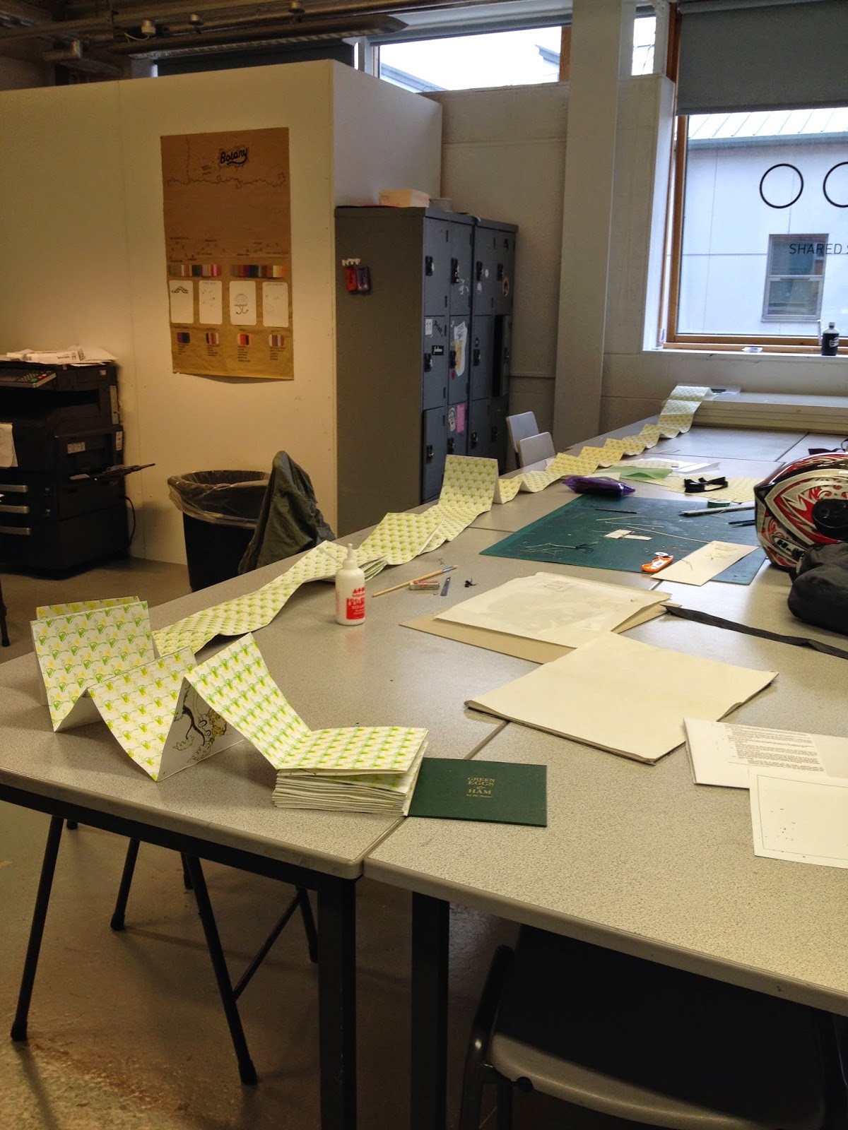
Binding the book together was a very long and tedious process. Due to the amount of pages and the thick stock the book turned out to be rather thick. Above is the pile of unbound pages. If I had known that it would have been this thick I probably wouldn’t have chosen to do a concertina, but at this point I could only move ahead with my plans.
I had to glue each double page spread to a patterned back piece to link it all together and the end result was rather long! I had a picture taken not even halfway through the binding and it was about 2-3 metres long at that point so it must be very long now. I do realise that this means that it is a rather clumsy book now for being a concertina however I wanted to keep that effect of the continuous story and I think it does show this.


If I were to make this book again I definitely would do something like a perfect bind or a Japanese stab bind purely for the fact that it would allow double sided pages and therefore would be a much more manageable book.
THE COVER


No comments:
Post a Comment