Showing posts with label Type. Show all posts

Monday, 13 October 2014

London Underground - Johnston Sans

This weekend I went to visit my friends in Bournemouth and during my journey I had to use the London Underground. I have read about Johnston Sans (originally named Underground) in 'Just My Type' so I found it fascinating to see the font in use today. The description from Johnston's commission was to create a typeface that represented "the bold simplicity of the authentic lettering of the finest periods". I think that he achieved this brilliantly and he even made it distinctly unique, there is no question that when you see Johnston sans combined with the red and navy blue of the signage that you think of the London Underground. I particularly love the  lowercase g of Johnston sans, I think it really epitomises authentic lettering yet in a quirky and modern way.


It really inspires me that a font that was designed in 1916 is still in use today, albeit a slightly updated version. Johnston was a pioneer in terms of sans serif fonts and his font used for the underground could be argued as the very first sans serif to be designed. It is simply a timeless font. 

It made me realise that this font could relate to my word of 'progress' as a journey and travelling is a form of progress in my opinion. So seeing a font that is used for travelling has given me a lot of ideas for my own work. I will take my letterform that represents progressing through a journey and alter it to look like Johnston sans while still keeping the map textures. However I do think that Futura is very similar to this typeface when used in all capitals. The only really difference is when you look at it in lowercase where Futura has the more geometric and simple forms but Johnston sans is very clear, yet draws its origins from sans serif fonts. 


Friday, 10 October 2014

Studio Brief 01 - Interim Crit

Today I received lots of good critique for my work and it has given me lots of ideas on how I can progress further. I scanned my letters and enlarged them for the sake of the presentation and went through the reasons behind the design with each letterform.

I started with the O and F which are both very different concepts. There was a general agreement that my letter O wouldn't work on a whole as a font as not every letter is round. However, Rhys suggested that I could have the other letters as the different stages so that they run in sequence. The feedback for my F was mostly good. I was told the weight of the thin lines was veery effective building up individually to create the overall letterform. They also said that it would work really well as an overall typeface as it can be applied to every letter. However, it was suggested that I could even add transistors as the theme was circuits to add a bit more interest.


The next set I showed was my ? and the g. Personally, I don't think that the ? mark works, I think it looks naive and childish to add hands inside of a letter. However I was complemented on at least giving it a go and testing the idea before I dismissed it. With the g I was told that it was very unique as serif fonts often have a g with an inverted tail, where as I kept the form of the Futura g. It was even suggested that I could use the idea of the progress through typography by creating the alphabet through the transition of modernist ideals to post modernist ideals within graphic design.


For my k the feedback I received was also good even though I don't like the letterform myself. They said that it was effective as a title font because it is so wide and bold. However, I was interested with the feedback that I received for my lowercase j as I really dislike this concept as I thought it was too obvious, with progress related to growth. Yet this was one of my groups favourites as they agreed that it was easily adaptable for all letterforms and was effective at portraying the word progress.


Next was my letterform that was inspired by my research into Shepard Fairley. The group liked where the research came from and particularly liked the B as they said that I completely transformed the letterform so it looks nothing like Futura anymore. Also someone said that they liked how I made the counters really small compared to in Futura where they are really large and open. For my Z it was said that it reminded everyone of the font from the opening of Star Wars when the history is told and it disappears into the background. After looking at it again I can definitely see this but they also said they liked the overall concept of the perspective. 


For my lowercase o I was told that it could be hard to read within a sentence or within a word and could only really be used as a large display font to become readable. The same applies to the J as it is created in the same style. However they said that they were drawn to my r as they said it really stands out from the rest and would make an excellent display font. They liked my idea of progress through movement.


Most people liked my uppercase H, saying that it was effective and readable. But I believe that it is too obvious concept from the word progress (being growth by growing upwards) so I don't think that this will be one of my final designs. With my Q it was mentioned that it was perhaps a little simple, but they liked that I was passionate about space and astronomy. Izzie suggested that I use actual textures of the galaxy and incorporate colours into it to make it pop. I might also reduce the counter size so that more of the new textures will be shown.

For my i that was made up of wires I was complemented on a unique concept that they have never seen the wires used around the letters, usually they are used to form the structure of the letterform. Someone also said that it reminded them of Chavis Tsevis' work with wires (below). I really like his pieces and I think that they are also quite relevant to my word of progress so I am pleased that my work lives up to these standards. My M was also commented on being simple yet effective and reminded people of a line graph. 


When I asked for feedback about my n they said that they enjoyed the idea of using a map pattern within the type but I should try using real maps to create my letters. Also the tail of the letter that I created would be better if it was shortened to increase legibility. The x was complemented on how it retains it's routes to Futura  with the sharp geometric edges. However when used within curved letterforms it may not work as well as with this letter x.


Most of my group liked my L and liked my idea of removing the outer line to just leave the horizontal lines to create the look that the font is half loaded. Even though I personally don't like the letterform as it is now, with the improvements suggested I think it would work well as one of my final letters. The a on the other hand is definitely my favourite. It works on e concept of non linear progression and someone mentioned that it looks like a glitches letter which is quite a good description. It was also said that it would make a good display font. 


Finally it was the W. I didn't actually receive much feedback for this letter a part from that I could experiment with cutting off some of the letter to further emphasise the work in progress. This is another of my personal favourites so I will definitely experiment with this idea a little more and use it in my final fonts as I believe it would transfer well to all letters. 


Overall, I found this critique really helpful and it has given me a fresh view on how I can interpret my word progress. It also helped me to decide my final 10 letterform styles that I will use based on others feedback as well as some from my own personal favourites. My final 10 will be based on my  F, j, B, n, r, L, a, x, Q and W. 


Thursday, 9 October 2014

Studio Brief 1 - Alphabet Soup - Initial Ideas

I was given the word 'Progress' to alter my chosen font Futura. At first I found it difficult to think of visual interpretations to the word progress. I was given the definition as follows:
progress
noun               [ mass noun ]
1 forward or onward movement towards a destination: the darkness did not stop my progress | they failed to make any progress up the estuary.
    - [ count noun ] archaic a state journey or official tour, especially by royalty.

2 development towards an improved or more advanced condition: we are making progress towards equal rights.

verb                 [ no obj. ]
1 move forward or onward in space or time: as the century progressed the quality of telescopes improved.
    - [ with obj. ] (usu. as adj.progressed) Astrology calculate the position of (a planet) or of all of the     planets and coordinates of (a chart) according to the technique of progression.
2 develop towards an improved or more advanced condition: work on the pond is progressing.
    - [ with obj. ] cause (a task or undertaking) to make progress: I cannot predict how quickly we can       progress the matter.

PHRASES
in progress in the course of being done or carried out: a meeting was in progress.

ORIGIN late Middle English (as a noun): from Latin progressus 'an advance', from the verb progredi, from pro- 'forward' + gradi 'to walk'. The verb became obsolete in British English use at the end of the 17th century and was readopted from American English in the early 19th century.

What I took from this definition is that the word progress is that it has strong links to time and movement. I really liked the idea to link progress to progressions in technology and advancements that mankind has made; I think this idea would work really well with the geometric and strong modern forms of Futura.


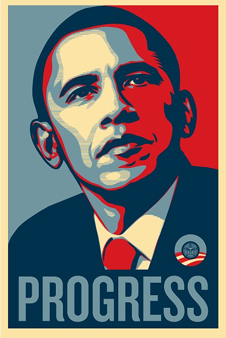
When searching for inspiration I came across Shepard Fairley's famous works for Obama's politicial campaign. I though this fit perfectly as one of Obama's main aims in his presidency was to progress. The font used in this implies power as it is tall and bold, giving the impression that Obama is a figure to look up to. Also the fact that the font is bold suggests that he is strong and supported as the font looks very sturdy like it wouldn't topple over. Additionally the words 'Hope' and 'Progress' are synonymous with each other and can mean the same thing, especially within politics. I thought that I could take stretch Futura so it becomes taller like the font used within the posters. If you look below, the letters 'B' and 'n' are my interpretations of the fonts that Fairley has used.


I also research Audi’s marketing as their slogan roughly translates to “Progress through Technology”. The typeface used in Audi’s marketing is once again a bold and powerful sans serif, here Univers is used. Univers was created to be similar to the early Swiss typefaces such as Akzidenz-Grotesk which was one of the early pioneering sans serifs. The ideals this font represents is very similar to Futura in my opinion as it represents modernist design. Audi’s marketing itself is quite modernist and minimalist like the poster shown above, using a limited colour scheme of red, black, green and white.

Here are just some of my initial ideas:


I already have favourites from my initial ideas! So far I like the idea of the circuits as used in the 'F' and another one of my favourites is the 'W' representing a work in progress. Additionally I particularly like the 'a' using the idea of non-linear progression making a strange shape that I believe would be quite interesting as a display font. I also like the 'O' with the life cycle however I am concerned that it will be unreadable as an entire font, and generally a bit impractical. The ones that work the best are the ones with the subtlest ideas in my opinion - I really like the 'x' as I love Astronomy and star charts so it really represents me.


Thursday, 2 October 2014

Study Task 1 - What's my type?

To determine what type represented my personality the most I started by looking at each typeface. I could see that the serif fonts (Garamond, Bodoni, Times New Roman and Century Expanded) all looked like they would represent a very formal individual. I don't see myself as a formal person at all - I find it boring! Also singling out letters such as 'a' I could get a grasp of the main differences between each of the types. For instance the a's of the serif fonts didn't differ much at all. In fact the main difference between the serifs is the weight of the type and whether they include flourishes on the curls of the 'c' or tails of the descending letters (g, j, y). However the sans serif fonts differ quite a bit in the style of the letters. Helvetica's 'a' is very similar to those of the serif fonts but Futura's is very simple and geometric, eliminating any unneeded lines. As a result of analyzing the types I think that my personality would be more suited to one of the sans serif fonts.


After looking at Vignelli's 6 basic typefaces, I researched each one to find out it's history. I will just use bullet points to avoid creating a wall of text.

Garamond:
- Designed by Claude Garamond in the 16th Century.
- However, when Garamond became popular many of his fonts related back to Jean Jannon.
- Produced to be legible.

Bodoni:
- Designed by Giambattista Bodoni
- Bodoni drew his influence from the Romains du Roi (A french typeface developed in the late 17th century)
- Also takes inspiration from Baskerville.
- Has been used most famously in the CBS logo, the Nirvana logo and even in the Hilton Hotel's menus.

Century Expanded:
- Designed by Morris Fuller Benton
- It is the only font allowed to be used in the Supreme Court of the United States

Futura:
- Designed by Paul Renner
- Inspired by the Bauhaus movement
- First typeface to be on the moon
- Used in IKEA and Volkswagen's branding
- Also used in Elder Scrolls: Skyrim in the UI (Skyrim is my favourite game!)

Times New Roman:
- Designed by Victor Lardent
- Commissioned to be made for The Times Newspaper (was used for 40 years)
- Claimed to be one of the most widely used fonts of all time.

Helvetica:
- Designed by Max Miedinger and Eduard Hoffmann
- Originally named Neue Haas Grotesk
- Helvetica's named after the Swiss national goddess "Helvetia" 
- Used in American Apparel's marketing
- Vignelli designed the New York subway infographics using Helvetica.

After much deliberation I chose Futura as the font that represents my personality as I believe that I'm a modern individual who works efficiently (like Futura's type is very efficient). I also enjoyed seeing some of the earlier designs of Futura and seeing how Renner came to his final simple geometric type. I love the way he constructed the g with a triangle and I also like the brutal simplicity of the m and n being just straight lines.


My interests are also linked quite closely to the history of Futura. I love space and astrology, so the fact that it was the first typeface on the moon makes it so much more interesting to me. My first car was also a VW Polo and my favourite game is Skyrim so the typeface was used in both of my favourite things!

My Presentation Slides