

After looking at Vignelli's 6 basic typefaces, I researched each one to find out it's history. I will just use bullet points to avoid creating a wall of text.
Garamond:
- Designed by Claude Garamond in the 16th Century.
- However, when Garamond became popular many of his fonts related back to Jean Jannon.
- Produced to be legible.
Bodoni:
- Designed by Giambattista Bodoni
- Bodoni drew his influence from the Romains du Roi (A french typeface developed in the late 17th century)
- Also takes inspiration from Baskerville.
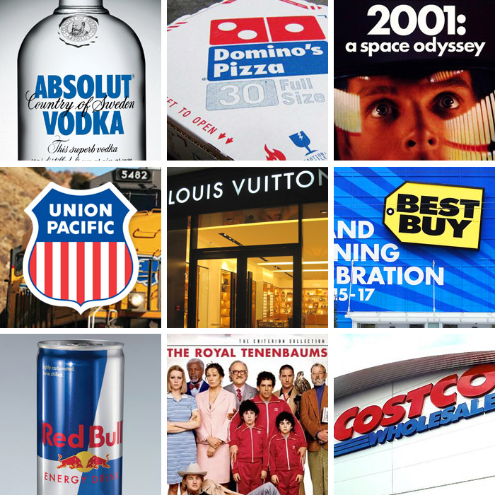
- Has been used most famously in the CBS logo, the Nirvana logo and even in the Hilton Hotel's menus.
Century Expanded:
- Designed by Morris Fuller Benton
- It is the only font allowed to be used in the Supreme Court of the United States
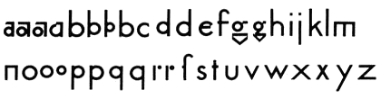
Futura:
- Designed by Paul Renner
- Inspired by the Bauhaus movement
- First typeface to be on the moon
- Used in IKEA and Volkswagen's branding
- Also used in Elder Scrolls: Skyrim in the UI (Skyrim is my favourite game!)
Times New Roman:
- Designed by Victor Lardent
- Commissioned to be made for The Times Newspaper (was used for 40 years)
- Claimed to be one of the most widely used fonts of all time.
Helvetica:
- Designed by Max Miedinger and Eduard Hoffmann
- Originally named Neue Haas Grotesk
- Helvetica's named after the Swiss national goddess "Helvetia"
- Used in American Apparel's marketing
- Vignelli designed the New York subway infographics using Helvetica.
After much deliberation I chose Futura as the font that represents my personality as I believe that I'm a modern individual who works efficiently (like Futura's type is very efficient). I also enjoyed seeing some of the earlier designs of Futura and seeing how Renner came to his final simple geometric type. I love the way he constructed the g with a triangle and I also like the brutal simplicity of the m and n being just straight lines.
My interests are also linked quite closely to the history of Futura. I love space and astrology, so the fact that it was the first typeface on the moon makes it so much more interesting to me. My first car was also a VW Polo and my favourite game is Skyrim so the typeface was used in both of my favourite things!
My Presentation Slides
No comments:
Post a Comment