Thursday 30 April 2015

OUGD406 - Studio Brief 4 - Final Outcome


This is the final package of my think, develop explore collateral. I created an envelope so that it was like a package for someone to take away. I am really pleased with the looks of the final outcome and I definitely think that this solves the problem I set myself on the brief. I didn’t staple the final books after my feedback so that students could add more pages if they needed to. 


I feel however that I could have done a lot more work for this brief but I had other briefs outside of college that I spent time on rather than this brief. I definitely should have spent more time and effort on my Uni work. 

Tuesday 28 April 2015

OUGD406 - Studio Brief 4 - Final Crit

For my final crit I received quite a lot of useful, and thankfully, positive feedback. My peers that were in my previous crit said that my new stock choices were much better and appealed to the audience a lot more. Also the fact that I stripped it back was favoured too, saying it feels more like someone would use it now. It was suggested that I could do different volumes, and create one for a guide on how to layout design boards or how to blog. I feel that this would be difficult to do in the time I have left as I have already started designing stickers and labels from my previous critique so I don't have time to make both. But I suppose if they are newly starting the course they won't have to do design boards for a while anyway. 

The one piece of constructive feedback that I found very helpful was that there is a possibility of running out of space as everyone works in different ways. But I thought that this could be tackled by printing extra pages, and I did add in extra notes and sketches pages at the back to compensate for this. Even if it was not used to write in it was said that it would be a good guide to follow a step by step process of a good process to start a brief. 

Monday 27 April 2015

OUGD406 - Studio Brief 4 - Development


I came up with the full book pretty quickly as it was quite straight forward to design with lots of blank/lined pages. I wanted to add humour to the book by using a friendly kind of sarcastic tone. I called it the ‘Graphics Survival Bible’ as I felt that it was a key thing to have to survive on this course. 

Initially I used the font that I had used for my personal branding (Quicksand) because of it’s friendly look and feel. But when it came to my critique while people said that the book was a great idea, it came across as a bit childish. The bright colour of the cover paired with the humour and friendliness of the book made it seem like a school work book to some of my peers. So however much I wanted to include my friendly style I think it might be inappropriate in this setting. Also they suggested a name change as the survival bible was a bit irrelevant to the design of the book and its purpose. 

I struggled coming up with a different name, however, as I went through loads of different names like a “design journal” or a “brief journal” and even a “Graphics journal”. I ended up coming up with a tag-line rather than having a title to inspire people to pick it up and explore it. 


Additionally for extra inspiration I used type embellishments at the top, bottom and sides of the page, similar to the ones used in printed pages layout. I put the academic years of the course as well as two words on opposite ends of a double page spread - experiment and explore. I feel that these two words are a key part of working on briefs as a graphic designer as all you are doing is experimenting and exploring new ideas until you come up with a great idea. 


I also added a section for the name, module and brief names to the front of the book so it could be assessed as a note book rather than a piece of student’s work. I do worry that this makes it look like a school workbook again but I feel it is very much needed on the cover. 


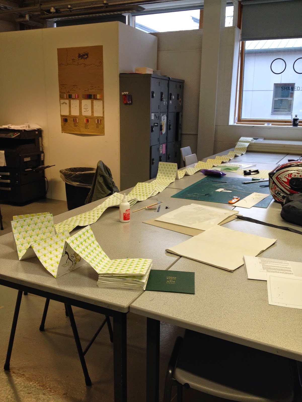
In terms of the content on the inside of the book, I added and took away a few pages, mainly giving more space for the sections I had already created. One of my peers had fed-back that they would like somewhere to write down research that may be mentioned within sessions so I added some more sketches/notes pages at the back with gridded and blank pages. 


After the interim critique it was suggested that I create labels or stickers so it could extend out of just the booklet alone. I thought for ages of what stickers I could create that were helpful but I only came up with having a “this belongs to...” Sticker to help people keep their goodies at the start of the year. 

So I thought I’d create something that was a bit of fun. I ended up coming up with an shield crest or emblem for the course and the first years. Using the most used tools I put this illustration together. I really like how bright and fun it is, it gives a bit of sparkle to the kit that I am making. Because everybody loves stickers!

I played around a lot with the colours of the emblem to get ones that complemented each other, I couldn’t choose on a final so I printed out all 3. I printed them on clear, glossy paper so that they could be stuck over things seamlessly. 

I really like these designs but I wish that I could have come up with more helpful designs. But I suppose sometimes inspiration is helpful to some people. 


Sunday 26 April 2015

OUGD406 - Studio Brief 4 - Interim Critique

When showing my initial print out in the interim critique a lot of people said that it would be very helpful to them which is a good sign so it shows that I have solved a problem that graphic design students have. The next thing that was mentioned was the title, I called it the 'Graphics Survival Bible' as I felt that it was a key thing to have to survive on this course. However other people didn't understand it and if it was going to be used in a submission it should have the name, module and brief on the front so that the markers know it is a notebook and not a piece of their work. But I also got feedback that the style of it and tone of voice is a bit childish, due to the use of humour and bright colours. In my opinion this isn't a bad thing but I think that I should strip it back a bit if it was going to get re-used/be handed in with an assignment it should be bare for others to put their personality on. 

I asked if they thought I should produce the booklet so it was for each module rather than each brief but most people said that it would be much easier to just have one per brief. A really nice suggestion was made too, that I could perhaps make some stickers or labels that could extend out of the book so it is more than just a notebook. Maybe I could create labels for submissions. I will definitely play around with this.

Saturday 25 April 2015

OUGD406 - Studio Brief 4 - Research


http://fieldnotesbrand.com/

My initial inspiration came from the field notes sketchbooks that you can buy. They are very popular for simple little sketchbooks, their popularity probably comes from the variety of patterned pages and different covers that you can buy. I really like the simple, straight to the point covers as they state what the book is for and what it is made of. I also like the bright colours that are available, I feel that if I used bright colours within my design journal it could possibly brighten someone's day rather than having dull and boring colours. A bright coloured note book would also stand out in your bag so you could find it easily. On the website I also found a 'kit' that you can buy complete with notebooks, a calendar and pens and pencils. I thought that I could produce a little 'survival kit' to give to the first years that had all they would need to sort out a brief initially. 

After this I decided to look at how I could lay out the book in an interesting way to appeal to young graphic designers.


I really like the way that printed pages is laid out, with extra information on the page like the numbers and sections in the middle of the page and on the top. I might incorporate some little details like this into the notebook so its not just blank, boring pages. Maybe I could include words that inspire so people could be inspired while using the notebook. Also this spread has made me think about the possibility of using coloured stock. It may be difficult to write/draw on some coloured stock if you wanted to scan it later when working digitally so having coloured pages wouldn't work. But I could still use a coloured cover like with field notes.


I love the simple straight to the point layouts in Elephant magazine. One thing that stood out to me on this particular page was the use of lines to emphasise the quote. Perhaps I could use this for my titles of each page. I don't know whether this would make it too stylised or not but it is worth a try. 

Wednesday 22 April 2015

OUGD404 - Design Principles - End of Module Evaluation


Overall through this module I believe that I have attended all the sessions that I could so I have benefitted a lot from learning the basics of graphic design within the lessons. Although with some of the lessons I feel I could have concentrated more to get the most out of it and as a result my blog posts suffered a bit, I think. Even though I have done bookbinding before I learnt a lot more binds that I hadn't learnt before. I even feel confident in doing these binds on my own now. Also I feel like I have improved my screenprinting skills through the module because of the amount that I had to screenprint for my book.

Throughout the brief I think I was a bit overambitious and if I was to do this again I think I would spend more time designing something that actually showed the rules of book layout rather than showing them in a pre-written book. I feel that my finished publication lacks sophistication and is a bit messy, which was said in some of my feedback. I definitely think that I could have done more design wise to the book looking back at it now. But to say that it was such a big book I managed my time well, finishing it and binding it in the week before the deadline. I think that if I had more time I would created a better, neater book because I could have practiced more rather than concentrating on printing and binding it.

After completing this module I would say that bookbinding isn’t one of my strongpoints – I made some silly mistakes while creating the book that made it have a bit of an unkempt feel. Yet I am pleased with the result none the less. 

Sunday 19 April 2015

OUGD406 - Studio Brief 4 - Initial Ideas

What have I learned through each module at university?  

OUGD401
- Learnt about the history of art and design
- Learnt about art movements
- Learnt that graphic design really can affect peoples opinions
      
OUGD402
- Explore all aspects of the creative world
- Don't be afraid to be yourself
- Look at things that inspire you everyday to keep yourself motivated
- Most importantly I have learnt through PPP to take challenges and to do what I want while I have the facilities

OUGD403
- Learnt about type terminology and anatomy
- Started to do critiques and learnt how helpful they can be
- Read Massimo Vignelli's canon
- Taught myself how to use InDesign

OUGD404
- Learnt more creative terminology and skills
- Learnt how to work within groups effectively
- Learnt a lot about creating books and further improved my InDesign skills

OUGD405 
- Learnt the importance of time management due to short briefs
- I also learnt to think about target audiences and how to aim your designs at certain audiences

OUGD406
- Learned how to think conceptually and contextually
- Further improved my group working skills
- Additionally I learnt that not everyone works in the same way as me, we all have our own ways of coming up with designs and ideas  


Struggles?
Overall through this year I think I have learnt a lot in terms of personal organisation skills, maybe more so than skills within graphic design. I have to admit I have struggled with writing about everything on the blog and keeping up to date with all my blog posts. The same applies to writing about my work on design boards. I have also had occasions where my organisation or time management has gone out of the window and I have missed important things, since then I started using my planner a lot more which helped me out a lot.

If I was to talk to myself at the start of this course I would probably say something along the lines of:
"Don't rush into things before setting out deadlines and planning your time. You can get carried away doing something and therefore lose time doing other things. Challenge yourself but don't be over ambitious."

From this I did a mind map of ideas of what could help a first year both in University and out of it. 


I feel like most of the advise I could give is to be organised and not to worry about things as I think this is what I have done well this year. So things like having a guide to meditation and how to cope with stress would reflect that. I also thought about doing some things to do with my personal life away from Uni as this year I have struggled with some of the people I have lived with. I had a silly idea of creating a box of little pre written notes to stick around the house saying passive aggressive things like: " Dishes are like boyfriends, your room-mate shouldn't be doing yours ". Although this is a silly idea and it will most likely make people laugh I don't think it's really that helpful to new first years. My favourite ideas from this mind map, and the ones that would probably be most helpful to new first years, are the week to week planner - combining something to encourage people to do more PPP, an academic calendar with terminology/history for every month and the thumbnail sketchbook, giving people somewhere to draw all their thumbnails and keep them in one place.


I did some thumbnail sketches of these ideas and I think after thinking it through and asking my peers which they think is most appropriate I will choose my last idea - the thumbnail sketchbook - as I always hate having to draw rectangles for my thumbnails so having guides as well as the ability to keep them all together rather than having loose sheets would have really helped me I think. While sketching it I thought of more that I could do with it. You could have one of these sketchbooks per brief, writing all your notes and ideas in one place. This would be great as once again it would mean no loose sheets that get lost easily and one could be handed in per brief to see all your traditional developmental work. It could represent the process that I have developed through out the course on how to tackle a new brief. To analyse the brief itself, then work on some initial ideas in the form of a mind map, then create thumbnail sketches and finalise them to one final idea, get feedback and then move onto the computer. I feel that this would encourage people to work traditionally to start with and not go straight to the macs like many of my peers do. I often find that some of my best ideas come from thumbnails that I have drawn rather than from digital development.


Friday 17 April 2015

OUGD404 - Studio Brief 2 - Final Book


Overall I am over the moon with the result. I think that in the end it was worth all the time and effort. Due to the binding method the pages are a bit uneven and in places it has got a bit messy but I think that this all adds a bit of character to the book - you can tell its handmade and bespoke - its not something that could be produced on a large scale. 

I think that the result is successful at ticking most of the boxes of good book layout, but if I were to show this again I probably would have created a book that could show the structure of how it is produced.

I realise that I was a bit overambitious with this project and it meant that it took away from other projects that I have been working on but to see the end result like this is very pleasing and I am proud of what I have achieved. If I was to do a similar brief again I would definitely be a lot easier on myself and pick something that was maybe a tiny bit shorter then I would have more time to make it really unique and display all the criteria for a perfect book.

OUGD404 - Design Principles - Studio brief 2 - Creating the Book

PRINTING

I started to try to screen print my pages as previously planned, I exposed a screen and managed to fit 4 double page spreads on one screen. Once I started printing with the screen problems arose. The text was so thin that the ink would dry once I flooded the screen, leaving some parts blocked. This meant I had to spray the screen constantly to get it unblocked. When printing onto the watercolour paper that I had chosen as my stock it was even worse as the texture meant that the printing quality wasn’t even. This happened with all 4 pages that I printed in fact which meant that I wasted paper and time. 


In the end I decided it wasn’t the best idea to try and screen print a 77 page book as it would take a very long time. I searched for an alternative method that I could use that would still let me print on my stock and let me watercolour over the illustrations. I went to the print room to see if I could laser print onto the stock, to which I was informed that their ink jet printers shouldn’t run once dry. I printed a test and low and behold the ink didn’t budge so I printed all of my pages using this method instead.

I did decide to continue screen printing, but with patterns for the back binding of my book. This was much easier as it was just a 2 colour screen print - green and yellow onto a smooth stock - with no text to worry about. These prints came out really well and I was very pleased with the results as I feel it represents the crazy sort of psychedelic nature of Dr Seuss in one print. Initially I wanted to do this sort of print on a green stock but because I needed over 40 sheets of A3 I decided to use a cheaper alternative. I think the use of white stock worked well as it makes the almost fluorescent colours stand out from the page and almost make them look 3D.


I also screen printed onto my hard cover as I wanted it to look like a traditional hard back book with gold text. So I designed a title using traditional serif fonts (Bodoni and I used Garamond for the ampersand) and I think that it came out really well. I feel that it looks very professional and gives the high quality finish to the book that I wanted.


BINDING


Binding the book together was a very long and tedious process. Due to the amount of pages and the thick stock the book turned out to be rather thick. Above is the pile of unbound pages. If I had known that it would have been this thick I probably wouldn’t have chosen to do a concertina, but at this point I could only move ahead with my plans. 

I had to glue each double page spread to a patterned back piece to link it all together and the end result was rather long! I had a picture taken not even halfway through the binding and it was about 2-3 metres long at that point so it must be very long now. I do realise that this means that it is a rather clumsy book now for being a concertina however I wanted to keep that effect of the continuous story and I think it does show this. 


If I were to make this book again I definitely would do something like a perfect bind or a Japanese stab bind purely for the fact that it would allow double sided pages and therefore would be a much more manageable book.

THE COVER