
LEEDS CENTRAL LIBRARY
As a group we visited the library to get a feel of both the building and the exhibition space. The architecture inside the library is beautiful, its ornate and it all feels important. However walking into the exhibition space it felt empty and all the character of the building is lost. But this means that it is a blank canvas for us to decorate with our artwork and create our own mood for the exhibition.


LEEDS ART GALLERY
We also had a quick look in the gallery to see how they present the artwork in there and there were some banners about the exhibition to get inspiration from.


Most of the information about both the paintings and the exhibition itself was vinyl stickers simply stuck to the wall. We thought that we should do this as the space that we are working with is all white with quite bare walls and it feels like it needs something on them.
SECONDARY RESEARCH
Crossover festival
https://www.behance.net/gallery/Crossover-Festival/4172437
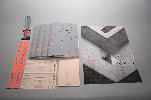
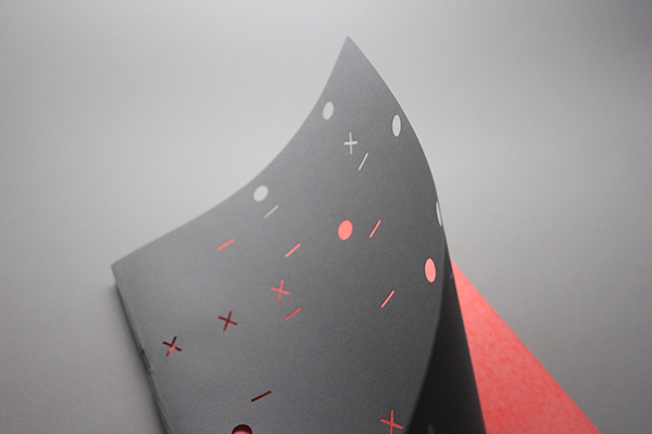
During the weekend we all went away and did some research and a couple of us found this example of exhibition advertising. We liked it for the minimalist approach with a pop of bright colour cleverly inserted through a cut cover of the catalogue. We also really liked the idea of using wristbands as tickets as it adds to the exclusivity of the event. We thought after looking at this design that we could use the laser cut facilities in college for the cover of the catalogue and wristbands if we decide to create them. We also wanted to replicate this very contemporary yet sophisticated tone of voice as we felt though the exhibition is one brief it could be a big opportunity for us to get our work out into the real world and have professionals look at it therefore the branding has to attract lots of people and this style has a large audience.
British Independent Film Festival


Another really inspiring piece of exhibition design was this by the British Independent Film Festival. The thing that initially wowed us about this design was the overall interactivity of the design. It seems that each element has been crafted to have the visitors affect the environment. Particularly with the vinyl decals on the walls - we loved how they play with perspective so you have to step back or change position to see the full picture. Also the perforated invitation is a very playful touch, enticing people in and making them want to pull the tag. Moreover the overall brand used here is very minimal yet effective - using simple geometry and type.
UTS Visual Communication Graduate Show 2013
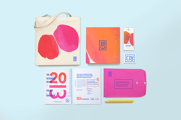
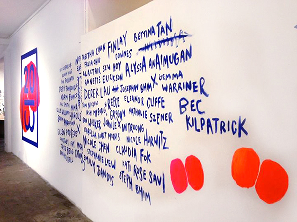
Yet Another exhibition design that we looked at was this graduate exhibition from UTS combining slick graphics with hand drawn text and shapes. We thought that it might be a nice idea to have an interactive wall where people could write on like in this design but rather than having names it could have opinions. After briefly looking at this I didn't see the playful nature of this exhibition but it is sort of depreciating in a way as they have changed UTS to bUTtS and the whole branding seems to around butts. I found this quite funny how I didn't see this initially and I just thought that it was abstract shapes but once you see it, it's so hard to un-see. Even the 3 of 2013 is turned to look like a butt...
No comments:
Post a Comment