Wednesday, 21 October 2015

OUGD504 - Studio Brief 3 - Presentation + Briefing

Today we got briefed on the publication side of our summer brief to collect type in context. I am a bit unsure about this brief because of the quality of the photographs that I took. I realise that this will prevent me from doing anything on a larger scale. However I could work this to my advantage. 

Reading through the brief I can see that the aims of this brief is to explore the production methods of creating a publication. I should consider each of my design decisions and think about how this will affect the production of my publication. Also it mentions that the book would be found under the category of "Art and Photography" so that is where I will start my research. 


Saturday, 10 October 2015

OUGD504 - Studio Brief 2 - Final Crit & Evaluation

Final Presentation

For the final critique I created a small presentation of which I also sent to the creator of the pitch on Kickstarter. Unfortunately they didn't get back to me throughout the brief which I was disappointed at because it meant that I lacked the most important feedback - that of the client. 


Critique:

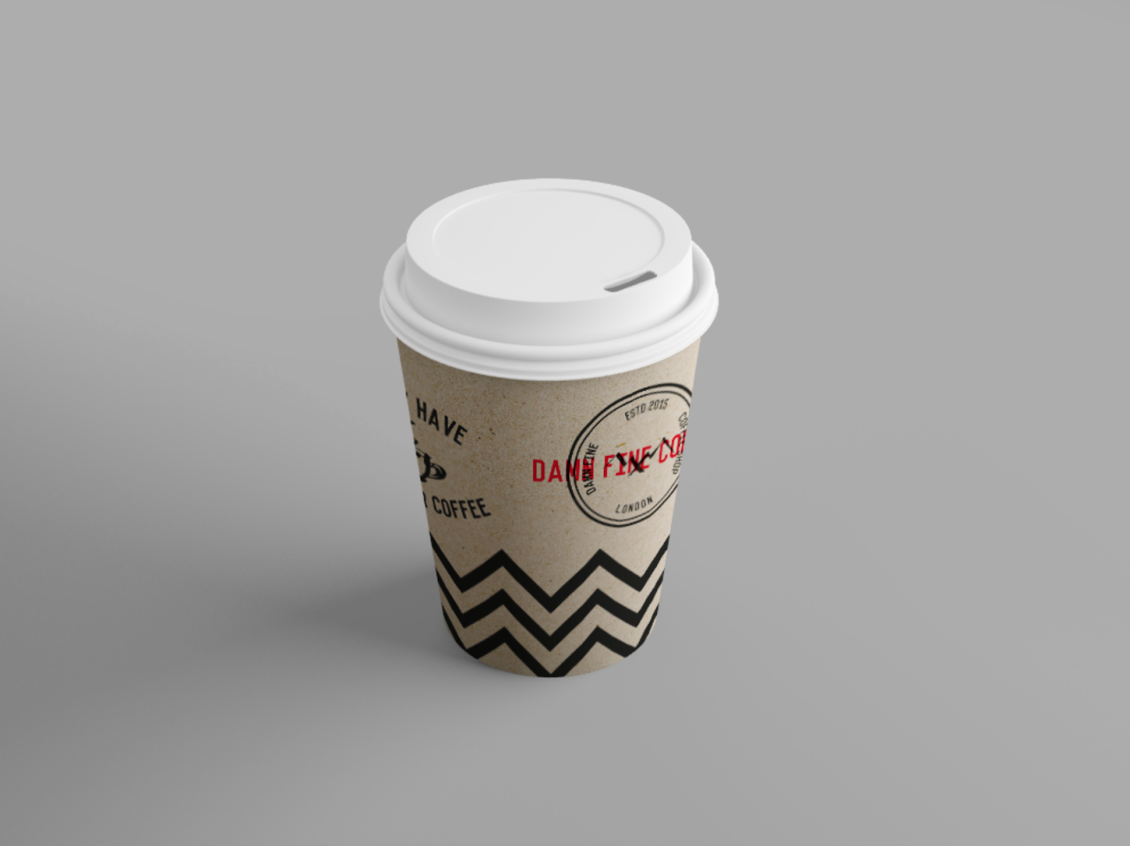
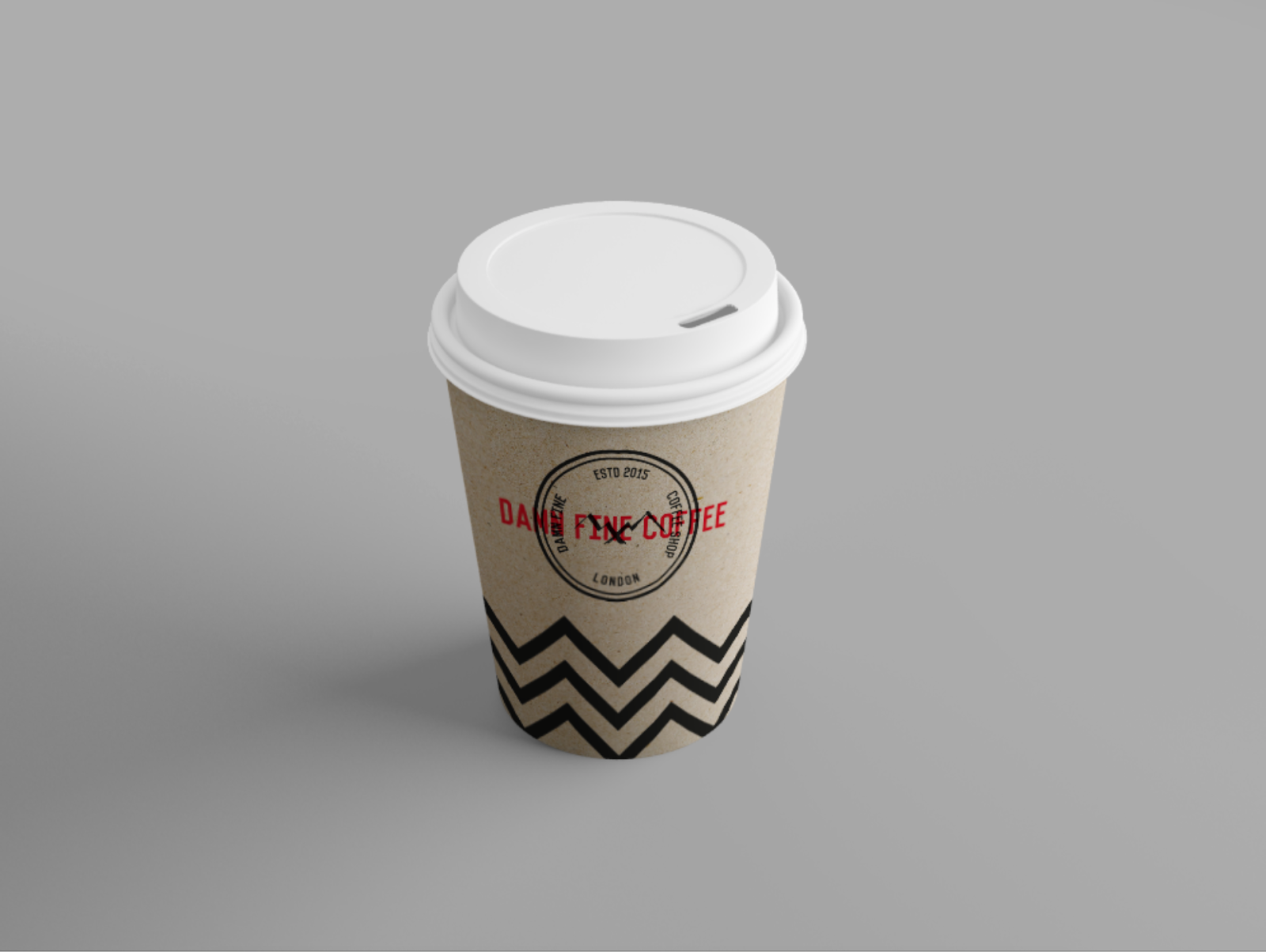
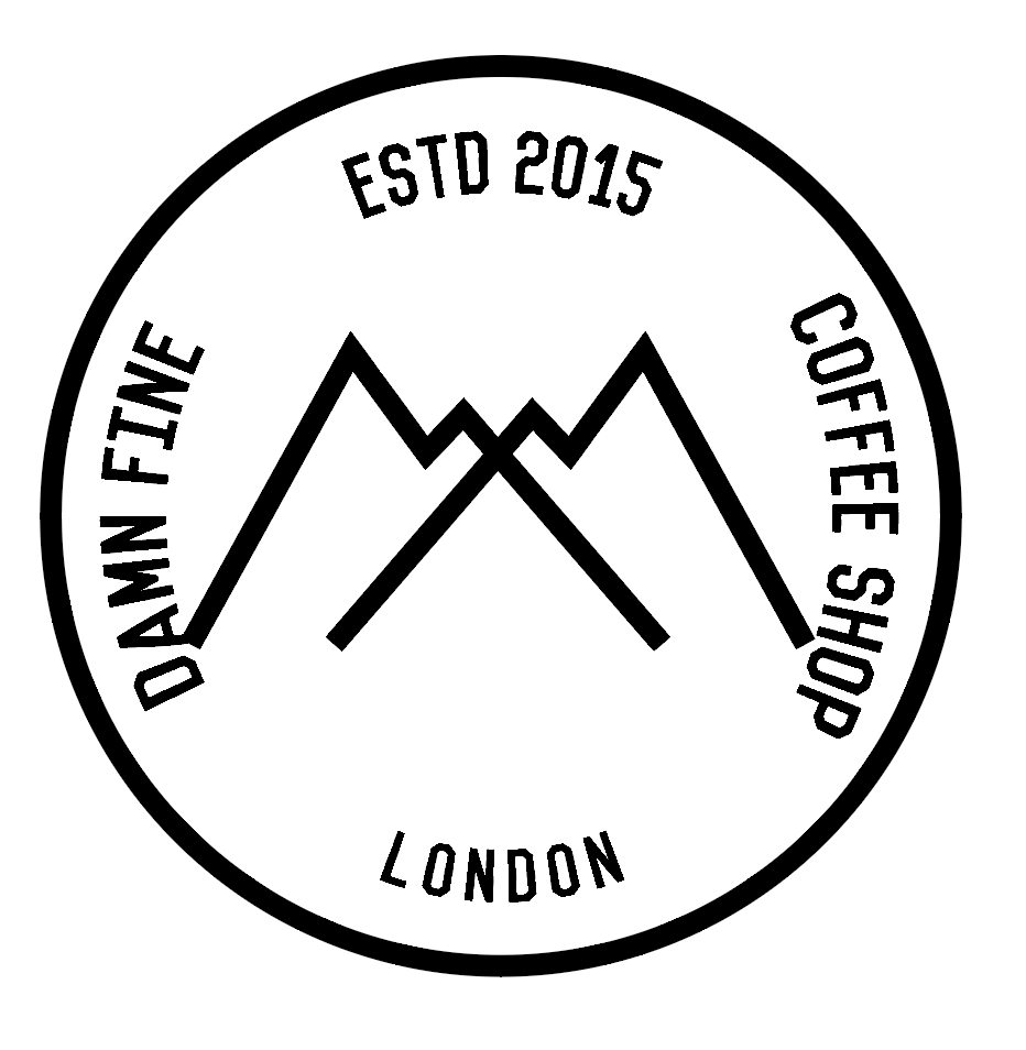
The immediate reaction to the logo itself was that it looks like a stamp. Which I am quite pleased about because I was going for that look where it could have been a stamp on the side of a sack of coffee. However someone suggested that the red type kind of looked like a "void" stamp which could be putting the wrong message across. Some people suggested that the logo may look better in grey rather than black after looking at my business card idea. They said that it is a lot more readable like this from a distance and is less confusing. However my tutor said that this slight confusion and surrealism suits the style of David Lynch's films. But I suppose it is just up to people's opinions whether they like this effect or not. However when I did justify this people did eventually change their mind.

One suggestion was that I could try and really push the boat out with the design and make it look even more surreal, perhaps distorting the logo. However I don't feel like I could do this without making it become unrecognisable as a logo. 

EVALUATION

Overall I have really enjoyed this studio brief showing my passion for branding. It has made me realise that this is definitely one of things that I would like to specialise in. Although, I was very disappointed that I didn't hear back from the Kickstarter project that I chose but I think that I did well considering this. 

With this studio brief being only a week long I felt pushed for time. However once I had chosen my project ideas came to me pretty quickly and I managed to get ahead pretty early on in the week. I think that this is down to how much I enjoyed myself meaning that I kept going back to change little bits of the logo and looking into other brands.

I think that overall I managed my time really well - I was able to complete the logo design and some samples of branded materials before the final critique. Even though I didn’t follow a time plan for the brief I was still able to keep track of what to do on which days so that I didn’t spend too much time on one part of the brief to then not have enough time to work on another.

However if I had more time with this brief I would want to experiment with Letterpress as I really wanted to try this out to create textures. But because I didn't have the induction yet I was unable to try out a logo idea in letter-pressed type so I had to simulate it digitally. Also I would have liked to tackle the packaging of the signature coffee that they sold to make everything tie together into one finished product. Additionally I would have liked to make a brand guidelines book for the customer to use. But because we only had a week all of this was not possible.

Friday, 9 October 2015

OUGD504 - Studio Brief 2 - Collateral Development

I decided that I would create some collateral mock ups to show the client as well as the logo to see how it looked while in use. The most obvious collateral that I could think of would be a coffee cup to take away and a napkin. So initially I incorporated the logo as well as a quote from twin peaks on a simple coffee cup. 


The simplicity of this coffee cup works however all the elements feel squished into one column. Maybe it is a bit too much to put onto the cup - it could just be the logo and nothing else. However I really like the contrast between the brown paper and the red flourishes of the logo. It feels very David Lynch.


After looking at my other cup I decided to remove the extra elements and use a geometric zig zag pattern that was used on the floor within the dream scene sequence (see below). I felt this felt like the cup could be a representation of the dream sequence as the red in the logo represents the curtains and the zig zag represents the floor. 


I updated the logo to my new version which I had created after the critique. I felt like the cup also needed to be a bit more interesting to look at so as well as the logo I added the quote from twin peaks again but in a more dynamic style.

OUGD504 - Studio Brief 2 - Final Collateral & Production

THE SHOP


For the shop front I wanted to show the dark vibe yet make it still look approachable and like a coffee shop.  I reversed the logo for this - I think that it looks really effective with white on a black background because it feels like it creates a higher contrast. 


THE PRODUCTS

I also mocked up some collateral that would be used within the coffee shop. I used mock ups to show to the client because it saves me printing things out when the client might not like the designs. 


I mocked up a napkin because in my opinion this is one of the most important products in the coffee shop! I mocked it up to be embroidered on cloth however a disposable printed napkin would be much cheaper to produce and print on. 


I also mocked up a business card on which I used embossing for the stamp part of the logo. I thought that this works especially well because it makes the red name more readable than with the black behind it while still keeping the stamp design. Although this looks like a very professional business card the fact that it is embossed would put up the cost to print the business cards and limit the amount of information that would be able to be put on it. Unless the business cards were duplexed so the embossing wouldn't appear on one side making it able to be printed on. Whether or not the business card should be embossed or not would be up to the client so for now I have just left it like this as I think the design is effective. 


I also created a mock up of a burlap bag that customers could buy as a sort of souvenir from the coffee shop. I thought that this would be particularly useful to customers due to the new 5p bag charge that is coming into effect this month. The bags would probably have to be screen printed due to the texture of the burlap but I think that this will give a really organic texture and effect. Though production costs for these bags would be higher than a paper bag it could produce profit if they were put for sale. Paper bags could also be produced along side this for customers who might not want a more permanent bag. 


And of course I mocked up a take away coffee cup for the shop. This would probably be the least expensive thing to produce. Although it would be cheaper to have just a non branded coffee cup I feel that printing their own would benefit them to spread the word of the coffee shop and act as a sort of advertisement. 

Thursday, 8 October 2015

OUGD504 - Studio Brief 2 - Logo Development


After some feedback on my initial logo ideas I was told that the red overlay made the logo hard to read. I was kind of going for this but I still want the logo to be legible on a shop front. So I added a diamond of red in the background instead of the 'damn fine' and made sure that the title was bold in the middle. I also added the flourishes on the top and the bottom of the logo to add a bit of extra information about the shop and to contextualise it a bit. I think that this also works as a method of framing the title and drawing your eye to it. 


I also tried out the stamp logo with a bit more texture added to it. I also tried inverting the colours and simply using white on black without the use of red. I really like this style similar to the logo Benazio used. I'm not sure whether using white as the main colour would be viable across all the collateral though as it is hard to print white ink on black.


I also experimented with the original logotype that I created out of the stamp style. I used another symbol from the Twin Peaks show with the red textured type layered over it. I quite liked the simplicity of this design, however I don't think that it successfully portrays a coffee shop logo through the imagery I have used. 

I decided to go back to the stamp design as I felt that it fit best within the context of the shop. I tried using the Twin Peaks mountain symbol in the background along with the more distressed textured type. I feel like this is lacking something though - without the overlay of the type it is a very plain logo and you wouldn't be able to tell what the logo is for.  

So I went back and removed the overlaid type and placed all the information that is needed into the simple stamp design. However I feel like the symbol is now dominating the stamp a bit too much and needs to be smaller. 


I ended up using the twin peaks symbol that I drew in ink so that it didn't dominate the stamp. I also reduced the size of everything to give more white space and stop it from looking too cluttered. As shown here the logo can be used with or without the red text. If the logo needed to be clearly red than it would be used on its own. But with the nature of Lynch's work I think the red adds to the abstract and surreal qualities of his works. It draws the eye and confuses the viewer perhaps like his films did.

OUGD504 - Studio Brief 2 - Brush Lettering Experiments

To add to the gothic vibe I experimented with inked hand lettering using a 3mm parallel fountain pen, a chisel tip pen and brush and ink. 


I really like the effect that this fountain pen gives especially with rushed strokes. I tried some small illustrations and they had a really nice quality to them. I could try incorporating these into the logo or perhaps on some of the collateral. 


These were created using the chisel tip pen. I am not as keen on them as the others but once again the more rushed version has a nice aesthetic with the contrast in line weight. 


I tried a more script typeface while using the ink and brush but I don't think that this suits the style or theme of the coffee shop at all. The capitalised sans serif is much better suited. 

I then scanned in the pages and vectorised them in illustrator, picking out my favourite from each of the pages. 


This was from the brush and ink version and I think that it has come out really well on screen. It works especially well as white on a black background - it really adds to the surreal and dark nature of the coffee shop. However I don't know whether this would be enough to use as a logotype, I will have to ask for feedback. 

I also really liked this version when I scanned it in. It's a lot edgier and rougher than the others but I think that this works. I'm not sure whether this would work as a logo but I could use this style of type for quotes to be used on napkins or something like that. 

I love how this illustration turned out. The variation of the thickness of the lines mixed with the abstract ness of the illustration over all really makes it stand out.