

After some feedback on my initial logo ideas I was told that the red overlay made the logo hard to read. I was kind of going for this but I still want the logo to be legible on a shop front. So I added a diamond of red in the background instead of the 'damn fine' and made sure that the title was bold in the middle. I also added the flourishes on the top and the bottom of the logo to add a bit of extra information about the shop and to contextualise it a bit. I think that this also works as a method of framing the title and drawing your eye to it.

I also tried out the stamp logo with a bit more texture added to it. I also tried inverting the colours and simply using white on black without the use of red. I really like this style similar to the logo Benazio used. I'm not sure whether using white as the main colour would be viable across all the collateral though as it is hard to print white ink on black.

I also experimented with the original logotype that I created out of the stamp style. I used another symbol from the Twin Peaks show with the red textured type layered over it. I quite liked the simplicity of this design, however I don't think that it successfully portrays a coffee shop logo through the imagery I have used.

I decided to go back to the stamp design as I felt that it fit best within the context of the shop. I tried using the Twin Peaks mountain symbol in the background along with the more distressed textured type. I feel like this is lacking something though - without the overlay of the type it is a very plain logo and you wouldn't be able to tell what the logo is for.
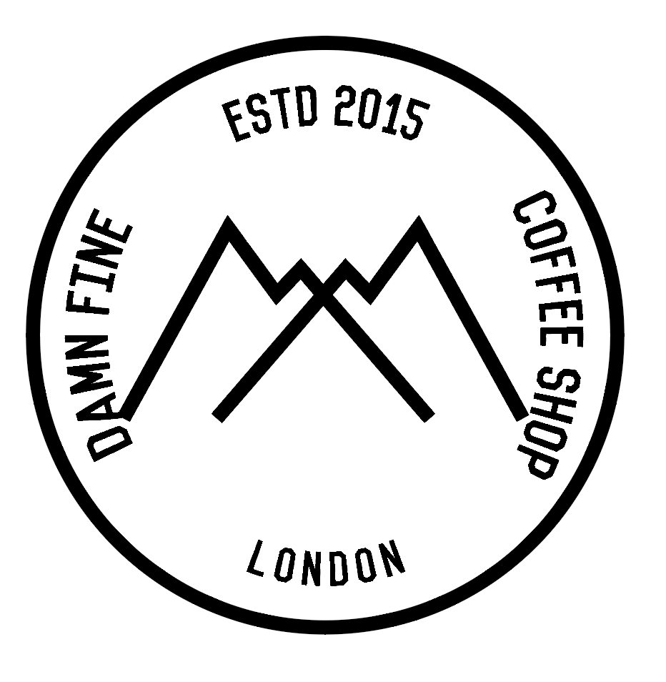
So I went back and removed the overlaid type and placed all the information that is needed into the simple stamp design. However I feel like the symbol is now dominating the stamp a bit too much and needs to be smaller.


I ended up using the twin peaks symbol that I drew in ink so that it didn't dominate the stamp. I also reduced the size of everything to give more white space and stop it from looking too cluttered. As shown here the logo can be used with or without the red text. If the logo needed to be clearly red than it would be used on its own. But with the nature of Lynch's work I think the red adds to the abstract and surreal qualities of his works. It draws the eye and confuses the viewer perhaps like his films did.
No comments:
Post a Comment