
I decided that I would create some collateral mock ups to show the client as well as the logo to see how it looked while in use. The most obvious collateral that I could think of would be a coffee cup to take away and a napkin. So initially I incorporated the logo as well as a quote from twin peaks on a simple coffee cup.

The simplicity of this coffee cup works however all the elements feel squished into one column. Maybe it is a bit too much to put onto the cup - it could just be the logo and nothing else. However I really like the contrast between the brown paper and the red flourishes of the logo. It feels very David Lynch.

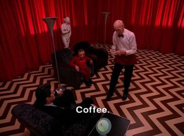
After looking at my other cup I decided to remove the extra elements and use a geometric zig zag pattern that was used on the floor within the dream scene sequence (see below). I felt this felt like the cup could be a representation of the dream sequence as the red in the logo represents the curtains and the zig zag represents the floor.

I updated the logo to my new version which I had created after the critique. I felt like the cup also needed to be a bit more interesting to look at so as well as the logo I added the quote from twin peaks again but in a more dynamic style.
No comments:
Post a Comment