Tuesday 27 September 2016

OUGD603 - Lifting Tower Projection


OUGD603 - Roots Collaborative Brief

Roots was the creation of me and my fellow classmates last year for PPP Taking Care of Business. We have decided to continue this collaboration through to this year to create analogue work to help solve a current issue in Leeds.


We came to the conclusion that traffic and congestion was a problem within Leeds that affects quite a lot of people getting to work in the mornings. Whether people use public transport or drive themselves there are always queues. 

We thought that we could help to relieve this congestion through promoting cycling to work and or university. However we were unsure what target market to aim this at so we need to do some research on who is most affected by the congestion getting into Leeds. I have a feeling it will be the working professionals as they will commute a lot further than most students. 

Research
For cycling, there are distinct differences by gender: at all ages, lower proportions of women tended to cycle than men - on average, 20% of men cycle, whilst only half that proportion of women did so (10%). However, for both genders, there is a decline in cycling levels between 25-34, before a further rise; levels then decline with age. 
So it seems that more men cycle than women. Perhaps we can alter this and aim a campaign at getting more women to cycle.


Monday 19 September 2016

OUGD604 - Brief Ideas - Print Typography & Lettering Awards

After searching online for some live briefs I came across this competition to create a peice of work that involves lettering and typography. Below is the brief.


DEADLINE: October 14, 2016
Typography is one of the most vital keys to successful design—and Print’s Typography & Lettering Awards is here to celebrate it. But this isn’t just a competition for classic type designers: We’re looking for projects that feature great uses of type by any designer. We’re looking for handlettered work. And, of course, we’re also looking for original typefaces built from the ground up.
All too often, typography gets overlooked in larger design competitions these days—which is why we developed one that gives the artforms their full due and recognizes the best designers in each category.
Whether you design your own typefaces, design type-centric pieces or create gorgeous handlettered projects, we want to see your work—and share it with our readers.
Enter today for a chance to be featured in Print magazine, receive a prize pack from MyDesignShop.com, and more!
This competition struck my eye because hand rendered typography is something that I have really enjoyed doing in the past and  have been able to create some good results with it. Also I thought I could maybe experiment with 3D lettering again similar to what I did for the Hort brief and my WWF type to set my self out from the usual hand lettering. 

Sunday 18 September 2016

OUGD604 - Brief Plans - Collaborative Brief

For the collaborative briefs this year I wanted to tackle one competition brief as well as create a brief that solves or helps a modern issue (be it ethical, moral, environmental or social).

If I was collaborating with someone on the course I think that it would be a good idea to do a printing project perhaps tackling an issue. So I have looked into some local issues in Leeds to be able to create something that could make a difference or raise awareness. After doing a little research I came up with a mind map for some key areas that could be tackled.


I think one issue that is definitely noticeable every time I go into the city centre is homelessness and people begging. And that pang of guilt you get when not being able to spare change for them. There are many charities to support the homeless like the Big Issue which allows people to get money for selling the magazine. One charity that I found that seems to really boost awareness in a graphical way is Simon on the Streets (http://simononthestreets.co.uk/). They are planning a fundraising event called Sleep with Simon so people can sleep on the streets and put themselves in the shoes of the homeless. They also offer support to homeless people who more often than not have underlying issues, both mental and physical, that got them on the streets.

I believe this cause is definitely one that needs to be tackled in Leeds and the surrounding areas. My initial idea was to talk to the common faces that you see on the side of the streets and hear their story. I think that this will make them seem more human to people who think that they are just lazy or begging because they can't be bothered finding a job.

https://www.behance.net/gallery/16861787/Spare-Change-News

Tuesday 6 September 2016

OUGD604 - Brief Plans - Star Pack Awards


After developing packaging for my final brief last year I decided that I wanted this to be my focus for my final year. I really enjoy creating friendly and approachable food packaging solutions and I am even focusing my dissertation on packaging this year. 

So I took a look at Star Pack's awards briefs from last year to get an idea for what kind of briefs they could present his year. The one that struck me was to create packaging using corrugated board. I really liked this brief because I thought that it would allow a lot of experimentation using the raw feel of corrugated board, creating quite a rustic feel to a product. 

Board of other materials? Try using corrugated!Sponsored by DS Smith PackagingEither: Using corrugated board, develop a piece of packaging as an alternative to any existing packaging made with other materials;
Or: Using corrugated board, design a non-packaging product, currently made from other materials, such as plastics, metals, wood or composites.
The Prize 1st prize £500, 2nd prize £250, 3rd prize £125
For this particular brief you would have to find a product to design the packaging around, making it a brief that could fit any situation.

 Winning Entries:


Looking at the winning entries I see that in most cases the actual design on the packaging wasn't commended that much. It is more about how effective the corrugated cardboard solution was. For the 1st place design (above) this was the judges comments "Interesting take on the use of corrugated, great attention to detail and finish to the board. Really good!"
So I think for the entries you have to have a specific target market to aim the packaging at as well as a lot of thought into how the product reacts with the packaging.

Thursday 19 May 2016

OUGD505 - Studio Brief 1 - Design Boards


OUGD505 - Studio Brief 2 - Design Boards


OUGD505 - End of Module Evaluation

As a whole I have really enjoyed this module. In studio brief 1 I enjoyed experimenting with my printing practice through screen printing for the bank notes as well as researching into a culture that i am interested in. I feel like the notes that I created were successful in portraying the future of the Japanese Yen. It definitely made me explore a style of graphic design that I haven't really explored before - one which is a bit more minimalist. 

In studio brief 2 I was also working on something that I am very passionate about. It goes to show the difference for designing for a cause that you support rather than something random. Additionally because towards the end of this module it was the only brief that I was working on I felt a lot more focused than with other modules which meant that I produced a lot more than I would have if I had briefs running either side of it. The outcomes that I created were of a better quality because of this too because I would go back and change little bits at a time until I was fully happy with it. Creating packaging again has re-inspired me to carry on with packaging as one of my main practices. I feel like the packaging element was the strongest part of this module. 

Although because I already had a fair amount of knowledge on my chosen topic I feel like I didn't spend enough time researching it as maybe I should have done. Perhaps my designs would have been a lot more informed if I had done a little bit more research. 

I feel like this brief has set me up well for my practice next year as curating my own briefs has given me a good focus which I hope to carry on into next year. Also both briefs of this module have been doing things that I do want to do more of in third year as part of my extended practice. 

Wednesday 18 May 2016

OUGD505 - Studio Brief 2 - Final Food Range


Overall I am really happy with how this packaging came out, I feel like it looks very professional. I think that it fits the target market of 5-10 year olds while also appealing to parents. From my final development designs I added puzzles and trivia to the back of the packaging so that children have something to do while eating their meals. Also I added a QR code which when scanned links you directly to a digital copy of the book "Perry's Adventure" on issuu.


If I had more time I think that I would have developed the snacks a bit further but I am glad that I put all my effort into this as I feel like it would persuade people that they can eat a vegan diet while still growing up strong and healthy.  A supporting adult food range might be a good place to spread the range as I feel that they are in more demand. 

Monday 16 May 2016

OUGD505 - Studio Brief 2 - Distribution of Products

Having completed the book and the food range I am now thinking about how they should be distributed and where. Because the book is a simple soft cover with a saddle stitch it won't be hard to reproduce and could be cheaply distributed with ease. So maybe the book could be in bookstores such as Waterstone's or WH Smith. But they could also be distributed to vegan or vegetarian cafes for the customers to read to their children while they eat the food there. 

The food range on the other hand I feel is quite niche because its aimed at children and parents who are vegetarian or vegan. Although I suppose that it doesn't necessarily have to be bought by vegetarians or vegans as they can be eaten by everyone. But I think that they would only be sold in higher class food supermarkets and health food shops like Booths, Waitrose or Holland & Barrett. 

To promote both products I would probably put adverts in health food magazines or vegan magazines. Hopefully they would get the endorsement of various vegan charities such as Peta for more exposure. I am not sure whether tv advertisements would be relevant as it is such a niche type of product. 

OUGD505 - Studio Brief 2 - Final Book - Perry's Adventure


Overall I’m really happy with how the book turned out. However I did have a few problems when I printed it because of the full bleed vector illustrations. The middle page skipped some of the illustration when printing which is really disappointing but everything else printed fine. I chose a bright thread to do a saddle stitch to add an extra pop of colour. The overall construction of the book went really well, I feel like it is created quite professionally. 

I could have done a hardback cover to this as well but I feel that making it more readily available at a cheaper price would mean that I could spread the message further.  If I was to create the book again I would probably spend more time on considering how the bind and print will effect the illustrations because I did come across issues on strips of the other side of the illustrations came through. 


OUGD505 - Studio Brief 2 - Illustration Development

After the critique I changed the colours of the illustrations to go from a blue hue to the warmer colour scheme that I planned to use initially. This way it represents the mood of the characters in the book as well as not being overly feminine. As well as this I decided that the illustrations would be much more effective spread across a double spread rather than fragmenting them into one page each. This also leaves more room for extra details within the illustrations. 


I also developed the illustrations further from my storyboard, trying to adapt the colours into a sort of gradient as the story progress. I did this by lightening off the blues and adding elements of yellows to the designs. 


When I finished all of the illustrations I asked for some more feedback and it was mentioned that while the characters are really geometric some of the elements of the background were a bit wiggly. Initially I thought this was good because the detail lacked here made you focus more on what the characters are doing. However I did change the shrubbery and trees to be a bit more defined and I find it fits the style of the illustration a lot better than the previous attempts.


One of the main challenges that I came across once I had completed all of the illustrations was where to place the text. I hadn't really left a specific area of the page on any of my illustrations where it was blank enough for the text to go. So I ended up having to alternate between the left and right page as well as the top and the bottom of the page too. However I feel that this works as the children will be looking all around the pages rather than focusing on one spot to read it the text.

Sunday 15 May 2016

OUGD505 - Studio Brief 2 - Food Range Development


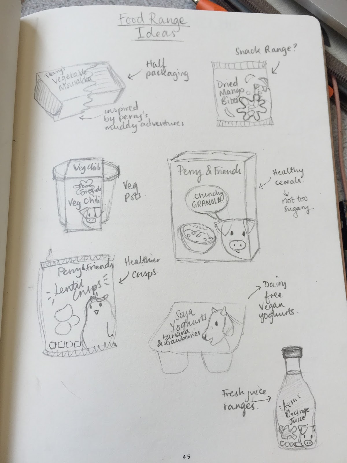
I had lots of different ideas for food ranges so I had to narrow them down a little. I wanted to make something that was healthy and nutritious after reading about children who live on a vegan/vegetarian diet. I think that soya yoghurts might be too niche and juices or smoothies are quite saturated in the market these days. So the best thing I can make in my opinion are the healthy snacks for lunch boxes or the ready meals to help parents effortlessly give their children lots of nourishment within one meal.

I started by designing some basic packaging for ready meals. I really liked the idea of having a squiggly window where you can see the food inside. Having something a bit out of the ordinary like this would attract more attention. Also I had to think of meals that might be child friendly as well as being vegetarian or vegan. The first meal that I thought of was Moussaka because it contains lentils for protein and you can add spinach for iron and it's a really tasty dish. 


Also a hearty chilli, holding back on the spice, contains lots of protein from mixed beans and wheat berries. I have added a range for each of my characters and hopefully as the brand would expand so would their range and new characters would be introduced. I also wanted to add to the approachable-ness of the packaging so I made the the text into a speech bubble as if the characters were talking to the children. I feel like the mix of these interesting shapes makes the over all look more pleasing. 


As I progressed with the designs I decided that instead of using a rectangular tray for the packaging pots would be a lot more effective. I find when I have a pot from a ready meal I tend to keep it and reuse it a lot more than if I had a rectangular one. This fits in with the vegan ethos of being environmentally friendly. I might put some ideas on how to re use the pot on the underside of the printed sleeve (using it as a plant pot, pencil pot etc). 


I also started working on some ideas for snacks that children could take in their lunch boxes as an alternative to unhealthy crisps or chocolate. However I am not as keen on these designs as I was with the packaging. I feel that to live a healthy lifestyle fresh fruits and vegetables would be much better snacks than anything dried or processed.