Saturday 30 April 2016

OUGD505 - Studio Brief 2 - Children's Food Ranges

As suggested in some of the feedback I decided to start researching into different kid's food ranges. I found that M&S has a healthy children's food range that is supported by Great Ormond Street Hospitals which is really interesting. It outlines on their website about the health benefits of eating more vegetables and outlines other things like additives.


M&S has formed a partnership with Great Ormond Street Hospital Children's Charity to fund groundbreaking new research into children's gut disorders. We are donating £500,000, which will help to pay for a new gastroenterology research unit at the hospital.  
The Gastroenterology department at Great Ormond Street Hospital is one of the UK's leading centres of excellence in treating complex diseases affecting the gut and other associated organs.
About Our Range  
We offer a range of foods designed specifically for the nutritional needs of children. All our Simply Kids prepared meals and desserts will display our Eat Well sunflower logo. This means they must meet strict nutritional criteria for calories, protein, fat, saturated fat, added sugar and salt.
kids foodOur range now also includes Spaghetti and Meatballs, made with Aberdeen Angus beef, Fish Pie with Juicy Peas and Cheese and Tomato Pasta - and with the range starting at just 99p, Simply Kids is an affordable way of providing nutritious meals for kids - which will make mums and dads happy too! 
Eating More Vegetables 
Most of our children's prepared meals, including the Nice Rice Chicken and Sausage Mash and Gravy, contain at least one portion of vegetables which will count towards their 5 a day.
Snacking
A healthy diet can include snacks and to help chose the better options we have also launched a selection number of treats, such as biscuits and popcorn that are all portion controlled. At less than 150 calories each these products also meet the governments 2012 salt targets. 
Additives 
A particular concern for our customers are the levels of additives in children's food. In response to this we have worked with the Hyperactive Children's Support Group who support the limited range of additives that we allow in our children's range. This includes no artificial colours, flavourings, sweeteners, added preservatives or salt substitutes.
The design of the M&S packaging itself is really friendly and inviting with lots of bright colours and illustrations. The typography is also set in wide friendly looking fonts to once again make the packaging more inviting, making children and their parents want to pick them up and put them in their baskets. Once again characters have been used outlining what is contained in the dish. This time with cheese and tomato rather than an animal. I don’t really understand this concept of personificating something that you’re going to eat.


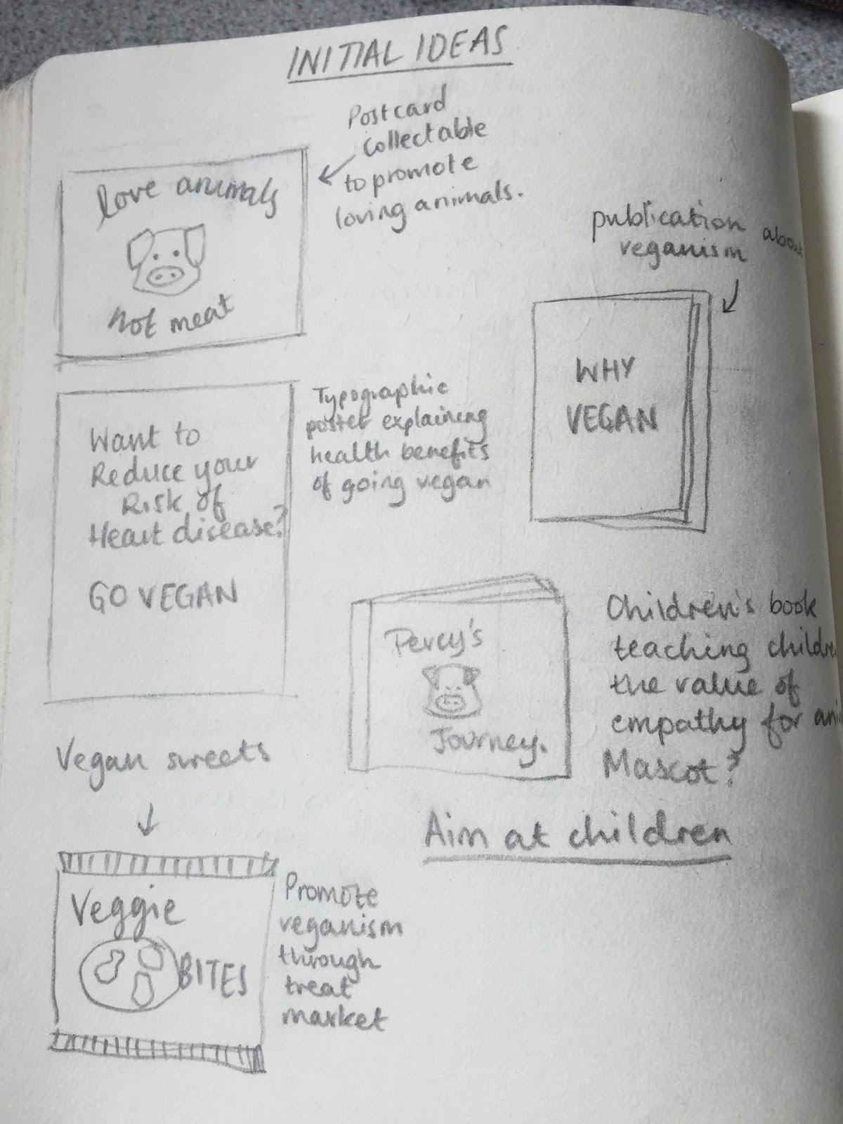
I went on to look for more adventurous packaging designs and came across these designs. I'm not entirely sure what food is contained in this packaging but I love how bold and quirky it is. I like how the packaging itself is a character, making it very appealing to young children. Perhaps I could use Perry and his friends as the packaging and use things like tags on them to provide all the information.


The Little Dish packaging is a more wide spread brand of food for children specifically ready meals. While less bright than other packaging designs I have come across the use of illustrations of characters for the corresponding meals makes it appealing to both children and their parents. Although I find it slightly sadistic that a chicken character is used for chicken meals and a salmon is used for salmon meals etc. It's like telling children that they have these friendly characters who are there to be eaten. I want to portray the opposite of this message in my packaging showing that you can save the characters by choosing not to eat meat. 

A more simple design that I found was this one for yoghurt tubes. I really liked the use of the mixture of photographic elements and doodles on top of them. However I do feel like this would be aimed at a slightly older target audience to mine due to its minimal packaging. The use of black and white paired with the flavour colours makes them really bold and the flavours unmistakable. Although the doodles could be used to be interacted with while the children eat their lunches, like a colouring book. This made me think that maybe I should include a puzzle of some sort on my packaging. 


Tuesday 26 April 2016

OUGD505 - Study Task 3 - Disobedient Objects North

THE BRIEF

Understanding the needs of specific layouts for specific jobs is key to your development and practice. There are many times as a designer that you will have to consider differing formats for layout due to clients’ needs and also the need of information.

This one week task is a practical exercise that will highlight layout skills and understanding of application of text, point sizes, columns, margins, gutters, image, page size, bleed, scale, format, pagination, fluidity, audience and composition.

You will be given dummy type / text / images to work with during this task that is studio based. You will be given instructions per layout requirements and also a context to help you decide how information should be positioned and organised.

You will be expected to add your own design flourishes upon these designs, where appropriate.

You will share visual representations of your work with a partner / small group.

Layout 1 – Minimal Text / image: A5 Flyer

Layout 2 - Text Heavy / Imagery: Concertina spread (10x A5 pages)

Extended Practice:

As soon as you have completed your flyers and brochures, you are expected to extend the range of design across platforms. Suggestions are: Poster / mail shot / tickets and appropriate mediums.

DESIGNS

I started off by experimenting with the black and white flyer. To add some extra interest I halftoned the imagery. For the text I wanted to go for a police tape kind of style. I feel like this suits the things in the exhibition because they are all about guerilla advertising and protesting. 


Adding a frame to the image rather than the full bleed image works a lot better in showing the tape like title in my opinion. Also it meant that I had some room down the sides to add the dates of the exhibition. 
I created two variations with different images but the same information. I feel like this serif type is really effective because it reminds me almost of a stencil typeface due to the dramatic difference in line weights. 

At first I wanted the leaflet to be really stylised so I changed the colours of the imagery to be a red with black. I feel like this makes the exhibition seem a lot more controversial and edgy. However when re-reading this part of the brief I found that the images had to be full colour so it takes away from my idea of a limited colour scheme. 


I used a ripped paper effect to add to the add lib style of the exhibition. I really like the texture that this creates, separating the imagery and text with a bit more interest than just white space. At first I struggled with arranging the text and the imagery but I found using more full bleed images helped fill up the empty spaces and found room for an extra map on the back of the leaflet. 


For the extended practice I produced a ticket to the exhibition follow the same sort of guerilla theme as the flyer and leaflet. I produced it in black and white to save costs on printing because the exhibition was free admission so spending more on the tickets would be redundant. 


Overall I'm not sure what I thought about this task. At first I found it enjoyable because I was able to do whatever I wished with the content provided. However it was hard to produce without guidance of what the client wanted or who the target audience was. It has taught me that learning as much as you can about the target market and clients aims is really beneficial to the design outcome. 

Thursday 21 April 2016

OUGD505 - Studio Brief 1 - Final Designs

For my final designs I struggled to chose between two sets of notes. One where I had experimented with marbling and mixing the inks and the other where the colour was a bit more flat making the designs clearer. 


In the end I chose the more unique design as I feel like the marbled colours add more interest to the bank note as well as making them hard to reproduce if someone wanted to forge them. I found out after printing them that the characters that I printed in the gloss ink are in the wrong order. I suppose this is the difficulty when doing something in a different language, I couldn't easily noticed that the characters were in the wrong places. But at the same time it isn't that noticeable because of this. Yet it has taught me to triple check the designs and positives before going to expose a screen. 

Additionally I have made all the bank note the same size, but in reality they would probably be different sizes in order for people to easily differentiate them from each other just by the size of the note alone. 

Rationale:
These bank notes are based on three of the five Japanese elements: Void (Kū) represented by the temple as it is a spiritual energy within the body, Water (Sui) represented by the koi fish to show the fluid and flowing elements of the world and Earth (Chi) represented by the cherry blossom (Sakura) showing the solid state of nature through a beautiful object. 

Evaluation:

Overall I have really enjoyed experimenting with this particular studio brief. I feel like I have learned about interesting production methods through screen printing as well as improving my printing techniques in general. I am now very confident at setting up my own screen, cleaning, coating and exposing it without any assistance. The final outcome that I have created I feel is very relevant to Japanese culture while maintaining a modern and contemporary style. I wanted to emphasise that the future of banknotes will remain a physical currency so I think that having a beautiful looking bank note is a step towards this. 

I also feel that my time management on this project has been good as I managed to get everything prepared and printed way before the deadline, printing the actual notes themselves in one day. This meant that I had a bit more time to focus on the second studio brief of this module and research it further. 

If I had more time to do this brief I would probably do the backs of the notes as well as the front. However I feel like even as a one sided piece they are successful. 

Wednesday 20 April 2016

OUGD505 - Studio Brief 2 - Vegetariansim and Veganism in Childhood

Benefits:
There have been few studies looking at the long-term health outcomes of vegetarian or macrobiotic diets in children. Adult vegetarians have lower intakes of fat, a lower body mass index and lower mean serum cholesterol levels than nonvegetarian individuals (). Thus, these findings suggest an indirect effect on reducing the prevalence of coronary artery disease, with a potential decreased risk of mortality in the future (). In addition, a large study of adults conducted in 1984 showed that Seventh-day Adventists, proponents of a vegetarian culture, have lower age-specific mortality rates than the non-vegetarian population ().
Concerns:
The American Dietetic Association () and the American Academy of Pediatrics () state that a well-planned vegan diet can, in fact, support adequate nutrition in the growing child. However, as health care professionals, we should become concerned when foods within strict vegetarian diets or macrobiotic diets are not appropriately chosen and/or lack adequate supplementation.
Protein intake
Total protein in vegetable-based foods is lower than in animal sources; plant protein is less digestible than animal protein; and many vegetable proteins are deficient in one or more essential amino acids (). Nevertheless, human physiological requirements for a well-balanced source of amino acids can be met if a variety of plant proteins are consumed, and additionally, if caloric needs are met ().
However, diets such as the macrobiotic diet are more restrictive during infancy and are of greater concern. One study () of Dutch infants on a macrobiotic diet, ranging in age from six to eight months, found that 59% of infants had a protein intake of less than 80% of the Dutch recommended daily intake. 
Energy intake
As a vegetarian diet becomes more restrictive, the energy intake requirements become more difficult to attain. The vegetarian diet is a bulky one that can restrict energy intake in children. Furthermore, energy intake in infants receiving macrobiotic diets compared with vegetarian diets is considerably lower than the recommended requirements (). A major potential concern relates to the expanding knowledge of the critical window of early environmental influences on subsequent child development and health (). Because the energy density of macrobiotic diets is lowest in infants during the weaning period of 10 to 12 months of age, this diet could adversely affect their future growth and development ().
The growth of a child is a sensitive indicator of the potential negative effects of vegetarian, vegan and macrobiotic diets. Children younger than two years of age who were fed vegetarian or vegan diets exhibited significant lower mean weight and length velocities () and were overall lighter in weight and smaller in stature than reference populations (). The Farm Study () analyzed 404 children from a vegetarian community in which parents were well educated about the diet and children were supplemented with the appropriate minerals and vitamins. While these vegetarian children were within the 25th and 75th percentiles for United States growth standards, height for age and weight for age were below the median when compared with reference populations for most ages. Values were statistically significant for children younger than five years of age. Thus, with the appropriate supplementation and parent education, children on vegetarian or vegan diets can attain adequate growth, but it may be somewhat less than reference populations.
In children following macrobiotic diets, weight and length were more depressed when compared with vegetarian children (). A marked decline from the median for reference weight, and height and arm circumference, was observed between six months and two years of age, following which a partial catch-up for weight and arm circumference was reached, given no change in diet. However, no catch-up growth in height occurred in macrobiotic children, which may indicate the existence of chronic nutritional deficiencies that do not allow for adequate catch-up growth (). 
Vitamin D
Because vitamin D is most commonly found in fortified milk products, egg yolk or oily fish, it is the most likely vitamin to be deficient in vegetarian and macrobiotic diets, but not in lacto-ovo-vegetarian diets. Exposure to sunlight may be an unreliable source of vitamin D, especially in northern areas and dark-skinned infants; thus, supplementation is important to avoid an increased risk of osteoporosis or rickets (). 
Vitamin B12Plant foods are not a high-quality source of vitamin B12. Thus, it is not surprising that studies have shown low serum concentrations of vitamin B12 in children on vegan and macrobiotic diets without supplementation (). Vitamin B12 deficiency is not a benign condition; it may lead to megaloblastic anemia and neurological disorders. Mild vitamin B12 deficiency in infancy, with or without hematological signs of deficiency, may be associated with impaired cognitive performance in adolescence, specifically, fluid intelligence (which involves reasoning, the capacity to solve complex problems, abstract thinking ability and the ability to learn), spatial ability and short-term memory (). Moreover, lack of cobalamin may lead to long-term neurological disorders in infants and toddlers fed vegetarian diets (). In addition, recent data indicate that the adverse effects of cobalamin deficiency in the macrobiotic community may not be restricted to just early childhood, but may also cause symptoms related to impaired cobalamin status later in life. Even a change to a lacto-ovo-vegetarian or omnivorous diet at six years of age is not sufficient to restore normal cobalamin status in previously strict macrobiotic adolescents (). Thus, it is obvious that vitamin B12 supplementation for children consuming vegan and macrobiotic diets is essential to ensure normal growth and development. 
Iron
Iron intakes in vegan preschoolers have been shown to be above the current recommended daily allowance (); however, nonheme iron from plants is less bioavailable than heme iron from animal sources. Consequently, iron deficiency anemia has been shown in many studies to occur in vegetarian children and in a greater proportion of macrobiotic children (). Iron deficiency is also not a benign condition, because anemic infants may have significantly lower Mental and Psychomotor Developmental Index scores compared with control infants (). Thus, iron is another nutrient that should be monitored in children who follow atypical diets. 
Calcium
Calcium intake for vegan and macrobiotic children may be below current recommendations (), and their diets may contain substances found in plant foods that may impair calcium absorption (). Low calcium may result in rickets () and reduced bone mineral content or osteoporosis (), with important implications for future fracture risk. Therefore, foods rich in calcium, or calcium itself, should be supplemented to assure adequate intake.

Overall this study shows that the vegetarian diet might be potentially bad for a growing child. However it does state with proper planning of meals and nutrients that it can be possible to grow up very healthy on a vegan or vegetarian diet.  This may put some people off cooking these meals for their children. If I am going to make a food range for children that are vegetarian or vegan I would want them to be as rich in nutrients as possible. I should focus on iron, protein and energy rich foods in order to create the healthiest meals possible.

Tuesday 19 April 2016

OUGD505 - Study Task 2 - Insects

We were tasked with coming up with a solution to make insects more commercially viable and more popular rather than something that is "gross". We used a method of exploring the problem through using sticky notes. We wrote down all of the ideas that came to our heads whether they seemed far fetched or fairly normal. We started by writing down the problems of why insects aren't popular. 


Most of the problems seemed to be either with the appearance of the insects or people's perceptions of them. People seem squeamish about having the insects whole and seeing their faces. 


Most of the solutions that we came up with involved making the insects into something where they weren't recognisable or changing them into something tasty. 


In the end we decided on the problem: that bugs look gross and society struggles to accept it. So our solution was to promote it to the younger audience so they could grow up eating insects and therefore become used to them and not find them weird to look at anymore. To do this we thought we could change the bugs into snacks for kids, i.e. cereal bars where they aren't really recognisable. 

Overall I really liked this method of exploring a topic because it means that you don't have to be precious about the answers that you come up with. So I found that I got a lot more out of this method than I would have done if I had created a mind map. Also having other people's minds on the same subject widened the scope of the answers that we got. 


Sunday 17 April 2016

OUGD505 - Studio Brief 2 - Positive Vegan Campaigns

After looking at my survey results and results from my critique and talk with my tutor I decided that the best course of action would be to create a campaign against animal cruelty in farming that was a positive one. One that doesn't include horrific imagery or shames people for eating meat. So I tried to look for similar campaigns that do promote veganism without being too negative. 


I found these posters by the Vegan Society that promotes vegan products without actually saying you have to cut out anything. The concept of "You don't have to be vegan to..." is really effective in making people feel better about themselves and hopefully promotes supporting products that don't support animal cruelty. 


I also found this set of posters which are quite folksy and quirky. The messages are really simple and have a bit of humour behind them. It takes a very serious situation and makes it quite simple. It suggests to eat more veg but doesn't shame anyone for eating meat. Only in small print at the bottom does it mention what it is really about. The naive typography and the pastel colours all give a friendly tone of voice which draws in the viewer and makes it an approachable piece of design. 


One campaign that caught my eye in particular was the Veganuary campaign where it asks people to take up being Vegan for just one month to challenge themselves. It doesn't seem to force any views onto people it only suggests some reasons why, two of which are just for the person themselves. The fact that being Vegan not only helps animals but your own health and the environment around you is definitely something that I could play on within my own campaign. 


One of the most interesting things about Veganuary is how many people continue to be vegan after its over. People must think that if they can do it for a month they can do it for longer. Or perhaps they feel the benefits of the change in diet to their health. Either way it seems to be an effective method of stopping some animal cruelty.

OUGD505 - Studio Brief 1 - Further Development

After trying out the more traditional bank note ideas I decided to try out a more modernised version of my designs. I wanted to try and use photographic elements rather than illustrations. So based on my idea to use the elements of nature within each note I tried this by using half-toned images.


Initially I started with a very plain and simple design with the coloured images on a white background for extra contrast. Initially I was going to have a little bit of information explaining what the images represented within the Japanese culture but I imagine this would be more relevant to tourists rather than the residents of Japan.


I decided to make the half-tone of the photographs larger in order to be able to screen print them easily without blocking the screen. However I quite like the texture that this creates, almost like the images are made up pixels adding to the contemporary vibe of the bank notes. 


Rather than having the images coloured I decided to try out having the stock that it would be printed on coloured instead. I really like the bold colours I have used here however I feel that the red is a bit too bold or maybe to similar to the pink so it makes the trio look a bit off. I also Added a similar circle to the one that I used in my other bank note designs using the symbols to make it up. 


After asking for some feedback off my peers they said that the colour of the architecture note worked really well but the other two colours were too bold. So I muted down the pink into one more fitting to the cherry blossoms. Also I changed the colour of the koi fish note to be a lot more subtle and now I feel that it fits in nicely with the trio. 

FINAL DESIGN to be printed


For the final bank notes I added some details to do in a spot varnish to the top, saying "The Bank of Japan" and the Japanese element for which the note represents. 

Saturday 16 April 2016

OUGD505 - Studio Brief 1 - Screen Printing

Producing my bank notes by screen printing was an incredibly fun process for me. I started off by doing fairly normal designs and then moved on to try and marble the ink on some of them with neon or brighter colours. 

When it came to the silver layer of the design I initially struggled with it because the ink was so thin. It would print like glitter rather than a solid silver colour. So on some of the designs the metallic element isn't as bold as I would have liked it to be. Also I had trouble with the gloss as the medium was really tacky and dried really quickly in the screen. So on some of the designs it came out slightly fragmented.


I really like the effects created on the dotted paper from GF smith, it added an extra layer of texture to the designs. If I was to do the notes again I think I would have done them mostly on this paper. 

Tuesday 12 April 2016

OUGD505 - Studio Brief 1 - The Five Japanese Elements

One of my ideas for the banknote was to do the elements of Japanese culture. One part of their culture which fascinated me was their respect for the elements. I could create five notes in representation of each of the five elements. Below is what I found out about each of the elements.
The five elements philosophy in Japanese Buddhism, godai (五大, lit. "five great"), is derived from Indian Vastu shastra philosophy and Buddhist beliefs. It is perhaps best known in the Western world for its use in Miyamoto Musashi's famous text Gorin-no-sho (The Book of Five Rings), in which he explains different aspects of swordsmanship by assigning each aspect to an element.

Earth 
地 Chi (sometimes ji) or tsuchi, meaning "Earth", represents the hard, solid objects of the earth. The most basic example of chi is in a stone. Stones are highly resistant to movement or change, as is anything heavily influenced by chi. In people, the bones, muscles and tissues are represented by chi. Emotionally, chi is predominantly associated with stubbornness, collectiveness, stability, physicality, and gravity. It is a desire to have things remain as they are; a resistance to change. In the mind, it is confidence. When under the influence of this chi mode or "mood", we are aware of our own physicality and sureness of action. (Note: This is a separate concept from the energy-force, pronounced in Chinese as qì (also written ch'i) and in Japanese as ki, and written alternatively as 気, 氣, or 气.) 

Water 
水 Sui or mizu, meaning "Water", represents the fluid, flowing, formless things in the world. Outside of the obvious example of rivers and the lake, plants are also categorized under sui, as they adapt to their environment, growing and changing according to the direction of the sun and the changing seasons. Blood and other bodily fluids are represented by sui, as are mental or emotional tendencies towards adaptation and change. Sui can be associated with emotion, defensiveness, adaptability, flexibility, suppleness, and magnetism.

Fire 
火 Ka or hi, "Fire", represents the energetic, forceful, moving things in the world. Animals, capable of movement and full of forceful energy, are primary examples of ka objects. Bodily, karepresents our metabolism and body heat, and in the mental and emotional realms, it represents drive and passion. ka can be associated with security, motivation, desire, intention, and an outgoing spirit.

Wind
風 Fū or kaze, meaning "Wind", represents things that grow, expand, and enjoy freedom of movement. Aside from air, smoke, and the like, fū can in some ways be best represented by the human mind. As we grow physically, we learn and expand mentally as well, in terms of our knowledge, our experiences, and our personalities. Fū represents breathing, and the internal processes associated with respiration. Mentally and emotionally, it represents an "open-minded" attitude and carefree feeling. It can be associated with will, elusiveness, evasiveness, benevolence, compassion, and wisdom.

Void (ether) 
空 Kū or sora, most often translated as "Void", but also meaning "sky" or "Heaven", represents those things beyond our everyday experience, particularly those things composed of pure energy. Bodily, kū represents spirit, thought, and creative energy. It represents our ability to think and to communicate, as well as our creativity. It can also be associated with power, creativity, spontaneity, and inventiveness.
Kū is of particular importance as the highest of the elements. In martial arts, particularly in fictional tales where the fighting discipline is blended with magic or the occult, one often invokes the power of the Void to connect to the quintessential creative energy of the world. A warrior properly attuned to the Void can sense their surroundings and act without thinking, and without using their "physical senses".

For Water I was thinking I could represent this with a koi fish, a symbolic fish of Japan represented the many water gardens in the country. For Earth I could use plants perhaps like the sakura (cherry blossom) for which the Japanese have festivals to celebrate the blossoms blooming.  For Wind though I am not too sure, perhaps the human mind element of it could be represented by a temple. Or would this be better represented through the ether (void) as it can be seen as a spirit. 

Saturday 9 April 2016

OUGD505 - Studio Brief 2 - Initial Design Ideas

Initially I wanted to do a peta campaign after looking at the majority of their campaigns. To bring some positivity to veganism would be hugely beneficial to people's views of the lifestyle in my opinion. So I explored some initial ideas through sketches.


I thought about exploring the health benefits of the lifestyle rather than focusing on the negativity of animal cruelty in the farming industry. So I thought about a series of posters or maybe even a zine that went through all the health benefits. However I feel like this would be something you would find in a doctor's surgery rather than for peta. Also I thought about making a series of positive postcards that could be viewed as art as well as supporting veganism. This would mean that I could further explore my traditional print side. Although I thought like with in study task 2 targeting something at children may mean that their generation will become more tolerant to this lifestyle. So I thought about doing a children's book and maybe some supporting food ranges to promote a healthy vegan or vegetarian lifestyle for children around 5-10 years old. 


After thinking about it I thought about what food I could include in this food range to go alongside a children's book. There are so many options that I could do from snacks to main meals. I have found as a vegan myself it is very difficult to find ready meals that are vegan friendly so having a children's meal that is vegan friendly must be even harder to find. I might try and fill this gap with my food range.

Wednesday 6 April 2016

OUGD505 - Studio Brief 2 - Peta Campaigns

After getting feedback from a survey that I sent out I found that a lot of people don't want to look at animal cruelty in farming or know any more about it for fears that it will put them off meat. Also in the extra comments I found that often people have a negative view towards vegetarians and/or vegans because they feel that they "preach" to others. Being a vegetarian for 9 years has made me very aware of this and as a result I don't often talk about my dietary preferences unless absolutely necessary to avoid people seeing me this way.

So I decided to have a look at the most popular voice for vegans which is PETA (People for Ethical Treatment of Animals) and see if this does indeed "preach" to meat eaters that their way of life is wrong in their eyes.

I found that a lot of their campaigns are quite sexualised which I find odd. It seems that they have gone from saying you can't treat animals as objects to objectifying women.


Alongside some advertisements which show brutal or gory imagery in the hopes of putting people off like the fur campaign below. 


I even found an article online named "13 Most Offensive PETA Advertisements" (found here: http://www.businessinsider.com/peta-shocking-controversial-ads-2011-10?IR=T) once again showing the things that I have found through just searching google. 


This overtly sexualised add apparently angered the catholic church and I'm not surprised why. 


They did a campaign with women in bikinis in a tank to protest against KFC. Once again using women barely clothed to represent animals. 

From finding all these campaigns there are barely any that are positive. There are some simpler posters with celebrity endorsements like below but other than that Peta comes across as a highly negative company. For this project I think that I will take the negativity away from veganism and vegetarianism.