Thursday 19 May 2016

OUGD505 - Studio Brief 1 - Design Boards


OUGD505 - Studio Brief 2 - Design Boards


OUGD505 - End of Module Evaluation

As a whole I have really enjoyed this module. In studio brief 1 I enjoyed experimenting with my printing practice through screen printing for the bank notes as well as researching into a culture that i am interested in. I feel like the notes that I created were successful in portraying the future of the Japanese Yen. It definitely made me explore a style of graphic design that I haven't really explored before - one which is a bit more minimalist. 

In studio brief 2 I was also working on something that I am very passionate about. It goes to show the difference for designing for a cause that you support rather than something random. Additionally because towards the end of this module it was the only brief that I was working on I felt a lot more focused than with other modules which meant that I produced a lot more than I would have if I had briefs running either side of it. The outcomes that I created were of a better quality because of this too because I would go back and change little bits at a time until I was fully happy with it. Creating packaging again has re-inspired me to carry on with packaging as one of my main practices. I feel like the packaging element was the strongest part of this module. 

Although because I already had a fair amount of knowledge on my chosen topic I feel like I didn't spend enough time researching it as maybe I should have done. Perhaps my designs would have been a lot more informed if I had done a little bit more research. 

I feel like this brief has set me up well for my practice next year as curating my own briefs has given me a good focus which I hope to carry on into next year. Also both briefs of this module have been doing things that I do want to do more of in third year as part of my extended practice. 

Wednesday 18 May 2016

OUGD505 - Studio Brief 2 - Final Food Range


Overall I am really happy with how this packaging came out, I feel like it looks very professional. I think that it fits the target market of 5-10 year olds while also appealing to parents. From my final development designs I added puzzles and trivia to the back of the packaging so that children have something to do while eating their meals. Also I added a QR code which when scanned links you directly to a digital copy of the book "Perry's Adventure" on issuu.


If I had more time I think that I would have developed the snacks a bit further but I am glad that I put all my effort into this as I feel like it would persuade people that they can eat a vegan diet while still growing up strong and healthy.  A supporting adult food range might be a good place to spread the range as I feel that they are in more demand. 

Monday 16 May 2016

OUGD505 - Studio Brief 2 - Distribution of Products

Having completed the book and the food range I am now thinking about how they should be distributed and where. Because the book is a simple soft cover with a saddle stitch it won't be hard to reproduce and could be cheaply distributed with ease. So maybe the book could be in bookstores such as Waterstone's or WH Smith. But they could also be distributed to vegan or vegetarian cafes for the customers to read to their children while they eat the food there. 

The food range on the other hand I feel is quite niche because its aimed at children and parents who are vegetarian or vegan. Although I suppose that it doesn't necessarily have to be bought by vegetarians or vegans as they can be eaten by everyone. But I think that they would only be sold in higher class food supermarkets and health food shops like Booths, Waitrose or Holland & Barrett. 

To promote both products I would probably put adverts in health food magazines or vegan magazines. Hopefully they would get the endorsement of various vegan charities such as Peta for more exposure. I am not sure whether tv advertisements would be relevant as it is such a niche type of product. 

OUGD505 - Studio Brief 2 - Final Book - Perry's Adventure


Overall I’m really happy with how the book turned out. However I did have a few problems when I printed it because of the full bleed vector illustrations. The middle page skipped some of the illustration when printing which is really disappointing but everything else printed fine. I chose a bright thread to do a saddle stitch to add an extra pop of colour. The overall construction of the book went really well, I feel like it is created quite professionally. 

I could have done a hardback cover to this as well but I feel that making it more readily available at a cheaper price would mean that I could spread the message further.  If I was to create the book again I would probably spend more time on considering how the bind and print will effect the illustrations because I did come across issues on strips of the other side of the illustrations came through. 


OUGD505 - Studio Brief 2 - Illustration Development

After the critique I changed the colours of the illustrations to go from a blue hue to the warmer colour scheme that I planned to use initially. This way it represents the mood of the characters in the book as well as not being overly feminine. As well as this I decided that the illustrations would be much more effective spread across a double spread rather than fragmenting them into one page each. This also leaves more room for extra details within the illustrations. 


I also developed the illustrations further from my storyboard, trying to adapt the colours into a sort of gradient as the story progress. I did this by lightening off the blues and adding elements of yellows to the designs. 


When I finished all of the illustrations I asked for some more feedback and it was mentioned that while the characters are really geometric some of the elements of the background were a bit wiggly. Initially I thought this was good because the detail lacked here made you focus more on what the characters are doing. However I did change the shrubbery and trees to be a bit more defined and I find it fits the style of the illustration a lot better than the previous attempts.


One of the main challenges that I came across once I had completed all of the illustrations was where to place the text. I hadn't really left a specific area of the page on any of my illustrations where it was blank enough for the text to go. So I ended up having to alternate between the left and right page as well as the top and the bottom of the page too. However I feel that this works as the children will be looking all around the pages rather than focusing on one spot to read it the text.

Sunday 15 May 2016

OUGD505 - Studio Brief 2 - Food Range Development


I had lots of different ideas for food ranges so I had to narrow them down a little. I wanted to make something that was healthy and nutritious after reading about children who live on a vegan/vegetarian diet. I think that soya yoghurts might be too niche and juices or smoothies are quite saturated in the market these days. So the best thing I can make in my opinion are the healthy snacks for lunch boxes or the ready meals to help parents effortlessly give their children lots of nourishment within one meal.

I started by designing some basic packaging for ready meals. I really liked the idea of having a squiggly window where you can see the food inside. Having something a bit out of the ordinary like this would attract more attention. Also I had to think of meals that might be child friendly as well as being vegetarian or vegan. The first meal that I thought of was Moussaka because it contains lentils for protein and you can add spinach for iron and it's a really tasty dish. 


Also a hearty chilli, holding back on the spice, contains lots of protein from mixed beans and wheat berries. I have added a range for each of my characters and hopefully as the brand would expand so would their range and new characters would be introduced. I also wanted to add to the approachable-ness of the packaging so I made the the text into a speech bubble as if the characters were talking to the children. I feel like the mix of these interesting shapes makes the over all look more pleasing. 


As I progressed with the designs I decided that instead of using a rectangular tray for the packaging pots would be a lot more effective. I find when I have a pot from a ready meal I tend to keep it and reuse it a lot more than if I had a rectangular one. This fits in with the vegan ethos of being environmentally friendly. I might put some ideas on how to re use the pot on the underside of the printed sleeve (using it as a plant pot, pencil pot etc). 


I also started working on some ideas for snacks that children could take in their lunch boxes as an alternative to unhealthy crisps or chocolate. However I am not as keen on these designs as I was with the packaging. I feel that to live a healthy lifestyle fresh fruits and vegetables would be much better snacks than anything dried or processed. 


Friday 6 May 2016

OUGD505 - Studio Brief 2 - Critique

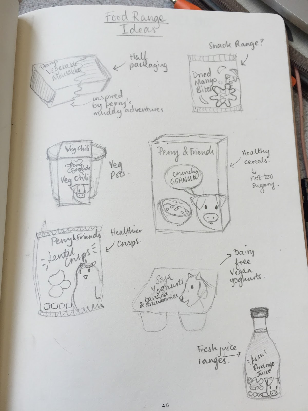
In this critique I showed my initial illustrations for some of the pages of my book so far. I also outlined my idea for a supporting food range for kids using the characters in the book as the mascot. This will encourage the healthy meat free eating that the book is trying to teach.

I asked about my colour palette as though it is contemporary I am not sure whether it is suitable as well as asking if the food range would be a relevant idea.

Below is the feedback that I got:

" Really like the colour palette simple and warming especially for a children's book. Do you not think its too young to promote to someone as young as 3? Why not create a children's book that informs adults too? Create a short book for children and one for adults? "

" Food range would work look at supermarket kids meals, such as M&S and Sainsbury's they both have a kid range. Love the colour palette. 3-7? 3 year olds will probably find this too complex. 5+ maybe? Many 3 year olds will not be able to engage with this. Research into the food market for children. "

" Colour palette is really nice, not sure its a bit feminine? Beautiful illustrations though and I think this idea would work best with a food range rather than the book being standalone. You could stick to the same style for the food range and perhaps offer the book as part of the food range. You could make a food trial or "Perry's trial" with it to make it more interactive? Could also create a campaign with your food range. "

" Great age group to target - hit them when they're young and start asking questions/being inquisitive. Vegetarian or vegan? Remember parents will be buying the kids book/food so it has to appeal to them too. I think the food idea is great as at that age parents often have to bring their kids food shopping so may influence what they buy. Colour palette is effective, although slightly on the girls side. Maybe make it more yellow/orangey as boys don't like pink. "

" Really like the illustrations - very cute! Great way of connecting with your target audience. In answer to your question I think it would be a great idea so that the children can put into practice what they've learnt from the book. The colour palette looks great but not sure if it fits with the target audience, perhaps could be brighter? More engaging for kids. This can really be expanded upon and there's a lot that can be done in terms of the range like more characters and healthy eating products. "

" I think this will work brilliantly as children's book, super cute! personally I think the food range is not necessary as the book is a strong enough outcome. I think the colour palette is maybe a little too girly? Any thoughts on developing the book into a range of books with other animals? "

All of this feedback was really useful. I will definitely have to have another play around with colour palettes as most people thought that the one I have chosen is a bit on the feminine side and I want the book to be unisex. Also I am pleased that people agree with my idea to create a food range and it is an interesting thought to sell the book with the food range. I think that this may be a better idea than producing a high spec hardback children's book that would only get tatty. However I did want to do some screen printed post cards but this might not be possible with all of the other things that I am planning to design. 

Thursday 5 May 2016

OUG505 - Studio Brief 2 - The Storyline & Book

After deciding that I wanted to do a children's book I had to decide on a storyline and also more importantly an age range. I feel that children in the age range of 3-7 would be best because I can really simplify the language and make it a much more visual book.

The kind of message that I want to portray is that sometimes eating meat is bad, and you can live off vegetables as your main diet. I think that children of this age will be more empathetic and if they are taught about some of the truths behind farming they may be less inclined to eat meat. Additionally I hope to influence the parents as well who will be reading it to their children. It is going to be a challenge because I don't want to put a negative light on the industry or on people who do eat meat. I just want to suggest that perhaps there is another way to live than on an omnivorous diet.

My initial ideas were:
- Show Perry the pig and his friends being strong while eating vegetables - stronger than other animals who eat meat perhaps?
- Show Perry the pig stuck in a farm and he wants to go exploring the countryside without being behind a fence.
- Perry has to choose between eating vegetables or meat?
- Perry escapes from the pig sty to explore the countryside and makes friends along the way

Also I had a think about how to print and bind the book in order to be durable enough for children of a young age to look through. I think that I will do a hard cover because of this so that the book can take a lot of use. I am unsure whether to use a perfect bind or a simple saddle stitch bind. Either would work with the hardcover but it depends on how I want it to be printed. 

I decided on the story line where he escapes from the pig sty and makes friends along the way as I feel like it is a better message for children to be shown the value of freedom for the animals. Plus this means that I don't really have any negative messages about the farming industry so I hope that this wouldn't put anyone off.

The next step was to draw up a storyboard of sorts showing the illustrations and text for each page.


Wednesday 4 May 2016

OUGD505 - Study Task 4 - Vote

A YouGov survey published in May 2014 stated that less than half of eligible young people planned to vote in the following year's general election (and we all know how that turned out). How could graphic design be used to ensure that more than 41% of 18-22 year-olds actually participate in the election process? Just by way of a comparison, three quarters of YouGov's surveyed over-60s planned to vote.

We had a discussion as a group to try and think of the problems with our age group not voting. We created a mind map made of sticky notes in order to come up with the cause, problem and solution.

Research
I looked into previous British political campaigns to see why our age range might not trust the politicians. I found that a lot of the previous campaigns have involved a back and forth match of picking on each other especially between Conservatives and Labour. They seem to copy each others adverts by depreciating one and other. This doesn't make them seem like trustworthy politicians all it does is make them seem childish. 


So what does a successful political campaign look like? Everyone knows about Obama's "Hope" campaign. His straight to the point campaign used simple slogans in order to get traction. Slogans like "Yes we can", "Hope", "Progress" and "Forward" fill the voters with a sense of positivity and pride rather than slogans which can be misleading. Also his campaign didn't shame any of the other people running for president. He focused on his own campaign and going about change for the country. 


The Solution:

We thought that the best solution was to take out all the confusing terms and bias from political materials and strip it down to the basics that people can understand what points the political parties are trying to put across without all the extra childishness. As a team we thought we'd mock up a guide each for a political party of our choice to strip back the parties views to the simple what, why etc. 


The Jargon Buster