
Below are images of my full mock up with screen printed cover and full colour photographs. The production process was fairly simple for this binding method as I didn't need to worry about pagination. Also the fact that my book's pages were single sided made this even easier.

The actual binding process was a bit of a pain using the cartridge paper. The last stitch of Japanese binding has to split through the middle of the book and tie off there but I really struggled doing this and found it difficult to put the needle back through the middle. I think for my final bind I will tie it off on the outside as the result of the tying off in the inside loosened my bind.

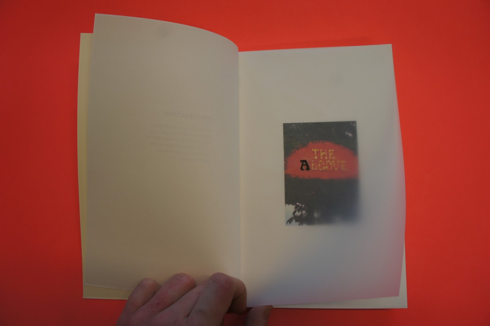
The over all alignment on this was really successful - I was worrying that it would go out of place when binding it.

Also I found the two colour screen print on the front cover really effective at giving the title that 3D look. I am disappointed that I couldn't foil the highlights because of the methods that I wanted to use. But I feel that the white is more subtle - the holographic foiling might have ended up looking really tacky and bringing the quality finish down a bit.
If I were to produce this book commercially it would be quite difficult if I wanted to do a large print run as the only way to do this bind is by hand - there is no machinery that can create it. So this would definitely put the prices up to produce as well as the time scale being a lot longer. Also having a two colour screen printed cover would make it an even more bespoke product and once again make it more expensive to produce. However I think that this adds to the journal concept that I was going for because of how bespoke it is. I know that it is unique and hard to reproduce.
No comments:
Post a Comment