Friday 31 October 2014

Studio Brief 4 - Research - Poster design, history and influences

HISTORY OF POSTERS

BROADSIDES 
Posters began being published in the 18th century and were known as Broadsides. They were large pieces of paper with large lettering printed on one side and were used to issue public decrees, governmental notifications and a host of commercial and private announcements. Broadsides were produced quickly and crudely in large quantities before being distributed freely to town squares, taverns and churches. They were intended to have immediate impact and then to be discarded later. 


Items like this that are printed for short term use are called ephemera. Slowly posters became more sophisticated as printing techniques and artistic movements evolved over time. This gave graphic designers and illustrators a medium to express their views and show their work to the general public on a large scale. Many of the typefaces used in these old poster designs inspired the new metal type on printing presses. 

WOOD TYPE
Commercial pressure for large type was answered with the invention of a system for wood type production. Darius Wells invented a special wood drill, named the lateral router, in 1827 which was capable of cutting letters on type high end cut wood blocks. The router was used in combination with William Leavenworth's pantograph (1834) to create decorative wooden letters of all sizes and shapes. In 1880  James Hamilton developed a method of adhering a veneer made of holly wood onto a pine base. Within a decade this was converted to the standard end cut method. 
LITHOGRAPHY
Lithography was invented in 1796 by Alois Senefelder when he was searching for an alternative to expensive metal plate engraving. His method was drawing onto a limestone with a waxy crayon and offsetting that image onto paper. Later on, in commercial applications metal plates were used. The process of Lithography captures an artists true intention, but the image that is printed would be in reverse. So the posters lettering would have to be drawn backwards. An advantage of lithography was the ability to hand draw lettering, opening the way for type design in lots of different styles. The lithography technique was arguably championed by Jules Cheret, who created the famous french style lithographs such as the one for Moulin Rouge. 
1897 Poster for 'Chocolat Ideal' lithograph 117 x 78 cm
This poster by the famous Art Nouveau artist Alphonse Mucha shows how lithography could really let artists show off their abilities. In my opinion, this poster really sells the chocolate well, with the steaming hot chocolate and the children fighting over getting their mug first it draws your eye onto the product and makes you feel as if you are part of the scene.

I found a really interesting video on lithography on Youtube:


CUBISM
In the late 19th and early 20th century, illustration overtook large type within posters and simple imagery was used to get across messages. It was greatly inspired by the cubism movement and the invention of the airbrush in 1876. One pioneer of this style of posters was A.M. Cassandre, his iconic style is very recognisable, with bold colours and his use of the airbrush. I love the use of geometric shapes in his work, especially in the poster below, it looks like he started with a large rectangle in the middle of the page and then formed the ship around it. This very simplistic, illustrative style is still popular today and many people still try to imitate it. 


A.M. Cassandre's work vs a modern interpretation. 


FUTURISTS
The Futurist design was very typography based, however they despised the use of grids and normal design conventions. They loved violence, speed and dynamics and this showed within their work. Particularly in Fillippo Tommaso Marinetti's posters it seemed almost like the letterpress had exploded while printing, creating a jumble of letterforms on the page. (Words in Liberty 1913)


DADA
In 1916 Dada became popular, it was a cultural arts movement that took place during the First World War in Switzerland. It encompassed visual arts, theatre, poetry and graphic design in one. Its members claimed that they were "responding to the violence and trauma of World War I - and to the shock of modernity more generally - by developing shock tactics of their own.". They scoffed at the definition of a conventional artistic media and expanded it to include things from their new modern world such as newspapers, magazines, advertisements, food wrappers… and the list goes on. The dadaists spread their message through staged public demonstrations and avant-garde art.


The dadaist graphic designers worked mainly in 'photomontage' - the combination of two or more photographs onto a single image. Although earlier artists had used photomontage the Dada method took new meaning as the images original intent was shifted to an unintended message. It is interesting that the letterforms and words within these montages were included as part of the composition rather than to convey a message or word. 

PROPAGANDA
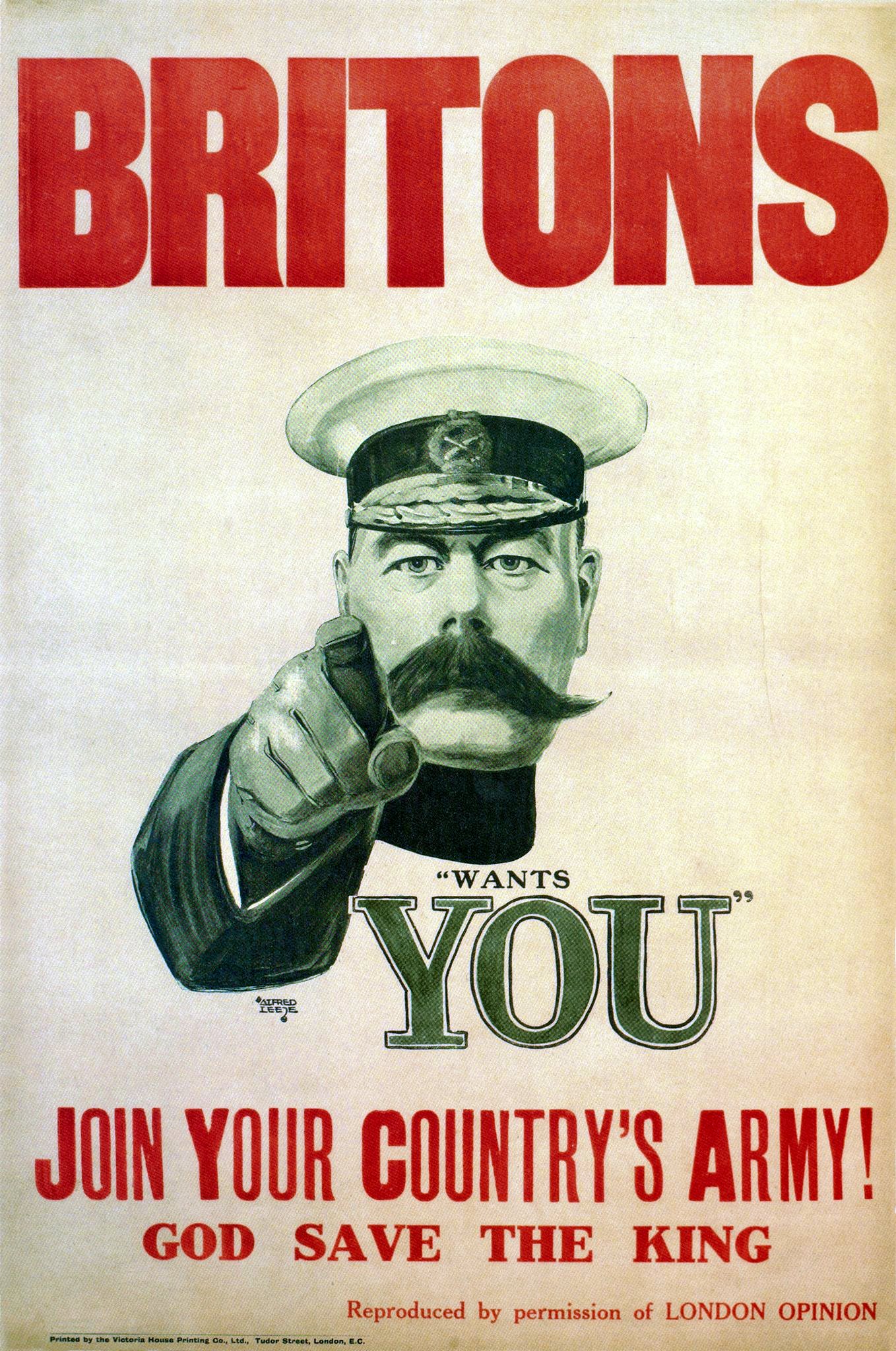
Posters played a huge roll in the First and Second World Wars in terms of rallying the people together and promoting joining the army. Probably the most famous being Alfred Leete's 1914 poster depicting Lord Kitchener pointing at the viewer. This poster took the war to the people and made them feel personally involved with the finger pointing at "YOU". 


This poster was copied in many ways for other wars including the civil war in America only 3 years later by James Montgomery Flagg, but depicting Uncle Sam instead of the English Lord Kitchener.

The use of the pointing finger was so effective that it was used a third time in a Russian propaganda poster by Dimitry Moor in 1920. 

Posters were an excellent medium to get across clear messages to the population and inspire many. In my opinion, without the propaganda used during WW2 the morale of England would have been very low. 

DE STIJL
De Stijl, or neoplasticism, was a Dutch art movement founding in 1917 in Amsterdam. The movement proposed ultimate simplicity and abstraction through which they could express a Utopian idea of harmony and order. This harmony was created by using only geometric shapes, primary colours and abstraction. Below (Construction de l'espace, Temps III) you can see how one of the main artists of the movement, Theo van Doesberg, used simple geometry on a page to create a 3D looking shape. The use of white and the primary colours on this yellow-brown paper makes it look even more 3D by jumping out of the page at you. 


Srudio Brief 3 - Final Crit

This was my final presentation of my research. I am really proud of how it came out as it looks organic due to the materials that I printed on. I produced 3 different concertina books - one about edible mushrooms, one about poisonous mushrooms and the other about facts about mushroom foraging. 


The feedback that I received was also good - they said that the way that I presented my research was effective because it was interesting to look at. However, I was told that a visual digital presentation on the board would have been good to accompany my verbal presentation. I agree with this as I only had 3 books to pass around and it would have been good for the audience to have something to look at while I talked.

But I think that I know what I will do for my final delivery of my research as many of the group were really interested with the facts that I gave and were unaware of the seriousness of poisonous mushrooms. So I will produce awareness posters for families (as out of 237 cases of mushroom poisoning in 2013 many were children under the age of 10) to make them aware of what their children might pick up during a walk through the woods.


Thursday 30 October 2014

OUGD404 - Design Principles - Colour Theory

This week we were asked to bring in a certain colour - mine was red - for our colour theory lesson. Below are the objects that I found and brought in.


Our first task was to order the colours of the objects from a dark hue to a light one which we all found relatively easy with the colours we had collected. 

Dark to Light
Dark to Light

The next task was to order the colours from cool to warm. We decided that the colours with more blue in them (like the burgundies and the darker hues of red) were colder, and the brighter reds were warmer. 


The next task was to then separate these colours into two groups rather than having them in a linear order. So we seperated them into a group of cold colours.


And a group of warm colours.


We then had to go to another colour's table and form a linear circle of their colours from a dark to a light hue. We found the yellow difficult, as they had picked gold objects and cream objects which were hard to place among the fluorescent yellows. 


This was how our table was sorted when we came back.


Finally we got a pack of pantone colour swatches and had to match them up to the colours of some of our objects. I focused on a small group of my objects and used a coated pantone swatch book. I struggled finding the exact colours but I thought that I had got a pretty good match. I was interested to find that most of the objects shared the same pantone colour. 


As a finish to the task we combined all 3 colours together into a loop so that they would flow. The results were quite interesting as I thought that they blended quite nicely in a circle, though you could tell that they are different colours the hues go together well. 


Tuesday 28 October 2014

Presentation of Research

I had an idea to present my research in a book format, so I began researching some book binding methods.


This image shows lots of different ways of binding a classic style book from sewn bindings to spiral bound. However I don't think that I have enough research to fill some of these sizes of books.

So I started to look at books that are constructed by using folds rather than binding the pages together. I first looked at the "secret fold" method, which was really easy to make and it folds out into one big sheet. 


I also tried a concertina book, which once again I found really easy to make and the design of it looks really nice when opened up. I also had the idea of doing the facts for wild mushrooms on one side and research about foragers on the other. I think that I will use this method to present the research that I get as it is easier to separate the two sides of the story that I have focused on. 


Monday 27 October 2014

Studio Brief 3 - Interim Crit

After our critique today I decided on which article I wanted to research. I decided on the Guardian's illegal foraging article as it interests me much more than the Scottish drink drive limit. I would rather work harder to find more research about foraging than easily find research about a topic that doesn't interest me as much. 

After a discussion with my group, it was clear that the Guardian only published this article on the second page because they knew that they had the readership for it. Other newspapers don't seem to comment on the environment, however the Guardian has its own "Head of Environment" who wrote the article in question. Also it was suggested that maybe this story was something that they had been working on for a while and isn't necessarily 'recent' news, they just happened to put it in Saturday's paper.

When I got home I did find more articles about illegal wild mushroom foraging, although they were mostly from a year ago. Though I have managed to find an article from from BBC news published this month about warning people to take care while foraging after a rise in hospital admissions due to eating poisonous mushrooms. This suggests that there might be need for more education on different types of poisonous mushrooms. 
The most famous case of mushroom poisoning in recent years occurred in the Highlands in 2008, when the author of the Horse Whisperer and his family accidentally ate deadly webcaps, thinking they were ceps. Nicholas Evans, his wife and her brother all had to have kidney transplants and were lucky to survive.
There is another article from a local paper for East London (where Epping Forest is situated) highlighting the issue of foraging. This was posted on Saturday the 11th October. The article brings to light that warnings given out to foragers are "at an all time high" so I decided to investigate and see if perhaps foraging had become more popular in recent years and why there is such a high demand for wild mushrooms in restaurants. 

Also on the BBC website I found a small quiz on how well you know your wild mushrooms, whether the ones shown are edible, not tasty or poisionous. You can find it here. I actually scored 5 out of 7 which isn't bad for someone who has only just started researching wild mushroom varieties!


Sunday 26 October 2014

Studio Brief 3 - News on the 25th of October


 These were the three newspapers I bought - The Times, The Guardian and The i. 


Searching through the news papers I looked at the headlines to see which interested me and put a tab next to them. I struggled with this as most of the headlines and articles were either about politics or about ISIS militants or deaths and wars happening in other countries.
I looked through the i first as it is the smallest, most concise of all the newspapers that I bought.


The first article I found was about the drink drive limit being cut in Scotland. I find this quite interesting as I am quite aware of the effect that drink driving could have on other people and I think that it is a very selfish thing to do. I think that I could get a lot of research and statistics about this article. 


This was the next article I came across - volunteering in third world countries can harm rather than help people. I find this fascinating as I was previously unaware of this culture of 'voluntourism' where people would kidnap children and take them to a school just so people can come to volunteer and 'help' them. It is also said in the article even when you do go on genuine volunteer missions, it harms the children as you form a bond between them while you are there but when you leave in a couple of weeks they are left heartbroken and disorientated.

I then moved onto the Times to search for similar articles or even different stories.


I found this article about a dead heart (a heart that wasn't kept beating) given to transplant patients successfully. This is a really uplifting story as it means that more people can benefit from organ donation as usually to have a heart transplant, the donor must still be alive to keep the heart alive for transplanting. 


Also in the Times was an article about a high speed railway that could run from coast to coast in the north, going from Liverpool to Manchester to Leeds to Hull. This would be a great cause to do graphic design work for and even though I probably wouldn't be able to find a lot of research on this proposed scheme. 

Next I looked through the Guardian, in hindsight I did find a lot more articles that I was interested in here than any of the other newspapers.


This was my favourite article in this newspaper purely because I have a vision of what I could produce as an end result. Even though the article is about the extremes of foraging where whole forests have been stripped of all their wild mushrooms (this has obviously had an effect on the wildlife) I would like to create a guide on mushroom foraging. 


I found an article on the heart transplant in the Guardian as well as the i so it is clear that this would be a story that has a lot of interest behind it. 


I also find another drink drive article in the Guardian, so this is another viable option for my final article.

In conclusion after reading all these articles I am stuck between two. I want to either do the drink-drive limit in Scotland or the woodland foragers picking wild mushrooms. These are the two articles that I have a vision of the end results. However I have found lots of research about drink-driving yet not a lot about foraging mushrooms (which I expected). But I do feel more passionate about foraging than drink-driving. I will have to ask my tutor and get his opinion.

Friday 24 October 2014

Studio Brief 3 - Newspaper Research

NORTH SEA OIL FIELD DISCOVERED.


For the study task I got put into Group 10, whose article was "North sea oil field discovered". At first I was worried that this was going to be a very boring article, just to do with economics. But, upon initial research we found this to be quite a controversial article because it had very strong links with the Scottish referendum. The Scottish National Party claimed that the No campaigners had kept this discovery hidden so they could say that Scotland would not survive purely on the oil fields that were found. This caused the SNP to call for an apology from the no campaign, yet they are still remaining silent. 


However, it's not all controversy, this find also means that it will generate more jobs for people in the UK and in Scotland to extract the oil and it will also be very beneficial to our wounded economy. 
So after reading articles from different sources such as The Scotsman, The Guardian, The Daily Mail etc. we got straight into research of what articles about oil generally look like. 
We found 2 very contrasting articles about oil and created a grid to compare them. The first was an article in the Sun:

This is a very simple grid as you can see there isn't much text at all, it is mostly taken up by the image. Although it is an article about fuel prices I thought that it might still be relevant to the subject of 'oil'
Then we looked at an example from the Times:


It immediately strikes you as having much more information on the subject than the sun with a much more complex grid system. There are differences due to this being the front page and the Sun's being a single page spread but I still think that this says a lot about the difference in the newspapers which is down to their target audiences. 


In the end, we decided as a group that instead of mimicking a current newspaper or tabloid we wanted to create our own contemporary version. We decided we wanted to base this newspaper on simple aesthetics and neutrality (no bias) to differ ourselves from the other newspapers. We were very much inspired by Matt Willey's work and the use of his bold, yet condensed typefaces that dominate the page.
We also decided to include a black and white photo in our article, similar to how Willey has just to make the design pop, and not just be columns of text with nothing to break it up. 


This was our initial idea, to have a dominating title, in black, being bold and imposing and taking up a bit of the second page as well as all of the first page. 

I had an idea to combine a drip of oil in the title design, lining up the i's in oil and discovered to pool into a puddle below, representing the sheer amount of oil that we as a country rely on.


I experimented with different versions of this, including have a continuous line of the oil drip. However, others in my group didn't agree with my idea and wanted to keep it simple so we stuck to just text. 


We decided in the end that simple was best, similar to how Matt Willey presents his articles we wanted a bold, simple title that dominates the page. At first we decided on a 3 column grid system, as this was what we had designed when hand rendering our design, however the article that we had put together was much longer than we had anticipated so it turned into a 4 column grid. I am really happy at how the finished product has turned out and I believe that we worked well as a team, with half of us split into research and hand rendered designs, while the other half got on with the digital copy.

Our final design.