
"Nothing could be more useful to reach our intention than the Grid. The grid represents the basic structure of our graphic design, it helps to organize the content, it provides consistency, it gives an orderly look and it projects a level of intellectual elegance that we like to express."
- Massimo Vignelli

Grids are indeed an essential part of graphic design. They are used in almost every publication, print and icon today. I have found finding grids within existing pieces of graphic design quite laborious as they often get very complex and need simplifying. For example when I was creating a grid for Futura I found the initial one that I created very complicated and hard to understand. It took me a while to create one that was simpler and easier to use.
ABOUT GRIDS

Other types of Grid
The Golden Spiral and The Fibonacci Sequence


Tschichold's Octavo

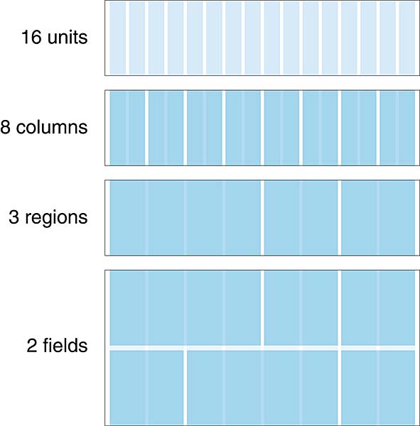
A grid can be split up into four different parts defined as:
- Units - The building block of any grid, a unit is the smallest vertical division of the page (i.e., units are measured in width), upon which columns are built. Units are typically too narrow to house most textual content.
- Columns - Columns are groups of units, combined together to create workable areas for the presentation of content. Most text columns, for example, require two or more units to be workable. A grid system of sixteen units can be combined into two columns of eight units each, or four columns of four units each etc.
- Regions - Regions are groupings of similar columns that form parts of the page. For example, in a four-column grid, the first three columns from the left might make up a single region for the display of one kind of content, and the remaining column might form another region.
- Fields - Fields are horizontal divisions of the page (i.e., fields are measured in height) that help a designer to visually pace the placement of elements on the Y-axis. Fields can be calculated in many ways, but using the golden ratio is one of the most effective methods.
Other types of Grid
The Baseline Grid - The baseline grid is formed by a uniform, top-to-bottom repetition of baselines spaced apart according to the leading or line-spacing of the text.
Horizontal and Vertical Grids - These concepts are notoriously easy to confuse (a unit can be thought of as either a horizontal or vertical division of a page, depending on your point of view), so this book refers instead to the columnar grid (divisions of the page measured in width) and the baseline grid and regions (divisions of the page measured in height).


The Golden Spiral and the Fibonacci sequence are both very similar and they are considered to be the 'divine proportions'. If the content of an image or design lines up with the squares or lines in the sequence it is considered to be compositionally perfect.
The Rule of Thirds

The rule of thirds dictates that anything that intersects the 4 focal cross-points in the centre of the image will draw the attention of the viewer. This rule is mostly used in photography and cinematography.
The Van de Graaf Canon

Also known as the "secret canon" it is used to construct a page design with pleasing proportions which is mostly used within book page designs. It was created my J. A Van de Graaf and it was used in many medieval manuscripts.
The Golden Canon

This canon relies on the ratio 2:3, to give a type area height equal to page width as demonstrated by the circle, and this results in margin proportions 2:3:4:6. It is named the Golden Canon as the ratio 2:3 is known as the "golden number".

Tschichold's octavo-format page proportioned in the golden ratio or golden section "34:21". The text area and margin proportions are determined by the starting page proportions.
-------------------------------------------------------------------------------------------------------------------------
Primary Research
I photocopied some pages from magazine and newspapers and drew grids over the photocopies to look at what grids are suitable for what publications.


Overall from these studies I found that most of the articles shared similar column grid systems especially the first two that I looked at. It gives them a very clean and neat appearance which suits the reader. Also the columns only have 7 words per line so it doesn't tire the readers eyes when reading their articles.

Additionally, I found this poster in a magazine and it instantly reminded my of the modernist movement. So I tried to draw a grid for the design. At first I thought it was quite a simple grid because a few of the pieces of type were lining up but upon adding more detail it became quite complex. Perhaps it was created based on a column grid or a modular grid? It is hard for me to tell.
Information found from:
http://www.peachpit.com/articles/article.aspx?p=1678655&seqNum=4
http://www.designersinsights.com/designer-resources/using-layout-grids-effectively
http://en.wikipedia.org/wiki/Canons_of_page_construction
No comments:
Post a Comment