
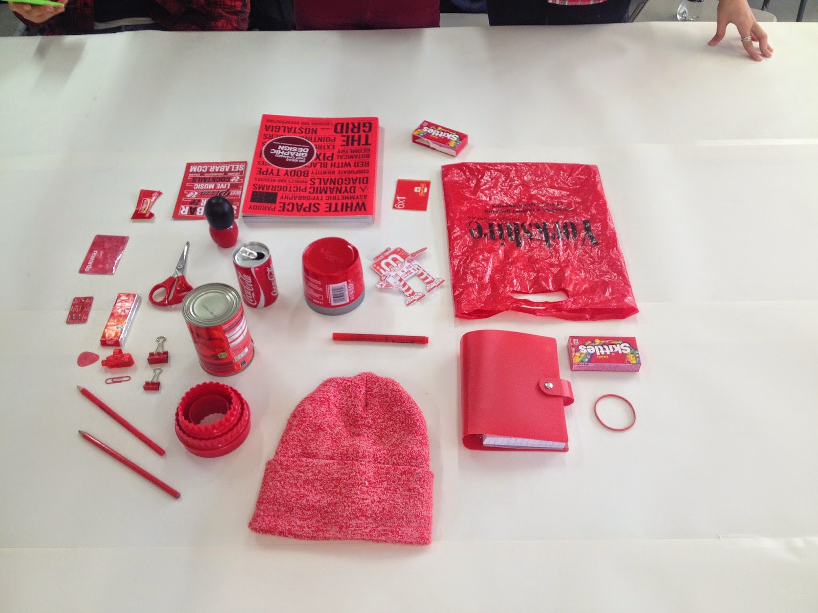
This week we were asked to bring in a certain colour - mine was red - for our colour theory lesson. Below are the objects that I found and brought in.


Our first task was to order the colours of the objects from a dark hue to a light one which we all found relatively easy with the colours we had collected.
 |
| Dark to Light |
 |
| Dark to Light |


And a group of warm colours.
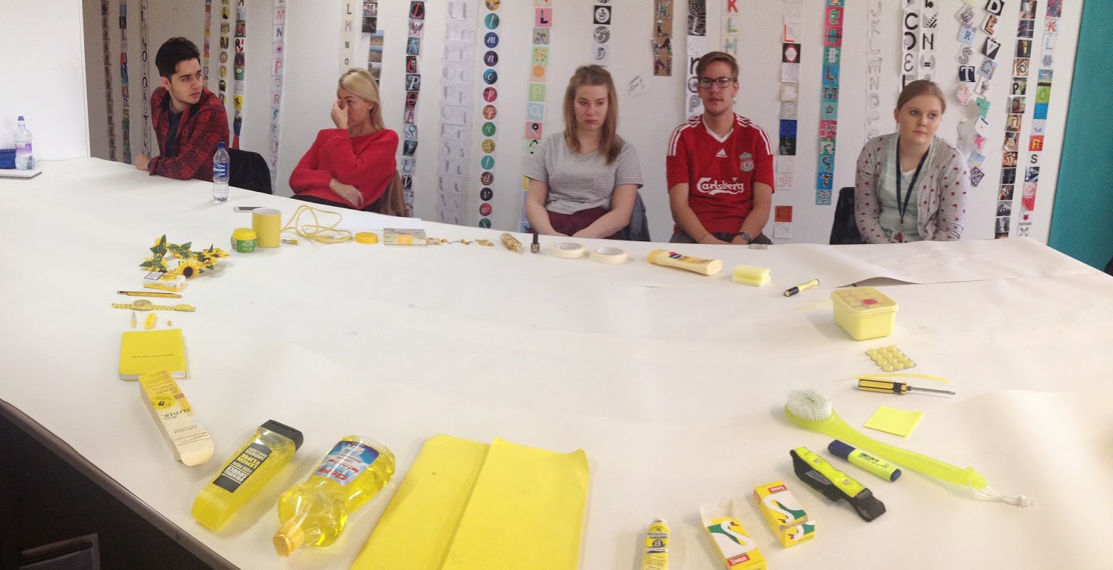
We then had to go to another colour's table and form a linear circle of their colours from a dark to a light hue. We found the yellow difficult, as they had picked gold objects and cream objects which were hard to place among the fluorescent yellows.

This was how our table was sorted when we came back.

Finally we got a pack of pantone colour swatches and had to match them up to the colours of some of our objects. I focused on a small group of my objects and used a coated pantone swatch book. I struggled finding the exact colours but I thought that I had got a pretty good match. I was interested to find that most of the objects shared the same pantone colour.


As a finish to the task we combined all 3 colours together into a loop so that they would flow. The results were quite interesting as I thought that they blended quite nicely in a circle, though you could tell that they are different colours the hues go together well.
No comments:
Post a Comment