


Liberty London Frames
These luxurious frames have been given a very unique frame backing. I love the use of traditional patterned papers and using descriptions of how the frames are crafted in the middle. The overall look of these frames screams upper class and quality. It also uses black letter, sans serif and cursive fonts once again connoting quality and luxury.

Tesco Frame
This has to be the most simple frame backing paper. It is greyscale, with only essential information displayed on it. Some may like this minimal style but this doesn't sell the product to me at all.

John Lewis Frames
Though this is a stylised frame, this backing paper is once again grey. But I really like this idea of using quotes from artists on the frame backing paper, I even thought I could use motivational quotes to use to brighten peoples day when they walked past them.
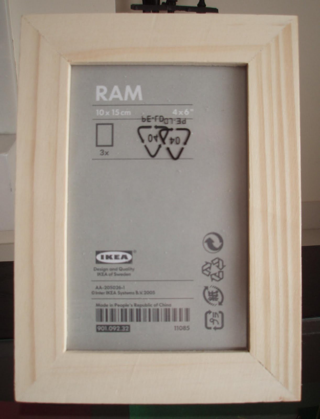
IKEA Frames
The IKEA frame takes a more technical aspect and I think that it has tried to be as multilingual as possible by using internationally known symbols. But I expect this from IKEA as it is a large international company that focuses on ease of use and simplicity.
Overall from this research I have found that most of the frame backing papers don't use bright colours at all, they are mostly grey or very pale shades. This may be because the design has to fit with a large variety of frame styles, shapes and colours. However, I feel like they need to be bold and colourful to draw your eyes to the frame and show that it can work with strong colours.
No comments:
Post a Comment