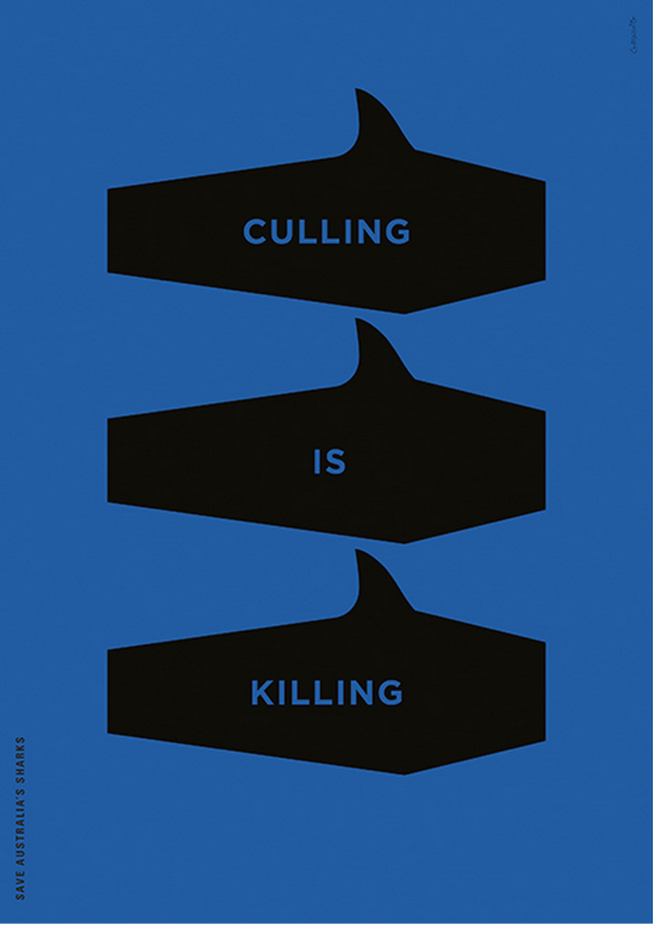
Mark Gowing - Personal Works.
I really like how simplistic Gowing's work is yet it can convey such a strong message. Both of these posters are some of his personal works, one against shark culling in Australia and the other protesting about oil. Both of these subjects interest me as well so it helps to draw me into the posters. Both posters only use two colours to add to the impact. I like the play on shapes within the "Culling is Killing" poster, how he has added fins to coffins emulating sharks.
Animal Canon
I really like all of Animal Canon's work as they are all screen-printed posters and I love the effect that screen-prints produce. It makes them feel more hand made and organic than normal printing methods. I particularly like the "Crane your Swan Neck" with it's use of geometric shapes and hatched patterns. I also like the fact that it is black and white, it adds to the drama of the hatching and draws your eye to the white triangle where the text of the poster is positioned.
TYPE ONLY POSTERS
Minimalist movie posters by Patrik Svensson.
Patrik Svensson created a series of film posters using type only to try and represent the film with 2 characters. I really like the effect that this makes, as you have to look hard to see how they have been made, like with the 2 Days in Paris poster, two 2s have been combined to create a heart. Also the monochrome look works very well, with the gradient that works almost like a spotlight on the characters.
IMAGE ONLY POSTERS
Race to Death Project and Personal work by Aron Vellekoop León
The style of these posters remind me of the cubist style posters like the ones by A.M. Cassandre. Both of these posters convey a message without the need of type. I have interpreted that the poster on the right is supposed to represent someone's life - with parts like the hole punch, coffee maker and paper clip representing work, the drugs and cigarettes representing habits and the money represents the individuals motivation in life. The poster on the left however is named the "Race to Death" project, which could mean that the design thinks that we as a society rely on transport too much. It shows the progression from child - with children's toys - to adult with cars and other transport - to old age - with a stretcher and wheelchair.


No comments:
Post a Comment