
The Golden Ratio
100/1.618 = 16.18
(insert number here) divided or times by 1.618 gives you the golden ratio sum
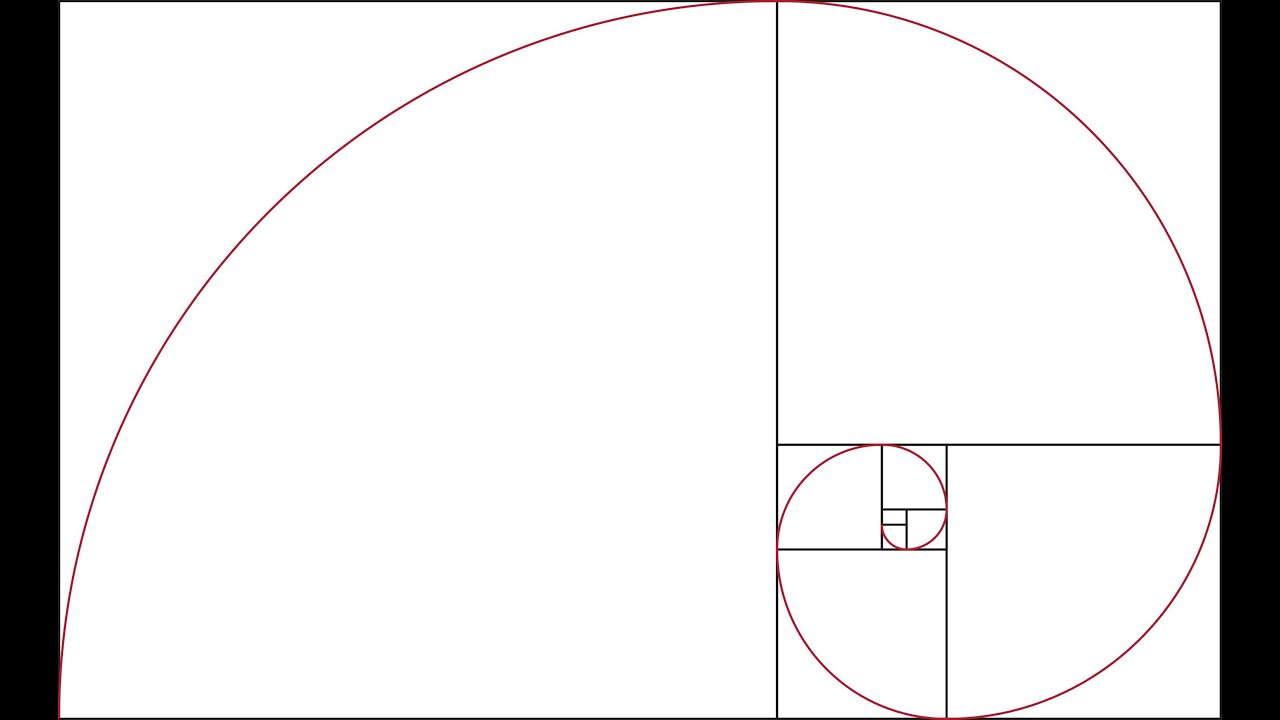
This can be used within canon construction, font point sizes and a whole range of other things. Below is the golden ratio of an area, created by measuring the width and the height of the boxes and dividing them by 1.618 to get the measurement for where the next line should go. Putting this into practice is harder than it looks - we tried to create our own on graph paper and I found it really difficult as I kept having to flip the page around to switch the measurements around. The hardest part for me was when it was getting to the smaller boxes - I couldn't seem to get the ratios right.
However I did try the theory of the golden ratio point sizes. That the title should be 1.618 times the point of the body copy. Putting this into practice was quite effective which surprised me because I felt like the use of the golden ratio within imagery and canon page construction seemed to be pointless and not work at all (in my opinion). I think I will definitely use this method of point sizing again as you can see below, it makes the sizes seem very harmonious.

Van de Graaf
Next we looked at Jan Tscichold's Van de Graaf canon which was a lot more simple to recreate and made a lot more sense layout wise in my opinion.

I implemented it into a text layout and I feel like it works very well. Although it would depend on the binding method of the book whether this layout would be effective or not - if it was perfect bind or a Japanese stab bind then the margins in the centre of the page would have to be a lot bigger in order to account for the bind and not lose some of the text.


It also works well with type and image. I have used one of my images from the type in context brief and I feel like this layout is particularly effective because of its minimalism.

No comments:
Post a Comment