
After deciding on doing Tea syrup I started looking for bottle designs rather than general tea packaging. I started by looking at Apothecary's old medical bottles because I love the shapes of the labels and the vintage looking type.


I love these in particular as they combine colour and information with the design to fill the whole label so it doesn't look too empty. My favourite label shape is the rectangle with the circular indented corners as it means that you can still fill the label but it isn't a boring rectangle, it adds more interest.

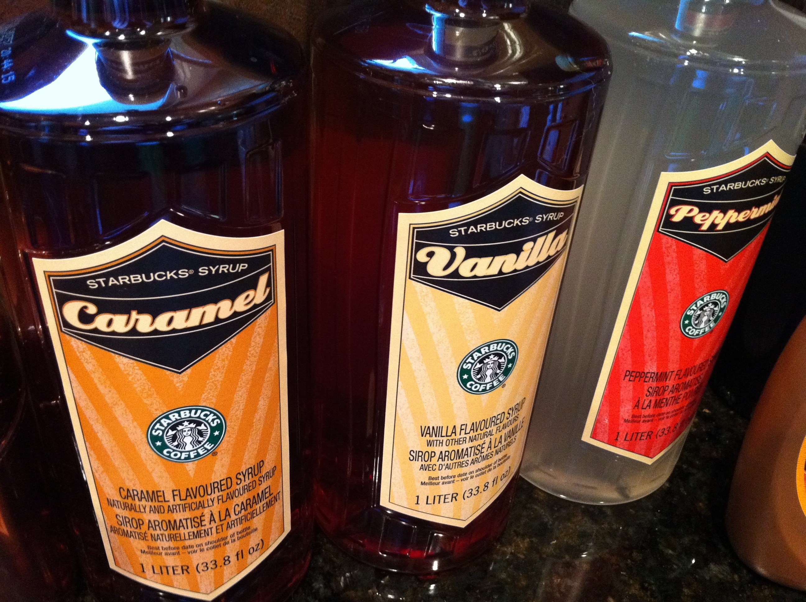
Also after searching I found Dave's coffee syrup, which is the same concept as my tea syrup but obviously the coffee version. I like the shape and size of the bottles that are used, they don't seem overbearing or large like the bottles for Starbucks below. Also it means it can be put away in your cupboard with your sugar and coffee. Additionally I like how fresh these designs are, they use a limited colour palette which reminds me again of the old apothecary labels with off white/cream, red and black.
Initial Ideas.
These were my initial digital mock ups of my first thumbnails. I really like the pattern that I created with china cups as it sets off the whole design with the colour that it needs. I also tried to use off whites to make it look aged like the medicine bottles as the tea syrup should sit in your cupboard, waiting for you to need a pick me up. However I don't think I like the name "Instant Brew" and the type I have set it in is not very appealing either, I much prefer Bodoni which I used for the names of the tea.
Someone also pointed out that I wouldn't need a weak, medium and strong version as this could be adjusted by using more or less syrup.

Initial concept ideas.

No comments:
Post a Comment