
I took my green eggs and ham idea into the feedback for design principles and I suggested that I would produce a more appropriate slightly post-modern layout that relates more to the essence story and of Dr Suess. It was said that it would be good that I have found content rather than having to write it myself but it may be challenging as it has probably been done lots of times before. Also I mentioned I could re-illustrate the images but I was told that this would go against the whole look and feel of Dr Suess.
However there was some good ideas flying around about the binding type, I was thinking about doing a meander or maze fold book to represent the twists and turns in the story. But someone suggested that I could have a really long concertina book so it flows all down as a continuous illusrtration/story. But this would take away from the readability of the book especially considering it is a children's book.
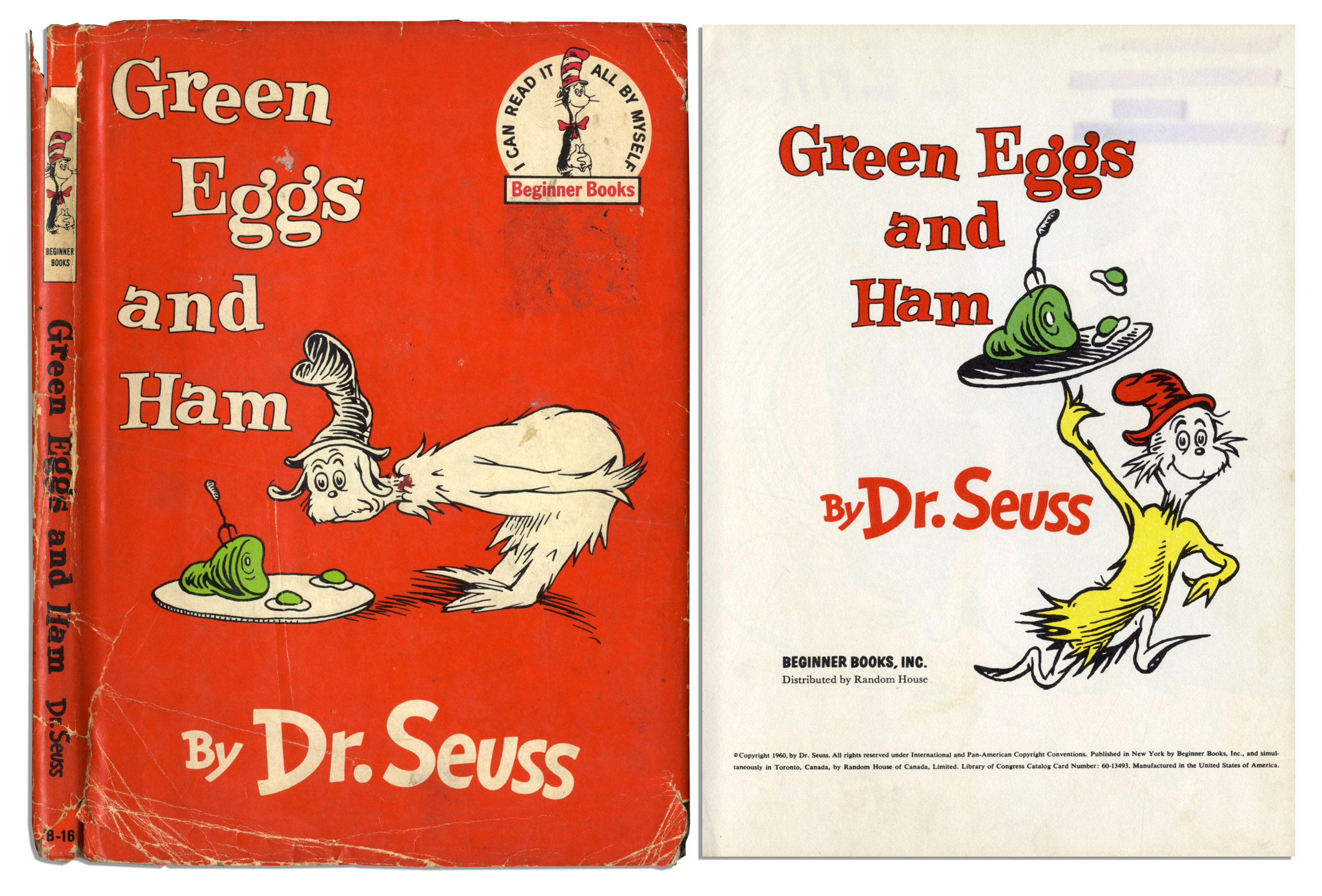
The first edition of Green eggs and Ham.
I really like the font used within the title of this first edition, it has so much more character than the font used in the edition that I got from the library. It feels more friendly and relatable than the one on my edition which is playful yet lacks in personality.
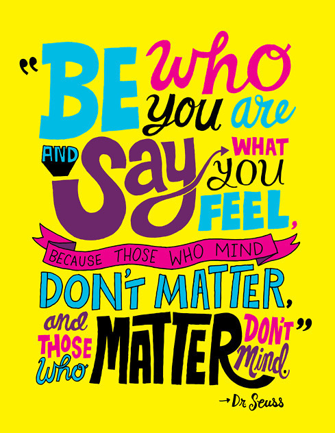
Next I tried to see if a reformatting of Green Eggs and Ham had been done before or in fact any of the other Dr. Suess books. I did find some quotes from some of the books that have been nicely designed such as this one:
http://funny-things-are-everywhere.tumblr.com/
This style completely encompasses all that I think of Dr. Suess - it's punchy, friendly, slightly humorous and fun. I really like the way the artist has emphasised the words that are important within this quote - it reads differently than if you were to read it just typed out. In this format it has much more impact because of the bold colours and different type choices. Maybe this is what I could do within my book design, however, I feel that this might not be able to translate into some of the rules that we are supposed to be showing. Maybe it would work if I purposely broke all the rules to emphasise them.
I also found some cover re-designs for some of the Doctor Suess books but none of the actual book layout which I was surprised about. However the designs that have been made are very plain as they lack personality which I feel takes away from the nostalgic friendly feel of Suess' books.


http://mimpro.tumblr.com/post/34379084314/dr-seuss-redesign-2012-monique-gruspe-2012

http://oliviavitou.prosite.com/211176/2287654/gallery/dr-seuss-book-jacket-collection
Bob Cobbing.


https://sites.google.com/site/concretedeath/home/concrete-poets/bob-cobbing
I was told that if I wanted to interpret the book from the text and story I should look into concrete poetry, where the function follows the form of the text. One artist that stood out to me in particular was Bob Cobbing. Cobbing was a British sound, visual, concrete and performance poet who was a central figure in the British Poetry Revival. I really like the abstract nature of the words however this makes the pieces really unreadable. This may not be a relevant style to do for Green eggs and ham because it would be illegible considering it is a children's book to help children learn to read.
Sam Winston.

http://arceditions.com/store/image/file/03/hi/8udbru/pg6_MUT.jpg

http://41.media.tumblr.com/4b550131682b995b91d991e202b8b1c2/tumblr_mgv58kEyRW1qaruxco1_500.jpg
I also found a concrete poetry artist called Sam Winton, whose work seems to be more ordered than that of Bob Cobbing. Although it would still be not very legible I really like this style of concrete poetry as I feel it is taking some of the elements of the text and translating this into the design decisions. This is exactly what I want to do with Green eggs and ham - take the tone of voice of the text and translate it visually.
No comments:
Post a Comment