
After researching a little bit into David Finch's filmography I knew that I wanted to create something that was quite bold and gothic. His films are usually either very dark or surreal. I think that I will use a very simple colour palette of black and red.

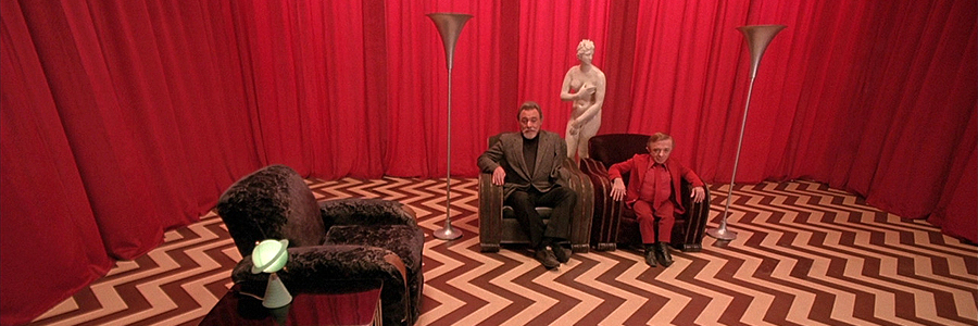
I took a lot of inspiration from the symbology used within twin peaks but tried to simplify them. I really like the idea of using an alpine scene within the logo, perhaps like a stamp. I quite like the idea of keeping it really simple and then using the illustrations or icons on some of the collateral. I also thought about using hand rendered or maybe even letter pressed type to add to the unique nature of David Lynch's filmography. The textures created by these techniques would definitely lend themselves to my idea of having a quite grungy theme. I wanted to avoid the typical coffee shop logos that included the coffee beans or a cup of coffee and go for something a bit more unique and recognisable.
I also sent a message to the creator's at this point in the hopes that they could perhaps give me feedback along the way. I will have to see whether they reply to me though first.
No comments:
Post a Comment