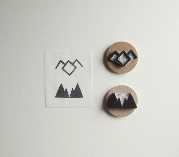
After doing some thumbnails I knew after a few the kind of direction that I wanted to take with the logo. So I mocked up some of the designs.
I started with trying to recreate the alpine scene idea to look like a stamp that would be used on a sack of coffee. I tried to replicate this with a stencil like font. I found these symbols when researching into Twin Peaks and are apparently well known between all Twin Peaks fans. I took the mountains and added it to my alpine scene with a tree. I think the combination of the type and the image isn't quite as effective, perhaps they would both work better on their own.
Next I tried a more grungier approach to replicate the effect that it would have it was printed on a burlap bag. I really like the simplicity of this logotype, it's bold and effective. I feel like that it does show David Lynch's style as it is quite grungy and dark. Also it is versatile because it is just one colour.
I then went from my original combination logo to combine the logotype with a simplified symbol. I went for a red overlay to confuse the viewer, like Lynch's films would. Also the use of the zig zag within the mountains and the red really reminds me of the dream scene that I talked about previously. It is quite subtle put I think that people would be able to pick up on it.


No comments:
Post a Comment